

Row Columns In Mobile View
Eduardo G.
Hi! I have an sppb page with 1 row and 4 colums with images In my PC I see 4 columns, in my phone I see 1 column
Is it possible to change this behavior? I want to show 2 columns in mobile view and 4 colums in PC view. Can this be done? How?
Thanks

Paul Frankowski
Accepted AnswerIn SPPB 3, you you should be able to do that using Columns Option settings in back-end editor.
There is Mobile Layout option here, set "col-xs-6"
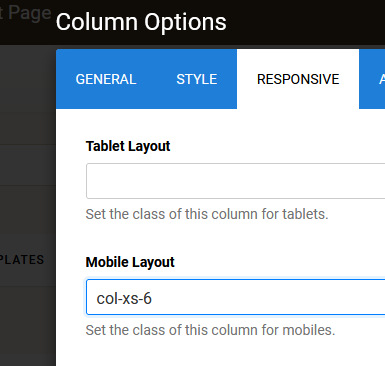
so CSS is not needed.

Rashida Rahman
Accepted AnswerHi there!
Thanks for contacting us.
You can click on the mobile icon on the topbar of the SP Page Builder editor and then you can slide your column bar or input width to adjust the view for the mobile devices.
Here is screenshots for your convenience:
The following blog post may help:
https://www.joomshaper.com/blog/make-your-columns-responsive-in-sp-page-builder-4
Best Regards
Paul Frankowski
Accepted AnswerHi Eudardo,
Possible, but not so easy as it was in SPPB 3 ;/ In SPPB 4.0.10:
- For that Row where you need it add unique Section ID name, for example, mygrid - using Row Options.
- Then use my Custom CSS and Save changes.
@media screen and (max-width: 680px) {
#mygrid .sppb-row-column  {max-width: 50% !important; flex-basis: 50% !important;}
}
Video (with all steps): https://youtu.be/rPPpeY6yRHE