

Feature Box Height
Addington
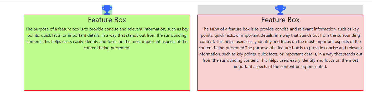
Is there a way to set a row of feature boxes to the height of the biggest feature box (but still let them revert to their true height when viewed in a column on a mobile)?

Paul Frankowski
Accepted AnswerSure @Charles - here is basic CSS example:
@media screen and (min-width: 860px) {
.sppb-addon-feature .sppb-media-content {
  min-height: 270px;
  outline: 1px solid red;}
}
Below CSS red outline is only to show changed area. You can delete it after test with correct height value.
outline: 1px solid red;
remember that two } } must be used (!) at the end.
Addington
Accepted AnswerThanks for this. I can see how it would work, but I am hoping to avoid having to manually set the min-height.
What I was looking for was a solution that would change dynamically with the volume of content in the largest feature box.
eg I use a row of four feature boxes frequently. Each row contains different content. I was hoping to be able to give the row a generic class name (eg "row4") and each column in the row another generic class name (eg "column4"). Perhaps I would also need to give each feature box add-on a generic class name too "eg "column-content")
Then I wanted to be able to create a custom css file which would always handle the situation whenever the two class names were applied.
Something like this, but not eactly this because it doesn't work!
.row4 { display: flex; }
.column4 { flex-grow: 1; display: flex; flex-direction: column; border: 1px solid #000; box-sizing: border-box; }
.column-content { flex-grow: 1; }
Is that possible?

Pavel
Accepted AnswerHi. In this case, you sould use only Feature Box addons in the section or in the inner section (without any other addons).
Add your own class to the section.
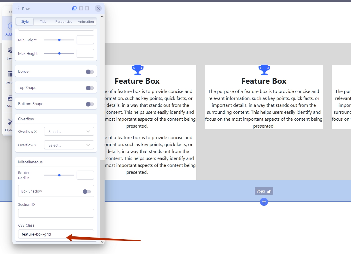
Set margin-bottom to 0 in Feature Box addons.
And use following code: (for SPPB-4, SPPB-5 Beta)
.feature-box-grid .sppb-row-column {
    margin-bottom: 30px;
}
.feature-box-grid .sppb-row-column :is(
    .sppb-addon-wrapper,
    .clearfix,
    .sppb-addon-feature,
    .sppb-addon-content) {
        height: 100%;
}
Result
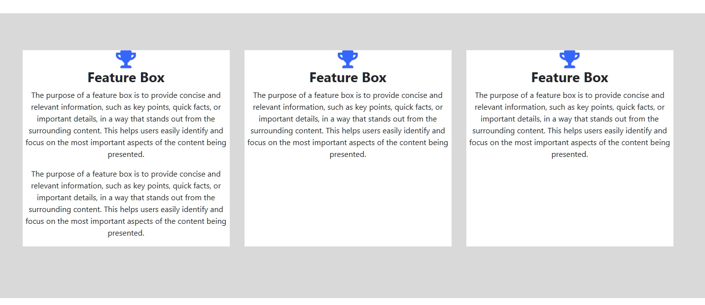 This is the basic code. Perhaps additional code will be required depending on your layout. For example, if you want to use a button inside Feature Box Addon and that it sticks to the bottom.
For SPPB 3 the code will be different. First, you need to configure and know the number of columns in the section. Only after that you can write a code
Addington
Accepted AnswerThis is super helpful! Thank you.
I am using SPPB 3 though...
Would it be possible to show me how to do this for SPPB 3 please?
Pavel
Accepted AnswerFirst, you need to configure and know the number of columns in the section. Only after that you can write a code
Doesn't matter.
The same for adding class to section and addon's margin-bottom to 0.
Here is a universal code for SPPB 3
.feature-box-grid div[class*="sppb-col-"] {
    margin-bottom: 30px;
}
.feature-box-grid :is(
    .sppb-addon-wrapper,
    .clearfix,
    .sppb-addon-feature,
    .sppb-addon-content) {
        height: 100%;
}Amir Kaviani
Accepted AnswerI had the same problem and thanks to your explanation I was able to solve it!
Well, the question now is, having the above settings already applied, wether it is possible to activate a within button stuck on the buttom of the feature box. Can anyone help me with this?