- TemplatesTemplates
- Page BuilderPage Builder
- OverviewOverview
- FeaturesFeatures
- Dynamic ContentDynamic Content
- Popup BuilderPopup Builder
- InteractionsInteractions
- Layout BundlesLayout Bundles
- Pre-made BlocksPre-made Blocks
- DocumentationDocumentation
- EasyStoreEasyStore
- ResourcesResources
- DocumentationDocumentation
- ForumsForums
- Live ChatLive Chat
- Ask a QuestionAsk a QuestionGet fast & extensive assistance from our expert support engineers. Ask a question on our Forums, and we will get back to you.
- BlogBlog
- PricingPricing
Mobile View Responsive Bootstrap Col-sm-6
J
Jesper
Hi I am using SPPB 4 and can not set the responsive view to for columns side by side. In the old version I could go to column option and in the responsive tab I could set the bootstrap usage for the column. This option is gone now I can only select the order. When in tablet or laptop there is no problem I can set the column width, but not in mobile version Please help. /Jesper
22 Answers
Order by
Oldest
Mehtaz Afsana Borsha
Accepted AnswerHi
Thanks for contacting us and sorry for this inconvenience. Could you please mention the page builder version?
-Regards.
pepperstreet
Accepted AnswerAFAIK, this essential (bootstrap) feature has been removed for an unknown reason. In v4 you had to work around it like it is described here: https://www.joomshaper.com/blog/make-your-columns-responsive-in-sp-page-builder-4
IMHO a strange and absolutely wrong decision for v4. Is there any improvement or "comeback" in v5 ?!?
Mehtaz Afsana Borsha
Accepted AnswerI have forward it to our DEV team, when they replied I will get back to this thread again. Allow us some time please.
Pavel
Accepted AnswerIMHO a strange and absolutely wrong decision for v4. Is there any improvement or "comeback" in v5 ?!?
Hi. In my opinion, on the contrary, an excellent, new solution. Instead of making many extra clicks, you can configure everything on the fly right in the visual interface. I was always annoyed by this choice of the bootstrap cols. It never was logical in context of interface and the joint of the finger hurts from it :). And in previous years, this caused the same bewilderment of users that you now have.
But a person gets used to everything, even to the bad. And innovations are always accepted with difficulty, because people are conservative :).
I think you should practice with this and you will see that this is better.
The comeback to the old decision is unlikely to be possible because of this new feature -

J
Jesper
Accepted AnswerHi Pavel I agree with your comments. The only thing and the reason fir my post is that it does not work in mobile view. / Jesper
pepperstreet
Accepted AnswerHello Pavel, I partly agree with you... I have to admit that my initial thoughts and concerns came from my long term experience with PB v1, v2 and v3. Since v4 was not to my own and others liking for many various reasons and issues, I did not use it at all. Personally, the v4 frontend experience was so bad, that I could not make professional use of it.
Frankly speaking, I can't even remember if v4 was ever related to Bootstrap, I mean in the sense of all responsive grid features. The options in the row-, cols- and addons-settings just implied it. This is why I wondered why certain options are still there, and this basic grid options were removed.
If the entire layout is based on a flexbox grid, I can understand the changes. If it is just a Bootstrap namespaced grid variant... I can't understand it.
You are right, people in general are lazy or they get used to something new very quickly. Although I am a very quick learner and a user of many different tools and techniques, but I could have easily missed that crucial PageBuilder logic: The device icons are not just previews switcher (like in any other tool I know), in fact they are an essential tool for the responsive display!!! I am sure, this important detail is still not obvious for many users. The previously mentioned blog post is such an eye-opener. I believe not many users are aware of it.
I agree, you have even more layout freedom with this approach. I like the interactivity. But I guess you don't have less klicks. You have to touch each column. Hence, all the other responsive options are still in the panel's responsive tab. I am curious how this is technically achieved, and what the actual generated CSS is. I mean, if this is all custom style for each column, there must be a lot of code at the end.
If one is thinking in "bootstrap" terms and mobile-first, it feels a bit strange. Actually, in PB you start with the default columns for a large screen... and then you would have to set each custom column widths for any other device. So, the logic is somewhat vice versa. There is no small to large inheritance. (Please, correct me if I am wrong)
---
BTW, I just installed the v5 over a v3 test installation. Appreciate the "backend" schematic editor view. Unfortunately I had no free time for more tests, but my first experience is much better than in v4. The frontend editor UI is working in Safari. Which was a big problem in v4.
My first surprise in v5:
-
frontend editor does NOT show any green handles for AddOns? No move, no copy?
-
backend editor has all green handles and options for AddOns, Columns, Rows. Big question: Why are both editors different in basic tasks!?
-
frontend editor ROW options are an icon toolbar
-
backend editor ROW options are a regular drop down menu
pepperstreet
Accepted AnswerHello Jesper, can you specify "does not work"? Do you mean, you have set a custom 2 column layout for mobile, and it doesn't keep your settings?
I have tried the current online demo. I guess, it is still v4. According to the mentioned blog article, it does work for me. Switch to Mobile view, Set 50% width for each column. The 4 columns should arrange to a 2-column layout.
Pavel
Accepted AnswerHi @pepperstreet.
But I guess you don't have less klicks.
Let's compare
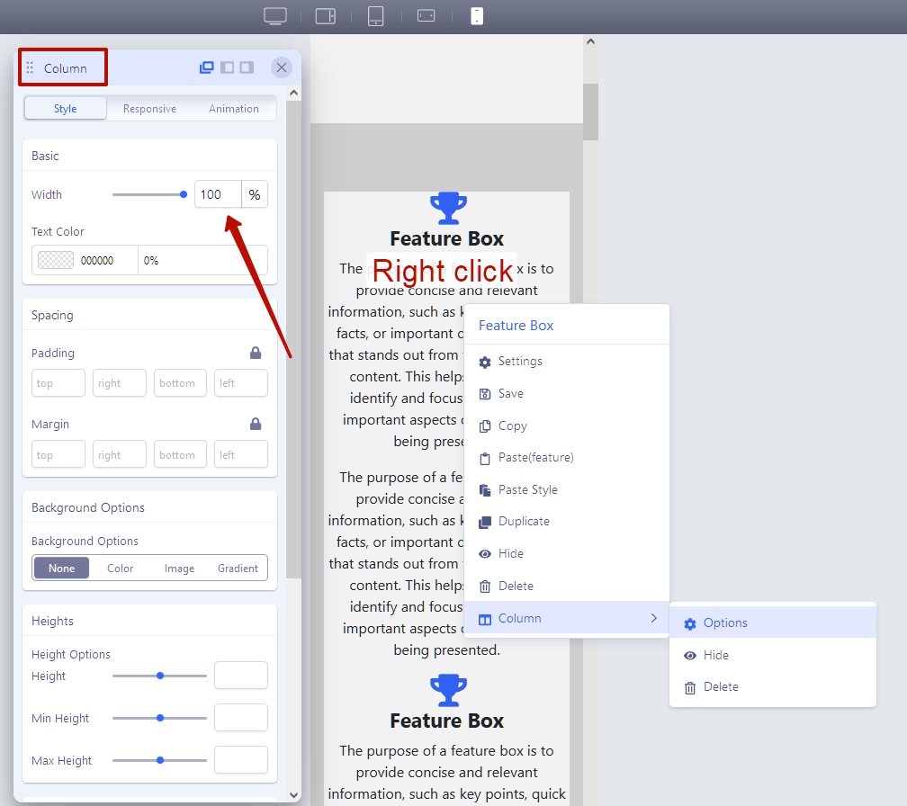
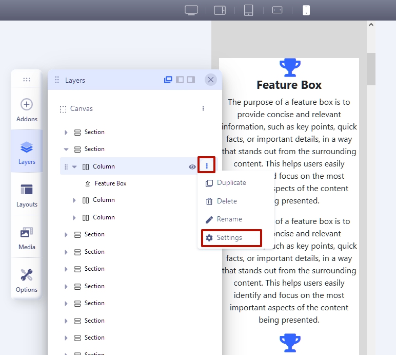
SPPB 3: Right click > Column (hover over) > Options > Responsive tab > Tablet/Phone cols - and multiply all this by the number of columns.
SPPB4/5: Drag slider or click on slider > set value

If the entire layout is based on a flexbox grid, I can understand the changes. If it is just a Bootstrap namespaced grid variant... I can't understand it.
Bootstrap grid = Flexbox grid.
In the context of SPPB4/5 the Bootstrap namespaced grid variants have lost the relevance of use in settings, because instead of static values, you can simply change the width of the column as you like.
But by default it is one col for phone and a selected amount of cols when you setting up a section, from a tablet to a large desktop. In this aspect, nothing has changed, only new breakpoints were added, which was not enough in SPPB 3.
And in Bootstrap 5 there are some changes compared to Bootstrap 4. Which allows to use less code when developing a user interface and more flexibility of UX ideas.
On the example of col-2:
Bootstrap 4
.col-2 {
    flex: 0 0 50%;
    max-width: 50%;
Bootstrap 5
.col-2 {
    flex: 0 0 auto;
width: 50%;pepperstreet
Accepted AnswerThanks for your time and efforts, Pavel.
Less klicks: I know what you mean, and I agree with you that the other responsive options are "burried" in the tabs. From a UI/UX point of view it is definitely improvable. But there are more than the cols options. I guess, users still expect them in that location. I think a pre-made cols setting is still useful and easier for an average user. Especially for an equal spread or equal division. Why not have both. In my tests, the interactive feature can be tricky for mobile view. To get my exact rounded value, I have to click/drag multiple times too, or really slow and carefully. Not really relaxing for the wrist. Seems the value is also an input field... but then I have to release the mouse and start typing each value... In narrow layouts and Mobile view, the right handle is not visible, or draggable anymore. I also wondered how I would "reset" it to the default again. Sure, a total custom column width is possible with the interactive method. But I see me using it rarely. My main use case is always to get rid of the 1-col stacked display. I mostly need a 2-cols display for mobile/tablet porait modes. So, with the interactive mehtod, I have to do this multiple times as well. Because there is no mobile-first inheritance, as far as I can see.
Bootstrap and/or Flexbox I know, that Bootstrap is flexbox based, but I was unsure if Joomshaper has written their own CSS from scratch... Or if they just copied and namespaced the BS5 stuff. If the latter, then I would expect a complete grid css including all the utility classes etc. And I would expect to find everything in the UI and parameters.
(as I mentioned earlier, I simply had no time for a closer look and comparison. I just made some first selfish assumptions. I have to work on a real project first)
Pavel
Accepted AnswerHi @pepperstreet.
I think a pre-made cols setting is still useful and easier for an average user.
I do not argue. Perhaps this is more convenient in some cases. I believe that there should be both types of settings. But, there are no these settings, and we need to get used to the new workflow.
My message was only that the new features are quite good and convenient. But I am not against old features.
Unfortunately, the Joomshaper team cannot quickly respond to all user requests. It took a year in order for the team to return to the "backend".
And this is not criticism. Typically, the development of such a project has a roadmap. This roadmap may not be successful, as it was with SPPB 4. Everyone is mistaken. But development on a roadmap is like a locomotive that is very difficult to stop and rearrange on other rails. Do not expect a scooter's maneuverability from it :).
J
Jesper
Accepted AnswerOk! a lot of discussions about clicks, changes and what so...
I guess one the ideas about having a program like SPPB is to make the development more easy, intuitive, visual and perhaps also a way for us, that are not too deep into the programming and code stuff.
I wrote this question from the right beginning to get help on how to make two columns in mobile version, and as I wrote in the beginning, it was an option you could choose in the previous version (easy and following the concept og selecting, clicking and using menus to get things done).
As I understand it now, its a matter of accepting that the program does not let you choose it anymore or you have to remember how and where to write the/a code.
And to clearify what I mean:
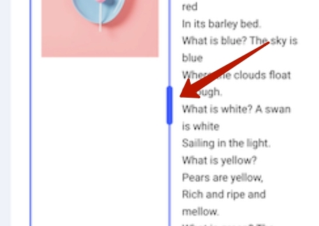
I do understand that in all other views that mobile you can drag the columns width, and that perfectly fine. But my mouse will not catch the dragging bar in mobile version.  So, from all you discussions above, I get that to make two/three... columns in mobile view, I have to code somewhere this:
.col-2 {
flex: 0 0 auto;
width: 50%;
(sppb ver. 5)
    Please correct me if I am wrong.
/Jesperpepperstreet
Accepted AnswerPlease, report the interactive issues in mobile preview mode to the Dev team. Jesper and me experienced the same UI problem. In mobile mode, you can't adjust , nor see the drag n drop UI element. They are cut off and obviously hidden by the screen border.
(sure , there are some workarounds like Pavel mentioned, my personal workaround was too add some padding/margin temporarily. Since the interactive method is THE preferred and suggested method by Joomshaper, it should be fixed. Thanks in advance)


