

How do You Enable The Larger Phone Preview?

Brad Thompson
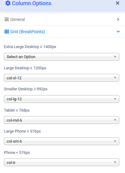
In Helix Ulimate 2.0 there's five device options for the grid.
- Larger Desktop
- Smaller Desktop (Laptop)
- Tablet
- Larger Phone
- Phone
Larger Phone is missing form SP Page builder when switching to preview.
The only options I have are:
- Desktop
- Laptop
- Tablet Landscape
- Tablet Portrait
- Phone Landscape
- Phone Portrait
How do I enable Larger Phone Protrait and Landscape?
The regular Phone preview looks terrible and is not representative of the majority of current devices in use.

Paul Frankowski
Accepted AnswerHi Brad,
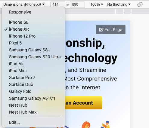
In Helix Ultimate 2.0.13 we used Bootstrap 5 grid
So "Phone Landscape" is sort of "Tablet" view. And here is evidence why I think so
(screenshot from browser Code Inspector - Responsive mode emulator - iPhone horizontal view)
Paul Frankowski
Accepted AnswerThe regular Phone preview looks terrible and is not representative of the majority of current devices in use.
What statistics are you relying on, please give the source. Remember that Mobile World doesn't start and end on one country only. Indeed every each year, people change phones to new model, sometimes "bigger".
If you are thinking that developers of Bootstrap are wrong - write to them directly before they will not finish Bootstrap 6. Really, they respond on e-mails ;) Every voice counts.
Paul Frankowski
Accepted AnswerBut I agree with you on one thing for sure, we have to consider using the same names of "grid/breakpoints" in all our products (Helix & SPPB).
Brad Thompson
Accepted AnswerI highly agree, it probably one of the most important features when designing responsive websites. I can't make proper style changes easily if I can't can see a proper rendering within the right dimensions.
It would be nice to have a down arrow next to the mobile phone preview and have the ability to select from the most popular and current versions, with the option of adding your own, like in dev tools in Chrome.
Brad Thompson
Accepted AnswerHi Paul,
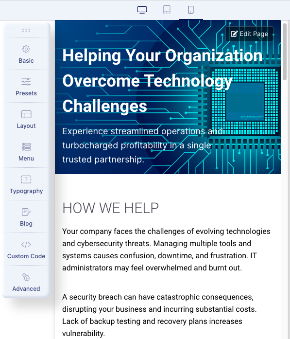
When in the Helix Template Options, the Mobile Previews looks as they look on my phone. ✅
When editing the page in SP Page Builder, the previews are too narrow and improperly rendered. ❌
Helix Settings
SP Page Builder Mobile
Chrome Dev Tools(Renders properly too.)

Regarding the Grid Break Points, do I have to set that for everything section of the layout? Nothing is set currently for any layout position. Is there a site wide setting?
Paul Frankowski
Accepted AnswerOk, thanks, now I see.
Indeed in Helix Ultimate Mobile preview we used width: 480px, which is averaged value.
I will ask for review that topic in SPPB 5.0.
Brad Thompson
Accepted AnswerThat would be great and if you can find out if there's a temporary hack I can enable on SPPB to expand the preview to 480px, would save me a lot of grief until 5.0 rolls out.
Paul Frankowski
Accepted AnswerIn general dealing with mobile devices is madness, so many resolutions, screen sizes ;/
even iPhone produced normal (classic) size, bigger and Max (size).
I guess there is no perfect solution, only compromises
Brad Thompson
Accepted AnswerI just found the KING of Mobile Simuilators in the Chrome Store and it is amazing.
Maybe this is the solution for now.
Brad Thompson
Accepted AnswerPaul,
I figured out how to resize the iframe preview for different devices for SPPB.
/components/com_sppagebuilder/assets/css/editor.css
Change
#sp-pagebuilder-view.builder-iframe-mobile{width:320px!important}To
#sp-pagebuilder-view.builder-iframe-mobile{width:400px!important}Clear the cache, refresh, and now it renders at a proper width that is actually useable and realistic to the layout on modern phones.
Also, I found an even better free tool Responsive Viewer. It allows you to set up as many concurrent device displays for popular models, or even allows to add your own custom size device. Works for phones, tablets and desktop/laptops.
If the dev team could take integrate some of Reponse Viewer functionality into SPPB, that would really enhance and make SPPB even more awesome.
The whole purpose of using SPPB is for saving time and making great web designs. We need to be able to achieve pixel and layout perfection across all these devices. Please ask them to consider this as a top priority.