Hi,
Display article listings in 2 columns on mobile devices Can you provide some help with this?
Thanks!
Hi,
Display article listings in 2 columns on mobile devices Can you provide some help with this?
Thanks!
Hi,
it's possibile probably only via Custom CSS:
@media screen and (max-width: 680px) {
.layout-blog .article-list  .row > .col-lg-3 {width: 50%; }
.burger-icon > span {background-color: #eee;}
Template Options > Custom Code > Custom CSS
After using it
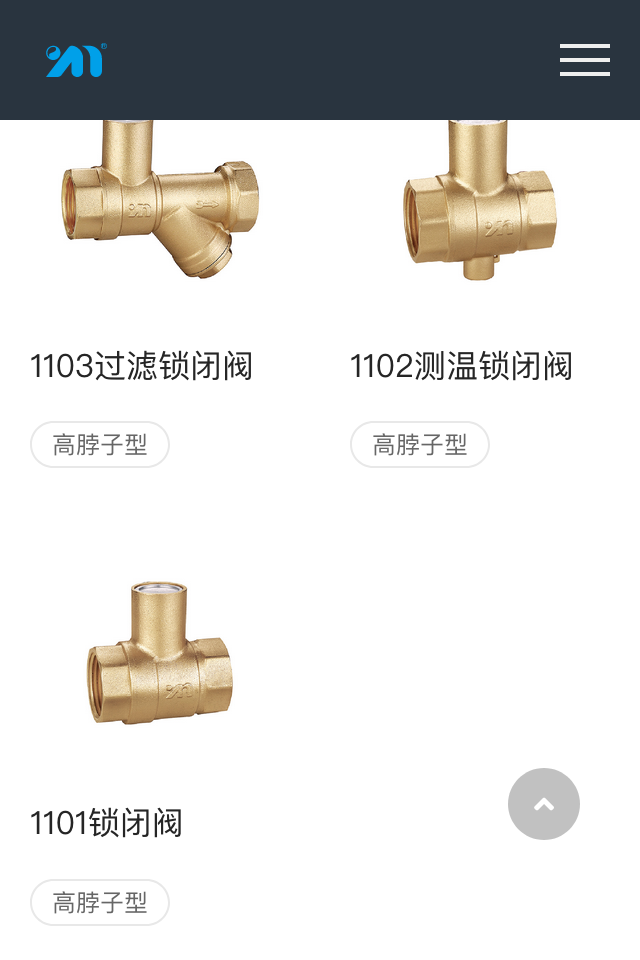
Hi Paul,
Your method works well.
One more question, I would like to hide this module in my mobile view, how do I do that.
Thanks.

