

Articles are Shown Double
Wiebe
Hello,
We use your template Podcast for a client, but something strange happens. When we publish an article, it will be shown twice.
You can have a look here, and then click on the image: https://medic.uwwebontwerp.nl/over-ons/blog
Can you tell me how to get rid of the part at the bottom? I'm already trying to solve this for 4 hours (really, 4 hours!!), getting frustrated.
When I use your Finance template (I installed this to see what happens), it shows only once, so I figure it has something to do with the Podcast template.
Hope you can help, thank you so much.
Kind regards, Wiebe Werkman

Ofi Khan
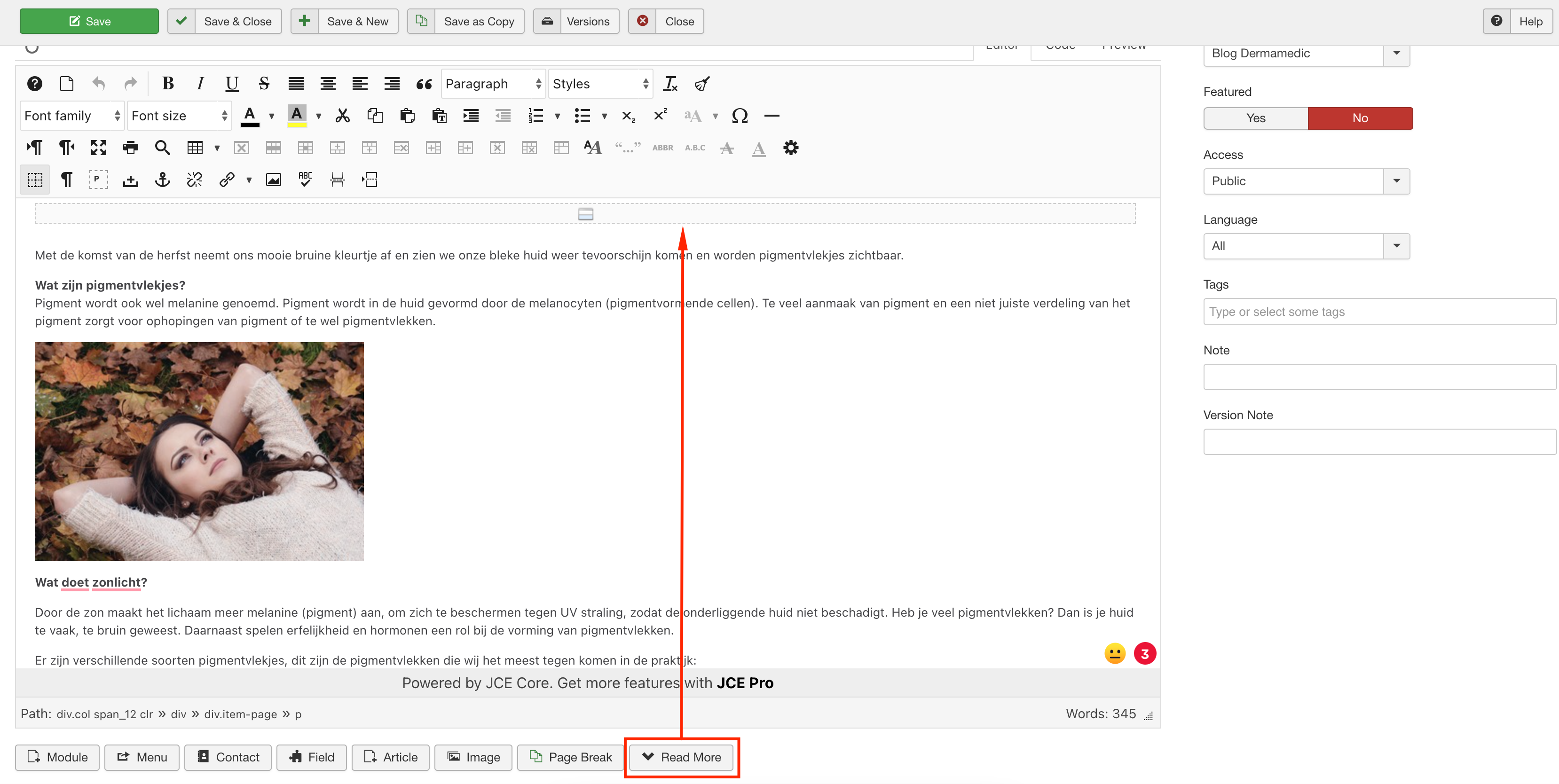
Accepted AnswerYour issue is fixed now. Please check your site. I have added a readmore to the article.
Ofi Khan
Accepted AnswerHello Wiebe
Please share your administrator access here to check the issue. Use the Hidden Content box to share the credentials.
Best regards
Wiebe
Accepted AnswerHello,
The issue is not solved, where is the logo, why are the custom fonts gone, where are the social icons righthand corner?
Can you please change it back, also the blog is not what it was (okay, the double issue is gone, but that was something I could do myself by installing antoher template....). Share on mustn't be published and the 'recommended episodes' ??
Please, can you put the right side back, and fix the blog in THAT template, thank you, I would like to start working on this site now, thank you in advance.
Wiebe
Accepted AnswerThank you, I will make all new blog items with that in mind. Strange that we need to start with a <read more> but if that does the trick, okay by me.
Can you take another look, I noticed the TikTok icon (upper rightside) is missing when I click on 'blog' and/or it's looking different now. Can you look at it and fix that (was an issue, fontawesome wasn't added correctly in this template i heard).
Thanks Ofi, you helped me a lot today!
Kind regards, Wiebe
Wiebe
Accepted AnswerSorry, one more thing. The alignment is not as I would like it, when clicking on a blog item. How can we make this the same size as the other pages, it's now to small, to much white area left and right.
Like to hear from you, we are getting there :).
Wiebe
Accepted AnswerWhen you've got the time, can you take a look at the homepage, reviews. The name is very small, can you tell me (I'd like to learn how to fix this) how I can adjust that font, so those names will be bigger?
Thanks, Wiebe
Ofi Khan
Accepted AnswerWhich one? Please share a screenshot of your issue to understand it better. You can make it larger or smaller with CSS.
Wiebe
Accepted AnswerWiebe
Accepted Answer Ofi Khan
Accepted AnswerI have added Custom CSS for it. You can check on Template Options -> Custom Code -> Custom CSS and change the font-size as your need.
.sppb-testimonial-carousel-name{
    font-size: 28px;
}Wiebe
Accepted AnswerTHANKS This is so much better. Next time I will use your input and try for myself, still learning.
Wiebe
Accepted AnswerI've got another thing on https://medic.uwwebontwerp.nl/.
When you look at https://medic.uwwebontwerp.nl/ and on https://medic.uwwebontwerp.nl/huidprogramma-s - we made a 'parallax' background image, but when viewed on an iPhone, it looks like ...well, not nice.
On a Android (Samsung) it looks okay, how can we make these 2 pages look nice on a iPhone also? You've got the login, it's still active, looking forward to hear from you.
Kind regards, Wiebe
Ofi Khan
Accepted AnswerI have found it good. Tested here: http://www.responsinator.com/?url=https%3A%2F%2Fmedic.uwwebontwerp.nl%2F
Wiebe
Accepted AnswerThanks, I've tested it on an iPhone and it looks like the attachement. Our client has the same, it's not resposive it seems. Can you have another look, because the test on that website is not how it actually is shown on a iPhone.
Ofi Khan
Accepted AnswerIt seems like iOS has an issue with parallax background. Please check this page on iPad or iPhone and let me know the result: https://www.w3schools.com/howto/tryhow_css_parallax_demo.htm
Wiebe
Accepted AnswerShe had a look, with her iPhone 11 Pro, and the results are:
https://prnt.sc/11g3pl9 https://prnt.sc/11g3s5s https://prnt.sc/11g3t5j https://prnt.sc/11g3vfd
They seem good to me, hope you/Joomshaper can solve this problem. It's not our first client with this problem on Apple.
Ofi Khan
Accepted AnswerHere is a CSS fix on our OLD FORUM. Please try this.
Wiebe
Accepted AnswerThanks, we tried the CSS workaround, not gonna work. On that old forum it's also being said that it's not working, so we (I think I can speak for most developers) hope you have a working solution, so the websites we build with SPPB are looking awesome in all devices.
Hopefully you've got the solution, disable the row on mobile is out of the question. That parallax effect looks great on Android and PC, I'm hoping on a solution from the team.
Thank in advance, Wiebe
Ofi Khan
Accepted AnswerIt has been an issue for many. Please try this CSS fix and let me know.
Wiebe
Accepted AnswerWish I had better news; I added the CSS in the custom.css file (didn't work) and also in SPPB on the homepage (custom CSS) on that row, also not working. It really is only on iPhones not working...
https://medic.uwwebontwerp.nl/huidprogramma-s - on my Samsung it looks great, when viewed on an iPhone, you see a huge eye, enormous zoom-in... really a bad thing (from Apple), hence why we are so keen on working with Windows and Android systems.
Got more ideas we hope, you can still log-in on this website if you want.