- TemplatesTemplates
- Page BuilderPage Builder
- OverviewOverview
- FeaturesFeatures
- Dynamic ContentDynamic Content
- Popup BuilderPopup Builder
- InteractionsInteractions
- Layout BundlesLayout Bundles
- Pre-made BlocksPre-made Blocks
- DocumentationDocumentation
- EasyStoreEasyStore
- ResourcesResources
- DocumentationDocumentation
- ForumsForums
- Live ChatLive Chat
- Ask a QuestionAsk a QuestionGet fast & extensive assistance from our expert support engineers. Ask a question on our Forums, and we will get back to you.
- BlogBlog
- PricingPricing
Feature Request: Multiple Mobile Device Previews
Brad Thompson
Hello,
In template options in Helix Ultimate, the mobile preview is wider than the SP Page Builder mobile preview, 465px vs 320px wide. I don't know of any mobile device that is still around the 320px range.
I've been actually going into the code and modifying SP Page Builder to widen the mobile preview to 414px which seems to be a happy medium.
/components/com_sppagebuilder/assets/css/editor.css Find replace 320 to 414
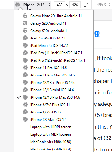
I'm seeing on other no-code editors offering a dropdown of various devices with their respected dimensions so web designers can make sure what they are designing is pixel perfect for each device.
Can the SP Page Builder team take a look at this overlooked highly important feature for possible inclusion and enhancement of SP Page Builder.
It would be nice not to have to use a 3rd party browser extension.
Thanks for the consideration.
3 Answers
Order by
Oldest
Pavel
Accepted AnswerHi.
I don't know of any mobile device that is still around the 320px range.
320px is still a minimum width of which should be focused on. Since starting with 576px to less the layout becomes rubber and you must have a reasonable supply to work with this. Using this width, you will be sure that your site is correctly displayed on all devices, even if their screen is a little wider.
By the way, iPone 5s = 320px. In the world, there are still many users have this device.
In general, it took quite a lot of time (several years) and the requests here on the forum, so that the Joomshaper team finally makes an adequate representation for testing on mobile. And now it is completely adequate and corresponds to the Bootstrap (5) breakpoints. No need to change anything in this. You just need a little more knowledge of CSS layout and Bootstrap breakpoints to understand this correctly.
The breakpoints should be universal, and are not tied to the width of specific devices, which allows you to make sites that work well on all devices with a minimum amount of code.
Paul Frankowski
Accepted AnswerHi Brad,
Indeed, as Pavel said, many people still have 5-8 years old phones (not only in India, leaving aside the obvious fact of how many milions people live there), not all have a new iPhone as you probably have. Trends in screen size are changing (flip screen etc.), but all developers (not only web) have to think about legacy & typical user.
Your browser has Mobile preview mode where you set over 20 different devices to preview site. There are also online browser emulators etc. I think we will add additional options over time, but not in the next few weeks.
Firefox

Brad Thompson
Accepted AnswerHi Paul,
I'm actually on an iPhone 7 Plus, it won't quit and does everything I need. However, I'll be refreshing to the latest shortly.
Yes, I'm aware of the diverse universe of devices out there as well as the developer tools and 3rd party browser extensions, which I use myself. However, it would be more efficient to have it all done at the point of design to stay within the spirit of WYSIWYG.
It also brings up the question, why is the Template Options and Page Builder mobile views different widths?
At the very least, it would be nice to have a system setting to set the mobile width based on the website target demographic. For example North American sites will be wider and more modern, sites focused in regions as you described, a smaller number.
Thanks, Brad

