How to create a gallery with square image thumbnails that are not distorted, whatever the aspect ratio of the image - Forum | JoomShaper
Awaiting an answer SP Page Builder

How to create a gallery with square image thumbnails that are not distorted, whatever the aspect ratio of the image

Asked by takis 2 years ago Last activity 2 years ago

Hello, I tried implementing the solution provided by Nia, and I manage to create the grid I wanted by adding the following in my custom css field in helix template
img { width: auto; height: auto; object-fit: cover; }

But now there seems to be a problem in my logo used in 2 different positions, one in header and one in footer.
Both positions use the same file in .svg format.
The problem is that the logo when you change sceen size it gets cropped until the screen size is fitted to a smaller dimension (smaller breakpoint?) so that the logo can change accordingly to smaller. So I want the logo to get smaller without getting cropped

Joomla 4.40
Sp page Builder 5
Helix ultimate 2.0.17

7 replies

Mehtaz Afsana Borsha Staff

Hi

Thanks for contacting us and sorry for your issue. Could you please give me your site URL and also screenshot of that portion which you want to change.

-Regards.

Mehtaz Afsana Borsha Staff

Could you please explain your issue a bit more? Do you want to change the logo height or what?

takis Asked this
  1. I wanted to create a grid gallery to some of my articles with sp page builder with all the images cropped in the same width and height despite their original aspect ratio and size, so I inserted the abovementioned code in my helix template > custom css.
  2. When I did that, my logo changed and behaved as the screenshots I shared in my previous post.
  3. Since then it seems that I manage to fix it by adding custom css to both logo positions.
  4. So now it seems correct but I don't know if this is the proper solution or if it could be a better one?

Any suggestion welcomed.

Pavel
2 years ago · edited

So now it seems correct but I don't know if this is the proper solution or if it could be a better one?

Hi @takis.

This decision is not correct.

.logo-image {
    max-width: none;
}

And this is also not correct img { width: auto; height: auto; object-fit: cover; }.

Using img as a selector, you apply this code to all images on the site. Because of this, the problem with the logo arose.

Remove all this.

Correct solution:

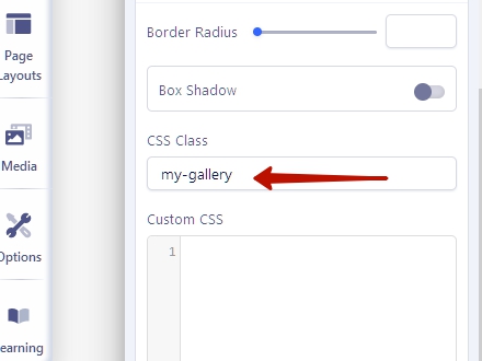
Add your own class to the Gallery Addon settings (Style Tab > scroll down > CSS Class field).

And use it for accurate aiming to the elements you need.

For example, if you add this class name my-gallery, then the code will be like that.

.my-gallery .sppb-img-responsive {
    object-fit: cover;
}

And that's all that is required. No need width: auto; height: auto;, moreover, auto values do not work with object-fit: cover; . So, this is just an useless trash. You set up image width and height in the Addon settings.

Then you can simply add this class to other galleries. Write the code is not required again.

takis Asked this

Hey Pavel,

Thanks a ton for your input – super helpful! The thing is, I'm aiming for a solution that's like a one-size-fits-all for every gallery, present or future. Your idea is spot-on for existing ones, but I'm wondering if there's a gallery selector I can put onto the template CSS. That way, it will be doable for every gallery, old or new.

Would love to hear your thoughts on this!

Cheers!

Pavel
2 years ago · edited

Hi. Yes, here is .sppb-addon-gallery .sppb-img-responsive {...}

Tip. Browser Dev Tools help you to find or to bild any selector you need

Log in to reply.