- TemplatesTemplates
- Page BuilderPage Builder
- OverviewOverview
- FeaturesFeatures
- Dynamic ContentDynamic Content
- Popup BuilderPopup Builder
- InteractionsInteractions
- Layout BundlesLayout Bundles
- Pre-made BlocksPre-made Blocks
- DocumentationDocumentation
- EasyStoreEasyStore
- ResourcesResources
- DocumentationDocumentation
- ForumsForums
- Live ChatLive Chat
- Ask a QuestionAsk a QuestionGet fast & extensive assistance from our expert support engineers. Ask a question on our Forums, and we will get back to you.
- BlogBlog
- PricingPricing
Structure Of The ComponentArea Of Shaper_helixultimate Template
IK
Iris Kleber
Hello, my website is based on template shaper_helixultimate 2.0.18, the joomlaversion 4.4.1. I have a question about the articles which are displayed in ComponentArea defined in the Layout-settings.
I like to have the width of these ComponentArea divided into 3 pieces (left - middle - right). left and right should bee placeholders and in the middle the content of articles should be displayed. left and right should gave 25% of the width each, and middle should have 50%.
So my questions is: How can i manage to configure how many % of the width is used to display the content of the article in the ComponentArea?
The URL of an example of my website is https://iriskleber.de/index.php/ueber-iris/ueber-mich-und-meine-pferde Thanks Ralf
2 Answers
Order by
Oldest
Paul Frankowski
Accepted AnswerHi Iris,
Helix Ultimate is based on Bootstrap 5 and 12 column grid, and also that is used in Layout.
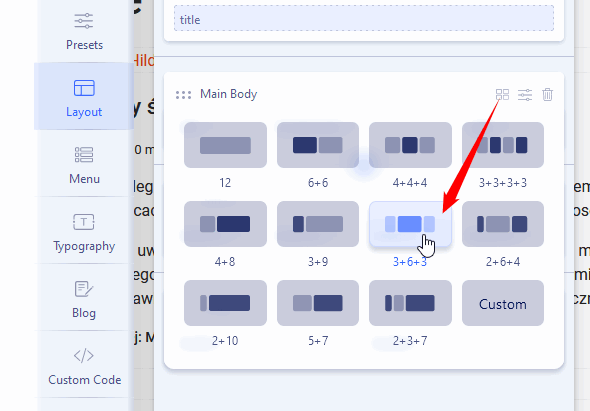
It means to get 25+50+25 you have to Template Options > Layout > Main Body > Colum Grid > and choose
3+6+3 more you can read in BT documenation (getbootstrap.com).

Paul Frankowski
Accepted AnswerHow can i manage to configure how many % of the width is used to display the content of the article in the ComponentArea
by default we allowed users to choose predefined grid or use custom grid (screenshot above). The whole rest, if webmaster need - have to customize on its own, using Custom CSS to override default bootstrap 5 grid rules or add its own CSS style.
As You know We do not teach here CSS, but to have a single article in the middle with 50% of width, without using modules. You may use, for example,
@media and (min-width: 780px) {
.view-article .article-details  {
  max-width: 50%; margin: 0 auto;}
    }
it will work for desktop view and tablet.

