

Responsive Full Width Image
MM
marley man
Hi, I want to put a top header image on each of the pages on my Joomla Site. I want the image to be responsive and full width no matter what size screen of the device users are using to view this website.
I tried adding a new row with a background image but that is not responsive. (Link in the Hidden Content Section below)
Please let me know how I can accomplish this. Thank you!
6 Answers
Order by
Oldest

Rashida Rahman
Accepted AnswerHi there!
Thanks for reaching out to us.
The background image will adjust relating to the device screen. It will crop automatically in proportion to the screen size. But you are the one in control, you can tell SP Page Builder that you are okay to lose the Top/Left/Right/Bottom part of the image. You can set this setting from "Background Position".
The background image depends on the size of the block that contains it. There are no options in the aspect of responsiveness for the background image. You can only regulate this with the size of the block or replacing the background image at the breakpoints.
You can try duplicating the row either.
The best option is the use of CSS to replace the background image of the section at the breakpoints, instead of creating the section's duplicate containing another background image.
Best Regards
EB
Eliana Braidot
Accepted AnswerI have the same problem, to solve it I have to use a third party component. I don't like weighing down the website with another component but unfortunately even if it has many options it lacks the one that is used most on a website

Pavel
Accepted AnswerHi. A little CSS knowledge will help you avoid installing as many as third -party components for such a simple task. Each web master should possess this knowledge, regardless of whether it uses a visual interface or writes the code manually. CSS knowledge will help to better understand the visual interface to correctly configure it.
Pavel
Accepted AnswerHere is an example of how to do it.
Add the background image to the section.
Add your class to the section settings:
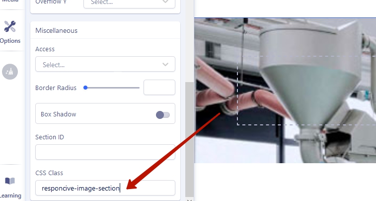
In any convenient way, determine the resolution of your background image:
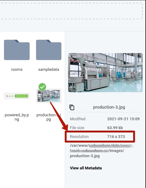
Write CSS for your section using the values of the image resolution:
.responcive-image-section {
aspect-ratio: 716 / 373;
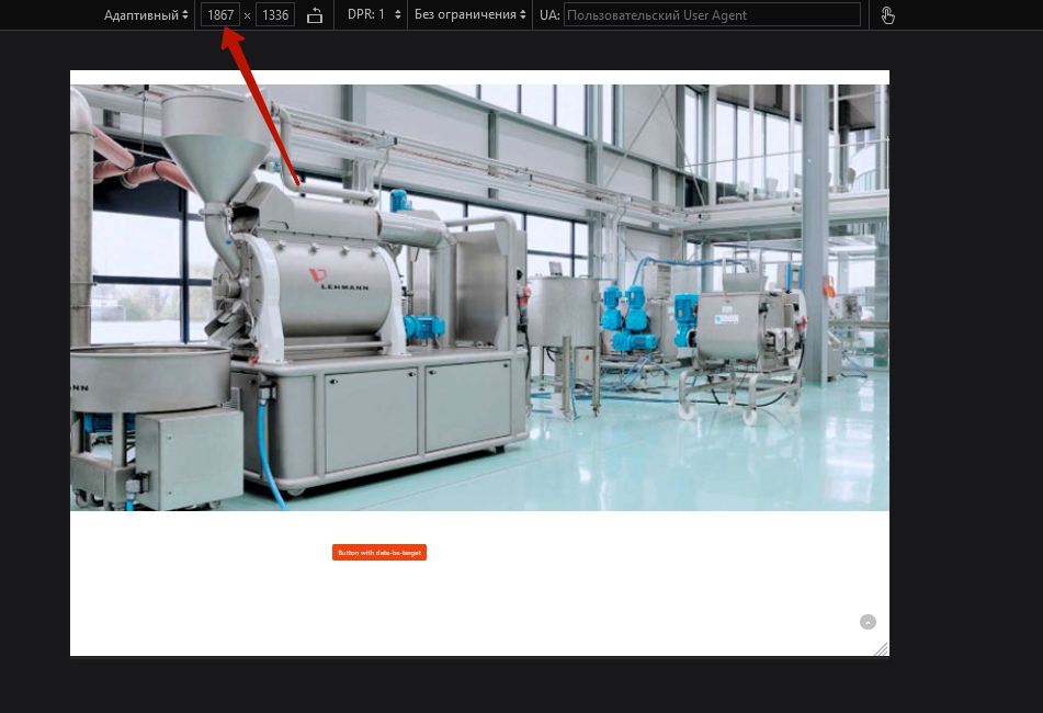
}Result

Pavel
Accepted AnswerAnother way (if you need to use image's alt="" for SEO).
Switch the section to Fluid Row, delete all paddings.
Add Image Addon to the section.
Add the class to the section, the same as in the previous method.
Write CSS for your Image Addon using the section class:
.responcive-image-section :is(.sppb-addon-single-image-container, img) {
    width: 100% !important;
}
Result the same, but now you can use the alt attribute in the Image Addon's settings.