

Footer Not Shown At 100% At Mobile Device
OHL
I'm building a new website. I'm now in the process of setting everyrhing right for mobile devices (mobile portrait to start with). In the desktop version I have a footer, it is made as a site module using the SP Page Builder module. I have a Page Builder page with 4 columns. Works great at desktop. When looking at mobile it's not good. So I duplicated the section. So now I have a section 'Footer desktop' and a section 'Footer mobile + tablet'. That way I can make changes in a safe way and remove things I do'nt need (I know it could be done in the same section, but I don't want to make mistakes, this feels more safe).
In mobile portrait mode the 4 colums are set below each other which is good. But it does not use 100% of the width available. I tried everything but I cannot find out why it is not 100% width standard. What do I need to do to change that? You can have a look at miracle-test.nl, for example the homepage.
I changed the background of the mobile section to an (ugly) green to make very clear the width is not 100%.

Paul Frankowski
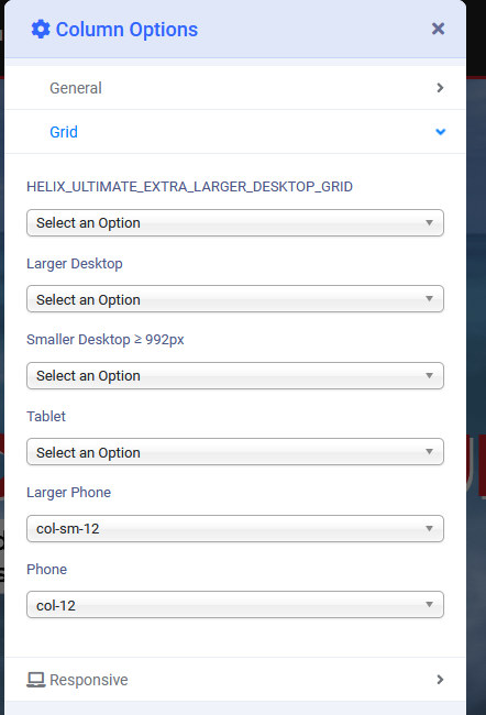
Accepted AnswerIn Fixter Template Options > Layout > Footer > Columns Options > Grid > Mobile - you had col-8 - should be col-12
yes, I set 12.
Paul Frankowski
Accepted AnswerHoi Stephan,
you made small mistake in Columns settings, easy to correct.