

Shaper State & SP Property
ClinicaMicro
Good Morning. I am trying to make that on large screens (laptops, desktops ...) the width of the carousel within the property does not occupy 100% of the width of the screen. Inside the template, in the Layout Builder, Main Body - Component in the Grid option, I have got inside Larger Desktop, put col-xl-9 and it occupies the space that I like, but it comes out adjusted to the left. I have also tried to make that part (the Main Body) that is not Fluid Width, but I do not see any change on the web or even deleting the cookies. can you help me? I only want the slider to occupy 70% of the screen and not the entire width, because otherwise the photographs on large screens occupy the entire screen and it seems that there is nothing else. I attached a link to youtube so you can see what I'm talking about.

Ariba
Accepted AnswerHello
@media screen and (min-width: 1025px) {
  .owl-carousel {
    width: 75%;
    margin: 0px auto;
  }
}
I have placed the code for the Desktop, it will now stay reduced on desktop only and for tablet and mobile it will remain as before.
Ariba
Accepted AnswerHello
It will be kind if you can share a screenshot displaying your problem highlighting the issue.
Please share your administrator access here so that I can check the issue. Use the Hidden Content box to share the credentials.
Thank you
ClinicaMicro
Accepted Answerhello, in the video that I have hidden, you can see that problem.
When the property is opened, the slider occupies 100% of the width of the screen, and the height makes it impossible to see anything below, so the visitor does not scroll and information is lost. If this slider were narrower, the height would also go in proportion and the text below would be visible, something similar to what happens on an ipad ...
https://ibb.co/XVNwjHQ
Ariba
Accepted Answer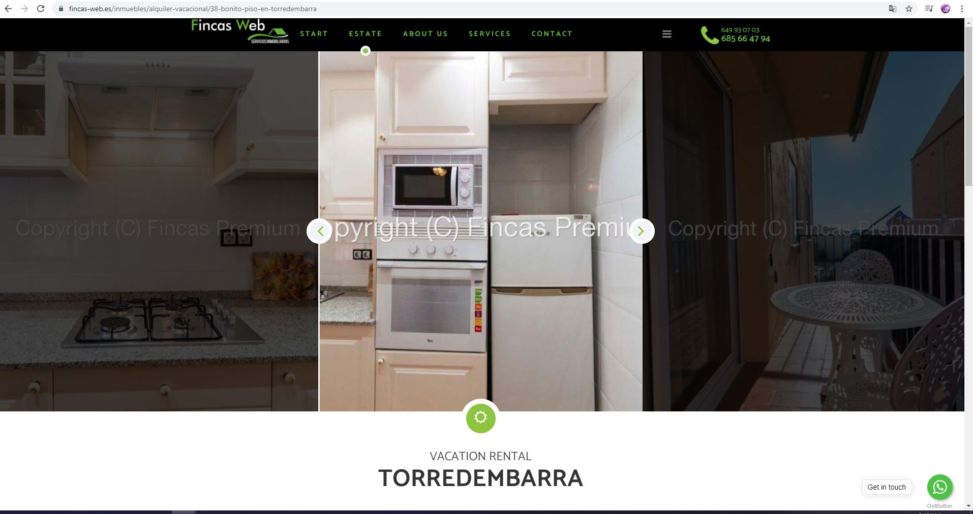
Hello
Could you kindly let me know if you changed any format of slider? Because the screenshot & video that you provided do not match with what i can see from my end. Kindly check my screenshot attached. I can see the format of the slider like this now.
ClinicaMicro
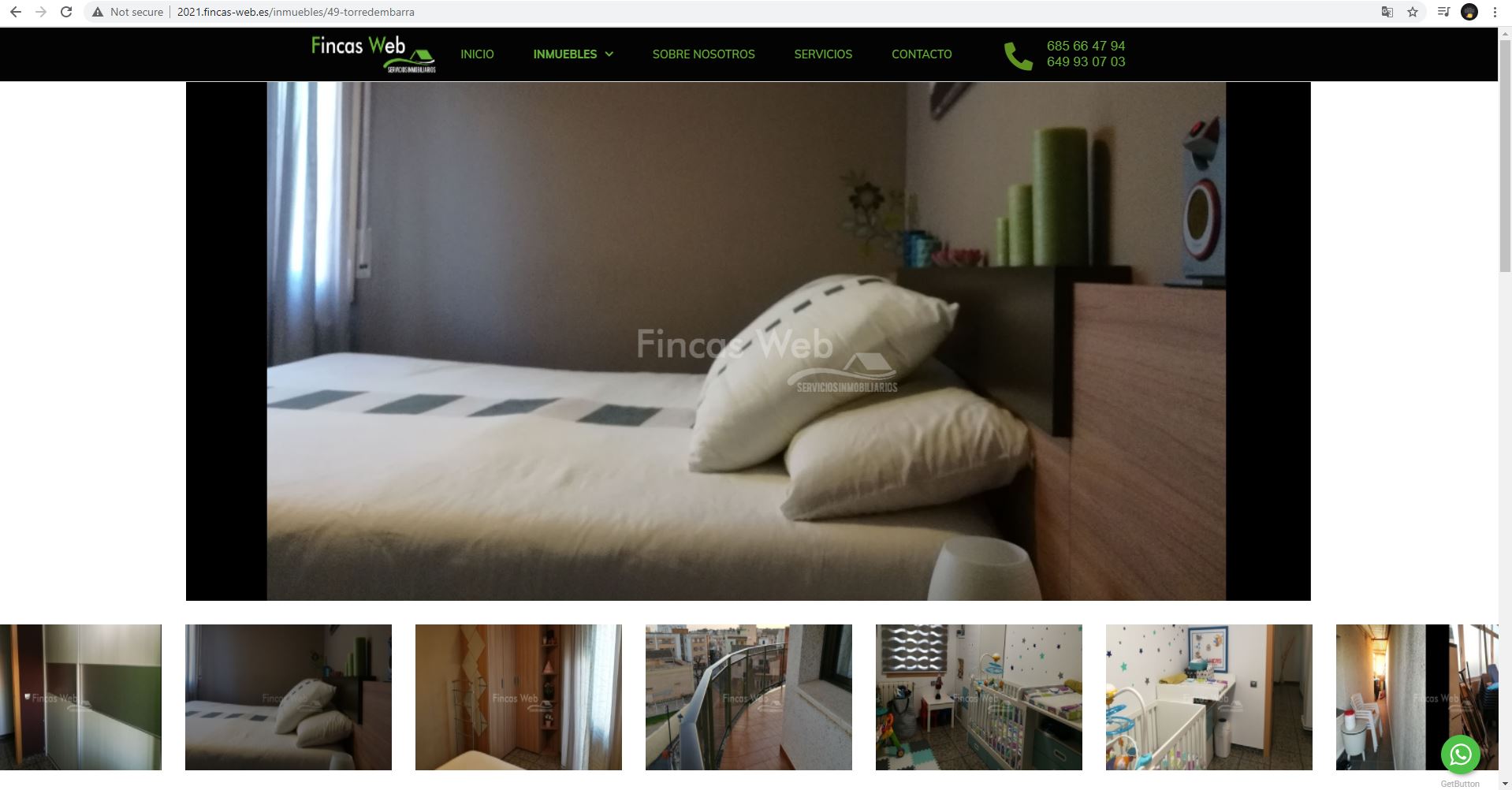
Accepted AnswerSorry, you are entering the active page. We are making the changes with the subdomain 2021.fincas-web.es. We were unable to change the size of this one, and trying with the other template the client liked it better.
Ariba
Accepted AnswerHello
Sincere apologies for the delay. Thank you for your patience, i appreciate it.
Could you kindly check the screenshot below and confirm if this is how you want it? If yes, then you can add this code below to Custom CSS.
.owl-carousel { width: 75%; margin: 0px auto; }
Please do let me know if you want it other way.
ClinicaMicro
Accepted AnswerPerfect on desktop, but now on tablet and mobile it is also reduced ... can it be reduced only on desktop?
Ariba
Accepted AnswerYes it can be reduced only on Desktop. Kindly allow me some time, i will look into it send you the solution soon.
Thank you