

Structure Page
G
gidipi
Good morning, when I configure the page for PCs and smartphones, it displays differently by type, can you help me understand why? Available for examples. Thanks a lot
2 Answers
Order by
Oldest

Mehtaz Afsana Borsha
Accepted AnswerHi
Thanks for contacting us and sorry for your issue. Could you please give me a screenshot of your issue?
-Regards.

Paul Frankowski
Accepted AnswerHI,
to displays differently by type
??? Not fully underdstand that phrase for responsive view.
Using current settings you can, for example:
- Hide/Show selected addon according to screensize (Desktop, Tablet, Mobile) - check addon settings > Advanced > Responsive
- Hide/Show selected Sections according to screensize (Desktop, Tablet, Mobile) - settings "Responive" tab
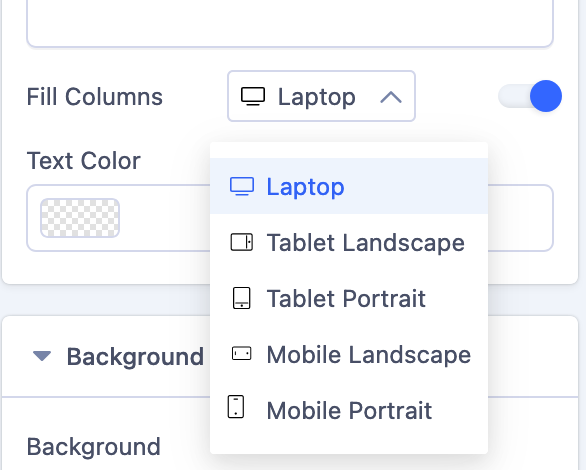
- In back-end editor in Section and Addon settings every time when you will see [Laptop] option click on it, to see others view that allows you to change settings according to it.
- Using Front-end editor you can switch Desktop, Tablet, Mobile using icons at the top. Then change columns grid.