Hamburger Menu Dropping Down A Position On Tablets And Mobile
MH
Matt Hunt
Hi, I've a situation where I've got the logo on the menu bar, with a layout of 2+10. It looks fine on a desktop but for mobile and tablets, it forces the menu (hamburger) to display below that menu bar even though there seems to be a ton of space available for it.
Please advise how I can get that to display where it should.
3 Answers
Order by
Oldest

Paul Frankowski
Accepted AnswerHi Matt,
is that a Custom Header (set by you, or premade) ??
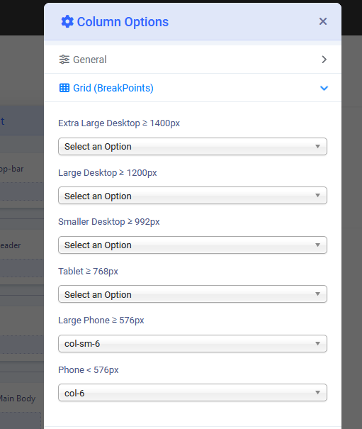
if 1st answer, set Grid for Phone view col-sm-6 / col-6 for each column (Logo and Menu).