

Investa Pagination

Serigne Fallou
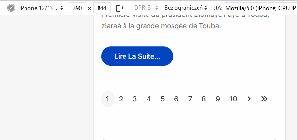
hello pagination issue as showen in the scrren in mobile and in deskyop https://share.icloud.com/photos/01dYT5WD6AVMAuAkh0yciklog
5 Answers
Order by
Oldest

Paul Frankowski
Accepted AnswerAnd additional CSS fix for Tablets (iPads) and Smartphones :
@media screen and (max-width: 990px) {
.pagination .page-item .page-link { padding: 10px; font-size: 16px; line-height: 18px;}
}

@media screen and (max-width: 680px) {
ul.pagination > li.disabled {display: none;}
.pagination .page-item .page-link {opacity: 0.9; padding: 8px !important;  font-size: 14px; line-height: 15px;}
.pagination-wrapper {margin-top: 10px; margin-left: -10px;}
}
Please use CSS from both responses to improve navigation lenght.
How it will look after. Yes, I hidden not active arrrow to reduce space in first list only. But they will appear on (2) (3) etc.
Paul Frankowski
Accepted AnswerHi Serigne
On typical Desktop computer it's looks totally OK, I checked.
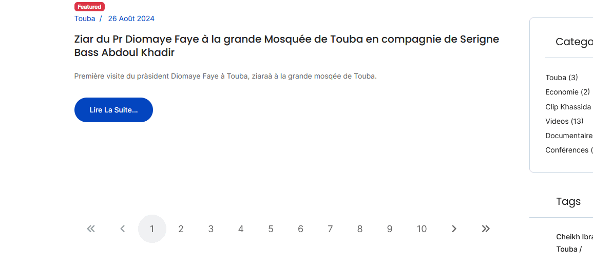
But indeed on smaller resolution it may be cut off...