

Padding Pagebuilder Article
G
gralfitox
13 Answers
Order by
Oldest

Paul Frankowski
Accepted AnswerFirst CSS will fix global padding, use it.
Your idea is too risky. I don't recommend it. It can make only global mess! Of course, it's your site, not mine.
Read Helix Ultimate guide "Custom Code > Custom CSS"
Paul Frankowski
Accepted AnswerHi,
so probably two lines of extra Custom CSS is needed to reduce that padding.
As Webmaster make quick investigation using browser tool >> https://www.joomshaper.com/blog/which-line-of-css-i-have-to-edit-code-inspector-in-action
OR
Share link (URL) to that subpage.
Q: Is that a "classic" Article view or Page view or Article with SPPB mode view ?
G
gralfitox
Accepted Answertake a look, I have cloned a newskit template to have fullwidth for a specific section, that shows onnly pagebuilder articles. (see this topic https://www.joomshaper.com/forum/question/30266)
link in hidden content
Paul Frankowski
Accepted AnswerFor Mobile View use that Custom CSS (becuase default global template padding is too big as you noticed)
@media screen and (max-width: 740px) {
.blog-details-content .blog-content-wrap {padding: 0 10px 10px;}
}
About padding in Sections (SPPB), remember that they have SEPARATE settings for Mobile view. So if on Desktop view you used 75px or 100px by default it will be used everywhere also on Tablet & Mobile view - and you don't need that.
I talk about (that mistake that you already made)

Edit that article in back-end editor maybe it will be easier to correct padding in Section. And reload Cached css files to see changes. If you've done the same mistake in more articles, you have to edit all of them. One by one, and Save changes. This is the only way to correct space in some areas.
So you have to switch to Mobile and put smaller value in Section, for example, use 10px or 5px for padding (space).

G
gralfitox
Accepted Answerno way to customize a css file and avoid doing it for every article? and what file will it be?
G
gralfitox
Accepted Answereven though my custom css shows this
i am getting this
cant understand links in hidden cointent
Paul Frankowski
Accepted Answeruse #sp-main-body BEFORE .container word
@media screen and (min-width: 1400px) {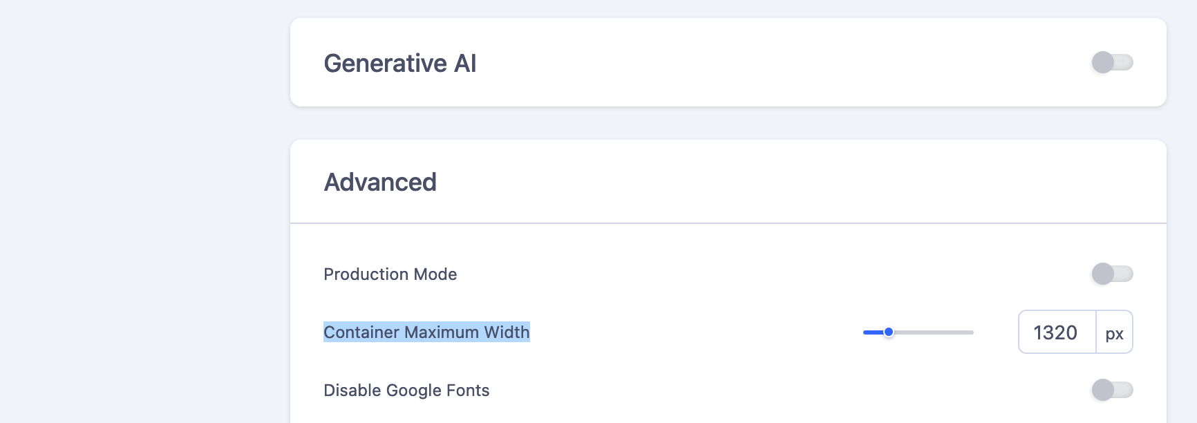
#sp-main-body .container { Paul Frankowski
Accepted AnswerBesides in SPPB Settings in Advanced > Container Maximum Width (increase value here!)
G
gralfitox
Accepted AnswerI´ll try and wait for the cache to refresh, thank you.
worked, thanks very much