Hi,
on the site https://www.tuttoperleaziende.it/ted/ I use the Manufacturer template.
I'd like to increase the font-size for mobile devices.
Which css can I use?
Thanks
Pio
Hi,
on the site https://www.tuttoperleaziende.it/ted/ I use the Manufacturer template.
I'd like to increase the font-size for mobile devices.
Which css can I use?
Thanks
Pio
Hi
Thanks for contacting us. Could you please give me a screenshot of your issue? Which portion do you want to increase actually?
-Regards.
Hi,
I need to increase the text of all sections of the home page and all internal pages, except the titles.
Thanks
Pio
Hi Pio.
In general you should do that from Text addon settings, there is possibility to set different font-size for Desktop, Tablet and Mobile devices. Then you have full control.
The lazy solution will be to force font-size using Custom CSS as you wanted:
@media screen and (max-width: 580px) {
 .sppb-addon-text-block .sppb-addon-content,
  .sppb-addon-text-block .sppb-addon-content p { font-size: 15px !important; }
}Hi Paul,
I tried the css but it doesn't work.
Best Regards
Pio
It works, and here is evidence || iPhone Emulator
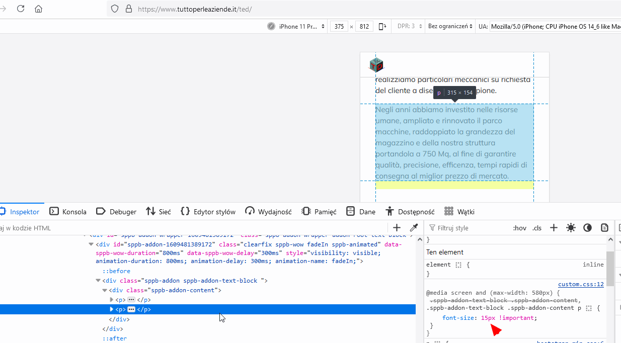
ALWAYS check on two browsers to be sure. I share CSS that I tested.
And obviously knowledge of CSS is essential to understand how it works.
Hi
Is this solved now?