

Changing The Settings In The Logo Position
M
Michał
Hello, I have a question about how to customize the hellix ultimate template (change something in the custom.css code) so that the logo field above the menu bar is divided into two parts (but only in the Desktop version). I want the logo field to display two different logos and be clickable and each one to lead to a different page.
Now I have it on the page as it should look but after clicking it of course directs to the home page. Maybe it is possible to divide this position so that e.g. the left half is the home page and the right half another link.
Regards Michal
Website
https://mck.skarzysko.pl
24 Answers
Order by
Oldest

Pavel
Accepted AnswerHere is:
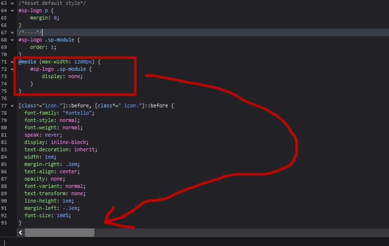
/*Reset default style*/
#sp-logo p {
margin: 0;
}
/*----*/
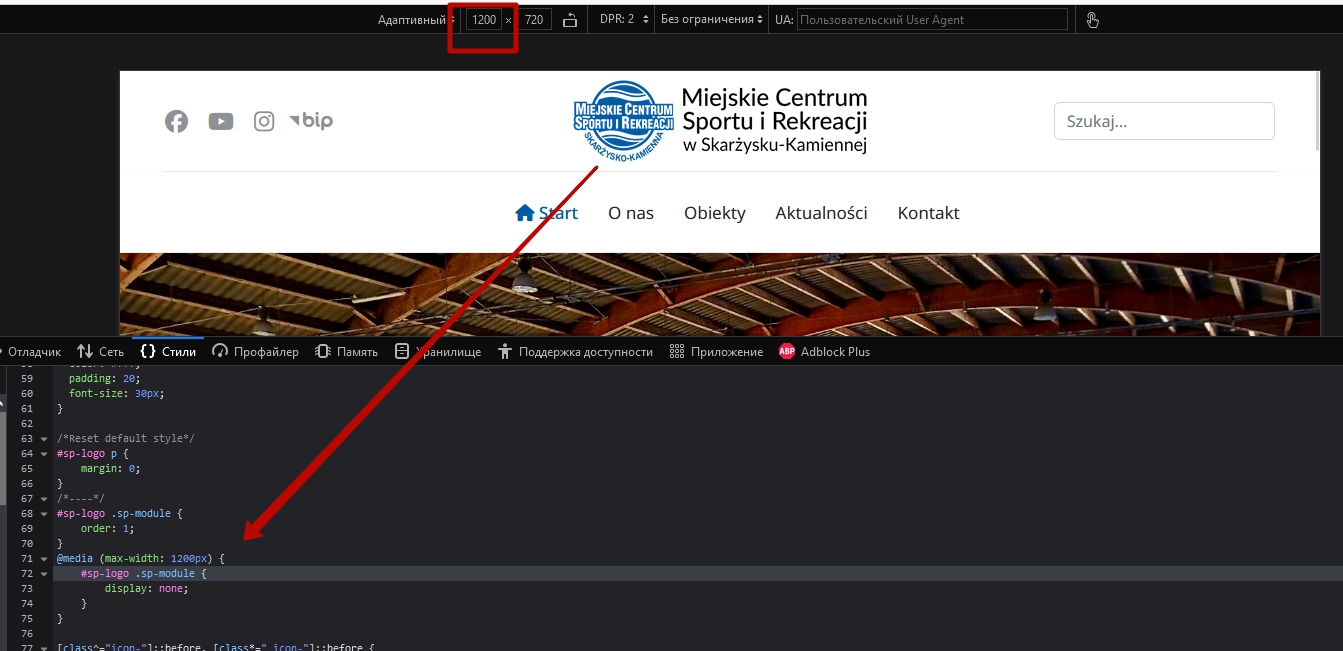
#sp-logo .sp-module {
order: 1;
}
@media (max-width: 991.98px) {
#sp-logo .sp-module {
display: none;
}
}/Reset default style/
Or make sure that the p tag is not added there. The p tag located there in any case is bad for SEO
M
Michał
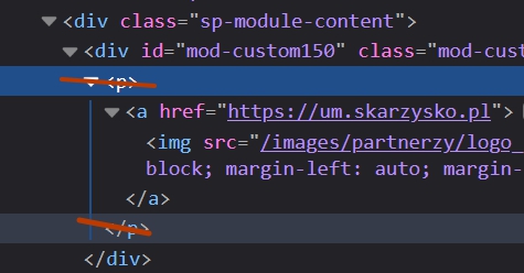
Accepted AnswerOK it works fine but I see that <p> tags have been added. What can I do to get rid of them?
Pavel
Accepted AnswerSwitch to the code mode in your text editor and delete p tags. Also, you can configure your editor so that it does not add p tags by default.

Atick Eashrak Shuvo
Accepted AnswerHello Michał,
Thank you for reaching out. By default, what you are requesting is not possible as there are no related settings available for this functionality. To achieve your desired result, you would need to design a custom header, which can be a bit complex. If you are not familiar with coding, I recommend seeking assistance from an expert.
I am attaching the documentation for customizing headers to help guide you further.
www.joomshaper.com/documentation/helix-framework/custom-header
Pavel
Accepted AnswerHi Michał.
No need custom Header. Use Joomla's Custom module with image and link in logo position. And of course you will need custom CSS codding.
But you must understand that such a division violates user experience and will mislead your users
M
Michał
Accepted AnswerDo you have any idea what css code I could use to do this? I have the module made because I have already tried different options.
PS. I know it can be confusing for users, two logos and two different links, but that's how the site owners want it.
Pavel
Accepted AnswerDo you have any idea what css code I could use to do this?
I can help you with this only if you provide a public link to your site. I am not an employee of support, so I can’t see hidden content. Administrator access is not required.
M
Michał
Accepted AnswerThis is a public link: https://mcsir.mck.skarzysko.pl/
Pavel
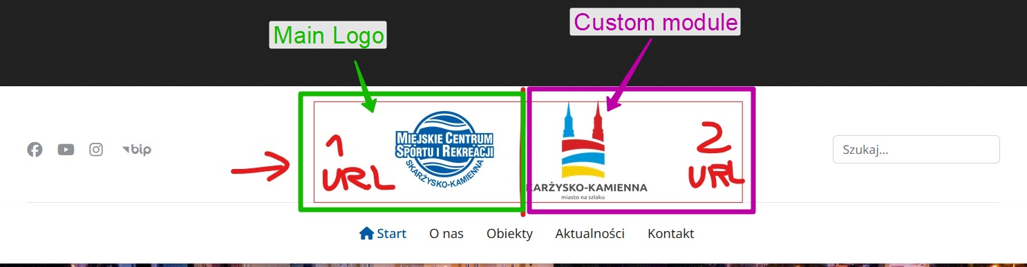
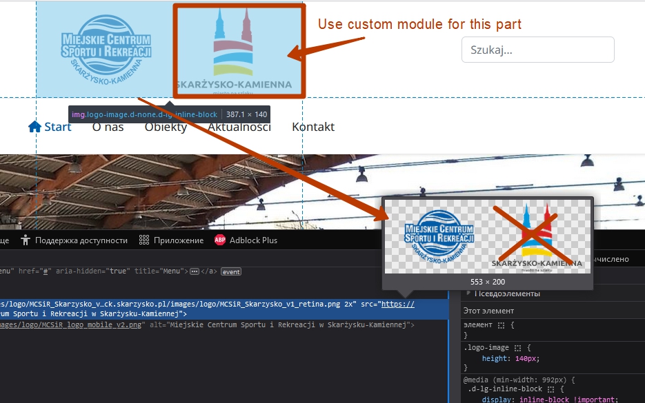
Accepted AnswerAbove you wrote that you made a module. But I do not see this. Divide the existing image by two. Publish the first in the options of the template as a logo, add the second to the module and publish this module in the Logo position. Only after that I can help you with CSS.
M
Michał
Accepted AnswerPavel I still have a small problem with the logo when changing the window size. It doesn't jump to the mobile logo immediately, but... see for yourself in the video. Do you have an idea what can be improved?
https://www.mck.skarzysko.pl/images/joomshaper_forum/logo.mp4
Pavel
Accepted Answersee for yourself in the video
Where is the video? I can’t see hidden content if it there.
Do you mean this?
If so, then here are the standard breakpoints that should be used in most cases.
/*Breakpoints*/
/* Desktop First */
@media (max-width: 1399.98px) {}
@media (max-width: 1199.98px) {}
@media (max-width: 991.98px) {}
@media (max-width: 767.98px) {}
@media (max-width: 575.98px) {}
/* Mobile First */
@media (min-width: 576px) {}
@media (min-width: 768px) {}
@media (min-width: 992px) {}
@media (min-width: 1200px) {}
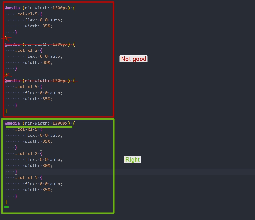
@media (min-width: 1400px) {}They must be located in this order at the very bottom of the document. There should be no other code below.
If there are several CSS rules for one breakpoint, you should not write them separately. Everything should be inside one media query
M
Michał
Accepted AnswerHi Pavel I forgot that you can't see hidden content
https://www.mck.skarzysko.pl/images/joomshaper_forum/logo.mp4
Pavel
Accepted AnswerHelix settings are designed to use SVG logo. If you use any other format, then they should be redefined through CSS.
Add this code to the desired breakpoint
.logo-image {
    height: auto !important;
    max-width: 115px;  /*for example*/
}
M
Michał
Accepted AnswerYes this method works I've tried it but then it also changes the size of the logo on full screen.
Maybe that's the only compromise.
Thanks Pavel
M
Michał
Accepted AnswerOK I think it will be ok now. There is a compromise, smaller logo and increased header to 90px and now it works.
@media (max-width: 1199.98px) {
    .logo-image {
        height: auto !important;
        max-width: 130px;
    }
}
M
Michał
Accepted AnswerPavel, I have one more question about another page and problem, maybe you can advise me something. On this page I use the Unite Slider component and it is very good for this page (I did not find a similar one that gives so many editing possibilities) unfortunately after updating Joomla from version 5.1.4 to version 5.2.0 there was a problem with adding photos to the slider (see the video).
Working Slider: https://www.mck.skarzysko.pl/images/joomshaper_forum/slider_work.mp4 Non-working Slider: https://www.mck.skarzysko.pl/images/joomshaper_forum/slider_dont_work.mp4
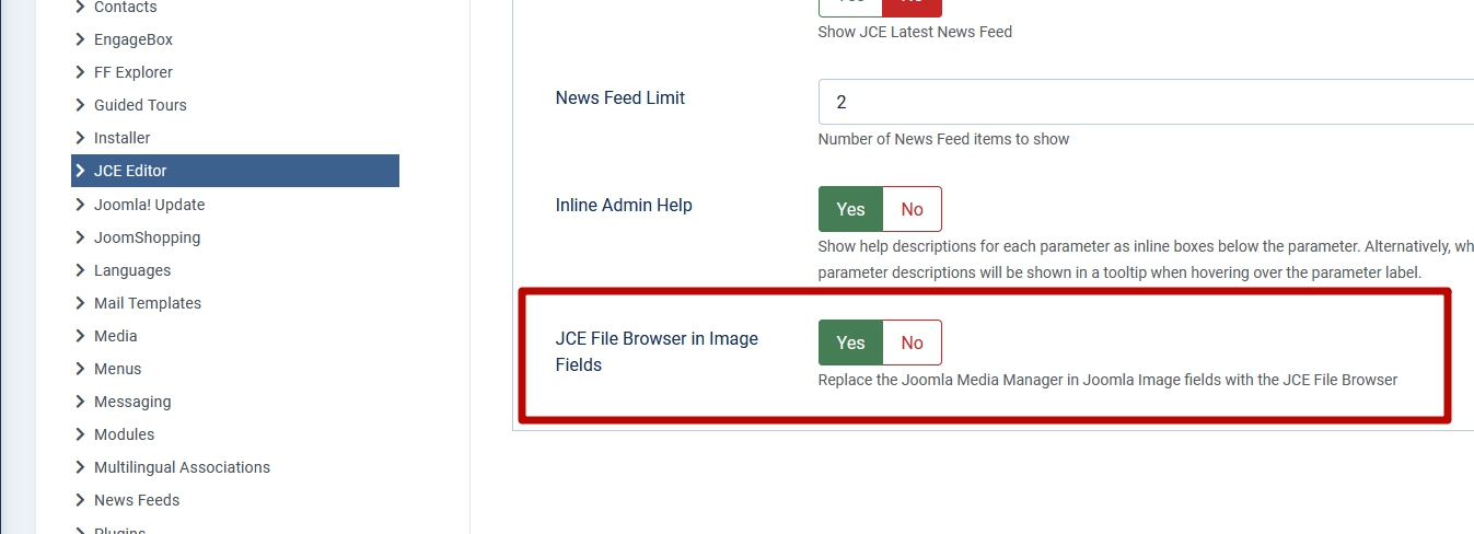
I wrote to the creators of this slider that there is such a problem but they replied that they are no longer dealing with it and more precisely they are focusing on Wordpress. My question is do you know any way to change the default Joomla media manager to another one? Because this Slider uses the Joomla media manager. I also use JCE Editor, which has its own manager but I do not know how to set it as default.
Regards,
Pavel
Accepted AnswerHi.
The only setup that is in JCE.
If this does not help, I'm afraid you need to edit Unite Slider backend PHP code. Since the call of a certain file manager is located there. Success is not guaranteed. Perhaps the best solution is to use another slider