How do I Change My Article To Full Layout?
S
Son
How do I change my article to full layout? https://daunhothanoi.com/kien-thuc-chung/thong-tin-chung/tong-quan-ve-tap-doan-gs-caltex
Website
https://daunhothanoi.com
20 Answers
Order by
Oldest

Pavel
Accepted AnswerHi.
What do you mean by the full layout of the article? Now you have such a layout.
- Component area - inside there is an article layout.
- The side panel of the template. This does not belong to the layout of the article, but belongs to the template layout.
What exactly do you want to make?
S
Son
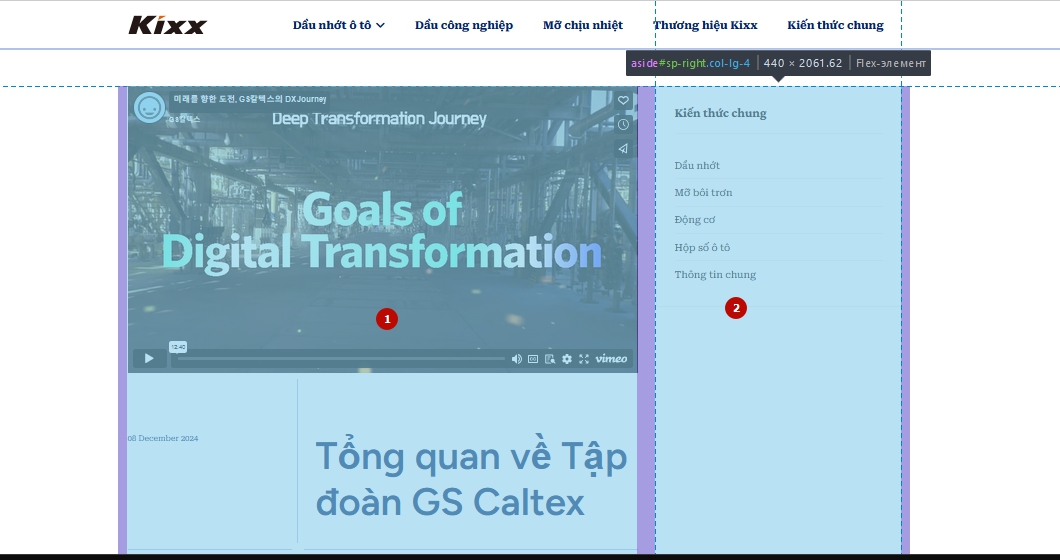
Accepted AnswerNo Sir, it is "left-sidebar-top" and "left-sidebar-middle" in "Component area - inside there is an article layout". I don't want to show these two areas.


Pavel
Accepted AnswerI don't understand and your photos are not available
Pavel
Accepted AnswerNow it’s clear. These are features of the template. You need to make an override of the article layout to get rid of this.
Try:
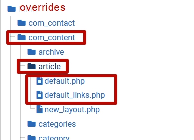
Dowload raw Helix Ultimate and copy from Helix_Ultimate\plugins\system\overrides this structure (folders and files)
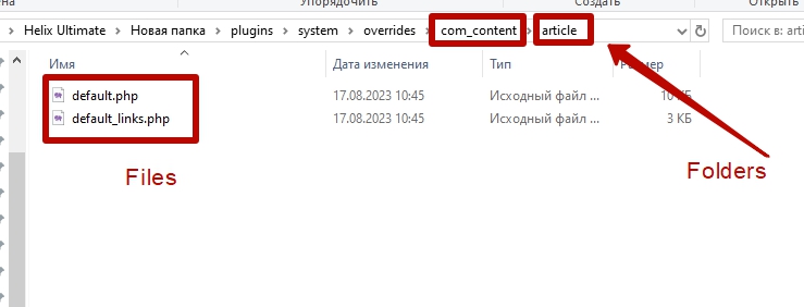
to this folder via FTP
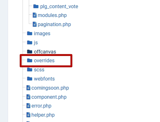
Should looks like this

Paul Frankowski
Accepted AnswerIf I may....
Maybe disable module that you have on the right side (right module position. Then article area will be wider to max container width (1320px)
OR
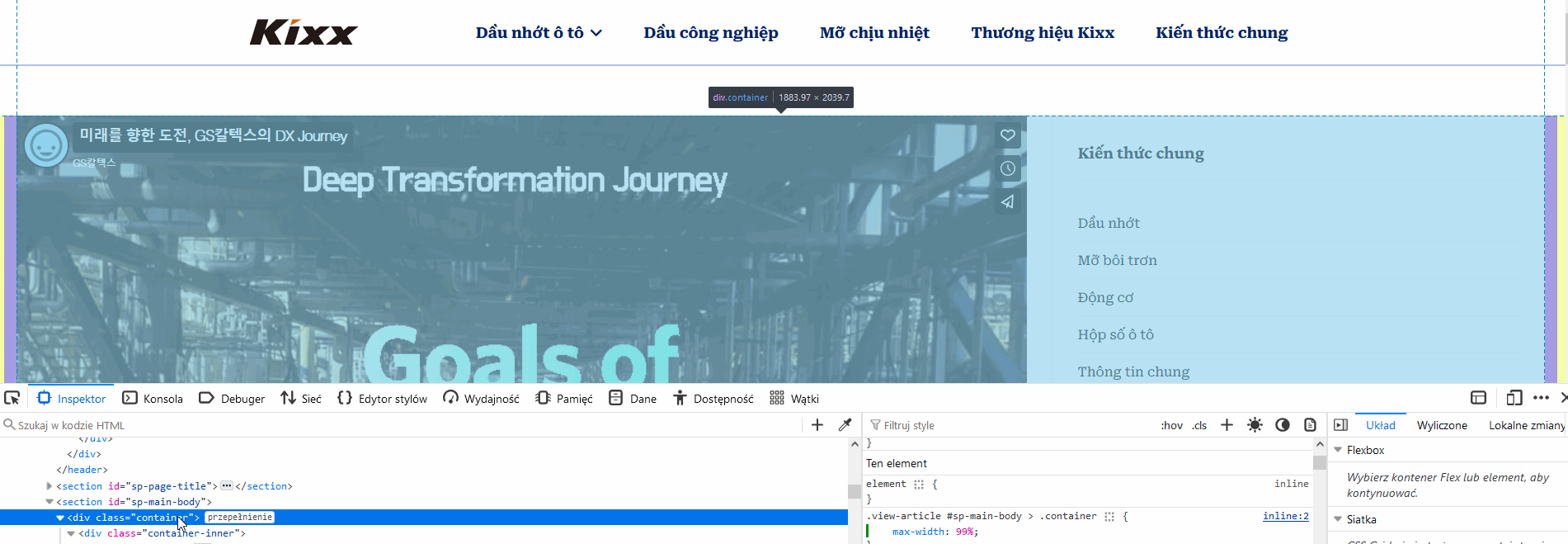
Try that Custom CSS:
.view-article #sp-main-body > .container {max-width: 99%;}
It will make container full width (max screen).
Paul Frankowski
Accepted AnswerIt would be simpler if you can make mock-up, Create image & share link to image then we can think again.
CSS that I shared works, but I am not sure what you really need.
And if you have module on the right side, it's natural that it takes some space.

S
Son
Accepted Answerif i can copy the same article format of this theme that would be great! https://www.joomshaper.com/joomla-templates/maxora
Paul Frankowski
Accepted AnswerBut you never mentioned that you need changes in Mobile view , you only asked "How do I Change My Article To Full Layout? " , am I right. And besides it doesn't must be a BUG as you may think, but designer concept (evidence below with template.css styles), the same example as you have with your Phone Applications. However, unlike the look of the app on your phone, on the Joomla website you can change almost everything, adjusting it to your vision. It's a bit like building with Lego bricks, if you know what I mean.
Spaces and font-size can be changed in just 4 lines of Custom CSS, if you think they are too big. Just use Code Inspector from your browser , check class name what you want to change and override that using your own @media style.
Paul Frankowski
Accepted AnswerEach template uses different overrides and CSS styles. In theory, you can copy from it. But it can be difficult for you if you are not an advanced Joomla webmaster.
Pavel
Accepted AnswerIt would be simpler if you can make mock-up, Create image & share link to image then we can think again.
Hi Paul.
Son wants to get rid of these things and make an article full width of the component area, not full width of browser view. (As I understand it)
 The only way to solve this is to create override using files from raw Helix Ultimate
Pavel
Accepted AnswerIT IS NOT EASY FOR ME. THANK YOU VERY MUCH TOO! I CANNOT DO AS YOU INSTRUCTED
Hi Son.
If you carefully read my instructions, there is nothing complicated there. All you need is the copy/paste skills that any Windows/Mac user can do
Paul Frankowski
Accepted AnswerThanks Pavel, you shared screenshot/mock-up - but he didn't so we both have to guess.
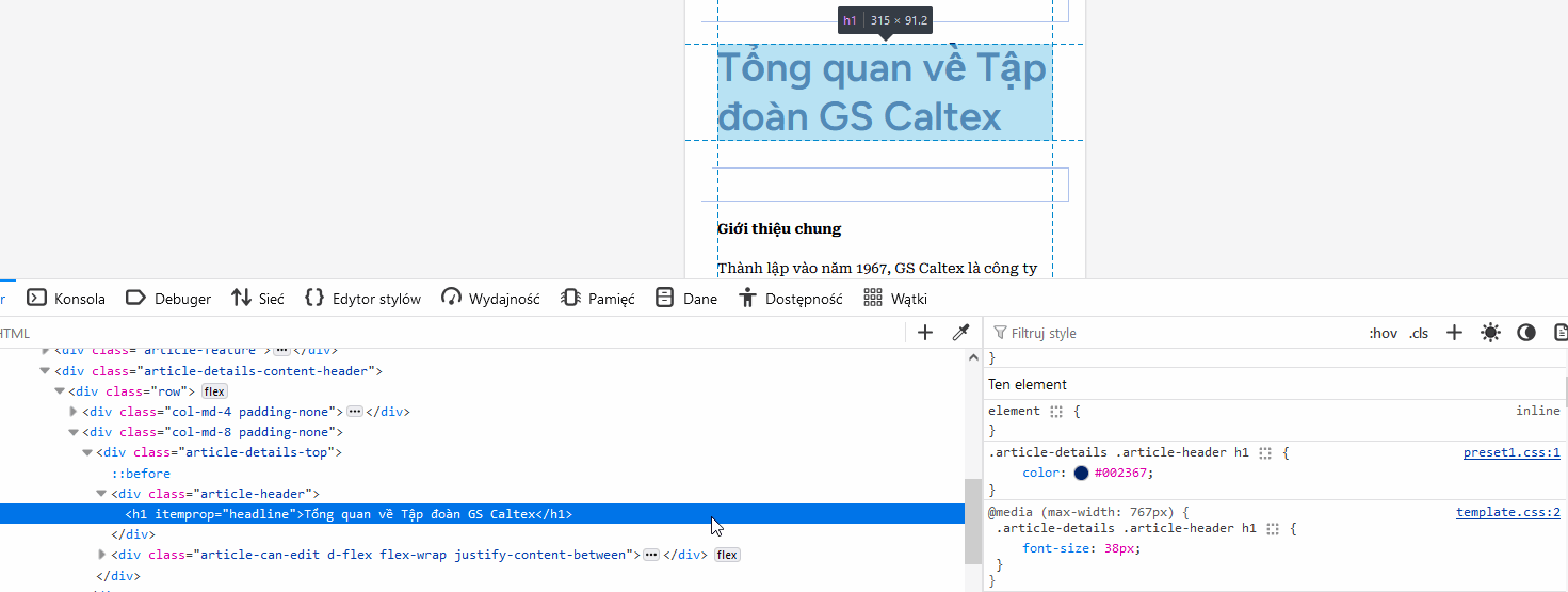
I think using Custom CSS, I should be also be able to reduce left side width:
@media screen and (min-width: 680px) {
.article-details-content-header > .row > .col-md-4.padding-none {width: 9%;}
.article-details-content-header > .row > .col-md-8.padding-none {width: 91%;}
}
After using it