Slideshow is not responsive when I test it on a tablet or cell phone.
It cuts off the slideshow image.
Can you help me?
Slideshow is not responsive when I test it on a tablet or cell phone.
It cuts off the slideshow image.
Can you help me?
Hi
Thanks for contacting us. Could you please give me your site URL?
-Regards.
It cuts off the slideshow image.
Hi.
You must understand the difference between a background image and <img> tag. This is the expected behavior. Do not use significant content elements in the background images, like texts and ect. A background image is just CSS decoration. Its proportions and "crop" depend on the size of the block to which it is added.
By the same time, the placement of texts in the image is useless for SEO and does not look high quality. Compare the quality.

Moreover, the placement of contact information in the form of an image is not usable. An user will not be able to copy it or click on the link to call. You will lose many targeted actions (leads)
Let me see if I understand, if I remove the text the image will become responsive.
Website URL: www.apace.org.br/apace
Let me see if I understand, if I remove the text the image will become responsive.
No, you don't understand correctly. The image added here will never be responsive. It will be cut depending on the size of the slider.
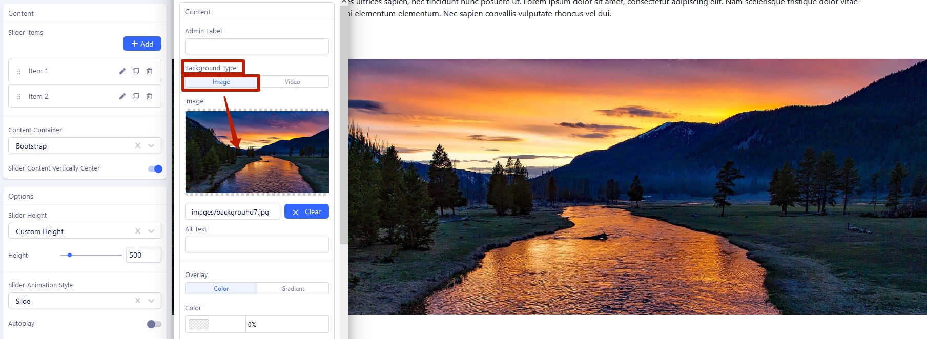
It's just CSS decoration, but not the image in itself.
The image added here will be responsive, as this is the <img> tag. But unfortunately, as you see in the screenshot, it is distorted because of the bug that has not yet been corrected and you will need to use CSS to fix it
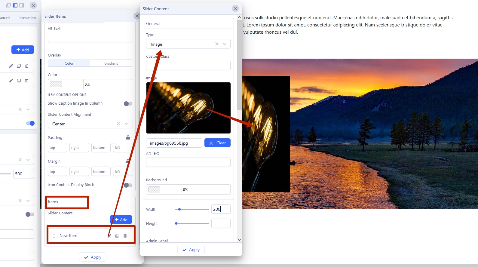
Is this solved now?