Black Friday 2026 50% off every plan Our biggest deal of the year on #1 Joomla products.
Ends in 12d 20h 39m 49s
Claim 50% off
Awaiting an answer Helix Framework

Change position columns in Helix custom header

Asked by Bluepoint 1 year ago Last activity 1 year ago

Hello,

How can I change the order and position of the columns on mobile in Helix?

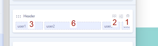
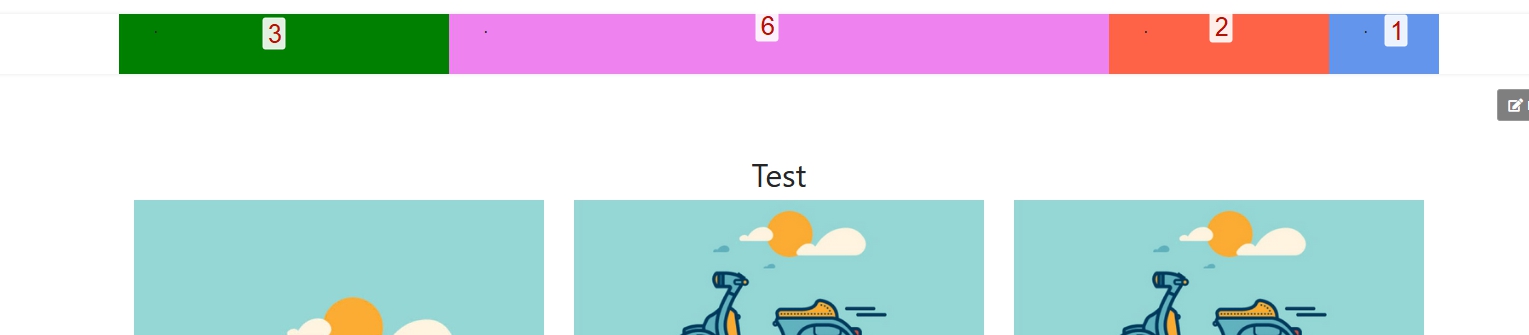
I have a layout of 3+6+2+1 on desktop and on mobile, each column now defaults to 100% and one below the other.

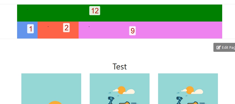
But what I want on mobile is 12+1+2+9 or 100%+10%+20%+70% for example.
And I want to be able to move the columns from position.

https://prnt.sc/IznRpsBwcRGF

Is this possible with Helix or is this not flexible enough? Or is there another way I can accomplish something like this? For example, create an SP Builder module and use it as a header?

Regards,
Michiel

11 replies

Bluepoint Asked this

Thanks Ofi for your anwer... but it is not working for me. I now have a header for desktop, a header for tablet and a header for mobile.
Desktop 4+7+1 (hidden on phone & tablet)
Tablet 5+5+2 (hidden on phone & desktop)
Mobile 6+3+3 (hidden on desktop & tablet)

But still got a 100% row for the logo... and in the next row the menu. And I want to have the menu next to the logo, not under it ;)

I've made a login for you to have a look.

regards,
Michiel

Bluepoint Asked this

Or.... is it possible to use a sp builder module as a header?
So with logo, Joomla main menu and possibly other Joomla modules in it? And then put that module position in Helix as a header?

Sorry for all the questions... but we are new to SP Builder.

Used Themler for years, but it is no longer well supported (unfortunately)... we are now testing with SP Builder, Nicepage and Quix. May the best win ;)

Ofi Khan Staff

Sorry, I could not find a fix for your issue. Please take a full site backup with Akeeba Backup in ZIP format and share here. Follow this tutorial. I will check it on my localhost. Or if you allow me, then I can take and download a backup from your site.

Bluepoint Asked this

Hello Ofi,

you can take a backup from our website... love to hear from you.

Regards,
Michiel

Ofi Khan Staff
1 year ago · edited

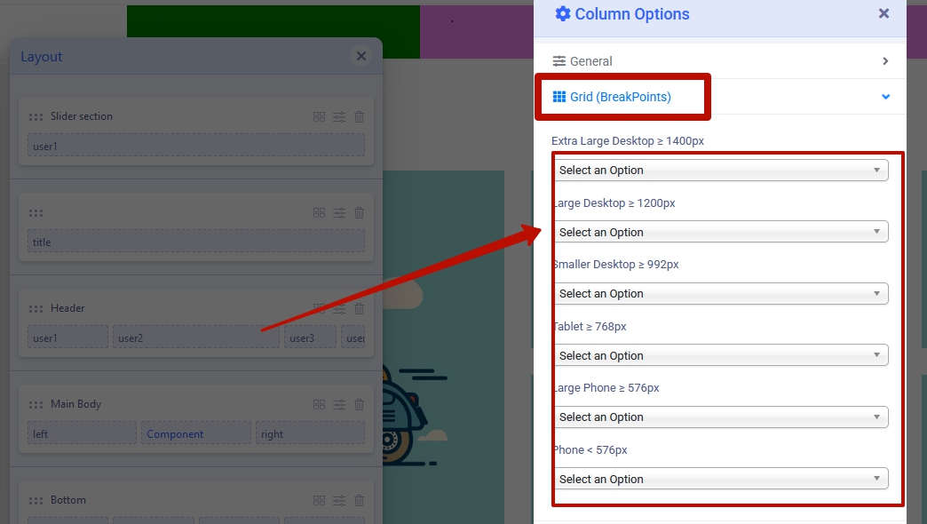
Thanks. I have fixed the layout on your site. Please go to Template Options -> Layout and check the 3 headers and their column settings.

Pavel
1 year ago · edited

Helix Ultimate Custom Header Customization

Hi Ofi.

It is obvious that your screencast contains an incorrect solution. Header duplication is unacceptable, as this leads to duplication of IDs. This will lead to CSS and JS conflicts. You should know this as a representative of the team knowing your own products.

check the 3 header and their column settings.

Hiding some elements and the display of others for various devices is a very bad practice that negatively affects SEO and performance. Only newcomers do this. Knowing you and your competence, it is strange for me that you offer such bad solutions.

It seems you began to take an example from Mehtaz :D


Hi Bluepoint.

For your question, there is no solution through Helix settings which would not be terrible crutches. However, Helix has a very simple and understandable code, which makes it extremely flexible. You can achieve what you want using custom CSS to fully control the layout of only one Header instance for different devices instead of using the settings and 3 Header instances.

If you do not have enough skills for this, just hire someone for this work.

Ofi Khan Staff

Thanks Pavel. I appreciate your feedback. I have to learn SEO. Your solution is better no doubt. I try to offer solution without customization according to Support Policy. I feel that too much modification to a template is harder than starting scratch. However, anything is possible with customization.

Pavel
1 year ago · edited

I understand your desire to offer decisions without going beyond the limits of support policy. However, if the decision is erroneous, it should not be offered, but it is better to refer to politics and offer a general advice. Otherwise, you will cause the negative users and doubts about your company's competence.

I am not an employee of support and unlimited by the policy :).

Here is an example of a right solution:

The code depends on the positions used. In the example used User 1/2/3/4 positions

Make settings for Desktop


Use CSS for mobile

@media (max-width: 991.98px) {
    #sp-header {
        height: auto;
    }
    #sp-user1 {
        order: -3;
    }
    #sp-user4 {
        order: -2;
        width: 10%;
    }
    #sp-user3 {
        order: -1;
        width: 20%;
    }
    #sp-user2 {
        width: auto;
        flex: 1;
    }
}

Ofi Khan Staff

Thanks for your solution. I will learn from it and apply in my replies 👍

Bluepoint Asked this

Thanks Ofi and Pavel for your answers.

I know it's not good for SEO to use Ofi's way... and then custom css would certainly be an option.

The fact is that we have worked with Themler for years and in it you can build your header in columns and easily set the width per device and use the flex setting per column to arrange the order per device.


It is a shame that Themler is no longer supported at all, so we are forced to look for an alternative.

All those page builders are quite nice, but when it comes to the possibilities to create a nice header within the software, it is very disappointing with SP Builder, Quix and Nicepage.

There is also no support for other extensions within SP Builder. So when using extensions such as Hikashop, VIK appointments, RSTickets and Membership Pro, the pages do not look good and a lot of CSS has to be used to make everything look good again... and that means extra work. Nicepage is the only one that handles this well.

In short... SP Builder is great for the content of your website... as long as you continue to work within their standard pages. So in my opinion it is not suitable for more extensive websites/shops.

Regards,
Michiel

Log in to reply.