Cannot Translate Working CSS Into Settings Of SPPB Components!
H
I am trying to create a section with 2 columns, the left column containing an image, that changes in a certain way when I go to a mobile screen size. Because I could not get it to work in SPPB, I first made a version with raw CSS (see below). Which I am trying to translate into SPPB settings.
I first tried to implement it using the div-addon in SPPB (see https://test.deijsmannetjes.nl/wat). This enables me to set all kinds of flexbox properties. But a limitation is that I cannot set the width of a div as % of the parent div. And using custom css is difficult because with the div-addon you are forced to do this through a custom CSS file, instead of being able to add CSS-code in the addon.
Then I tried to do it with columns in a section (see https://test.deijsmannetjes.nl/ijstaarten). Because I can set the width of columns in %, the image on the left scales properly when I decrease the width of the screen. But I cannot see a way to implement the media query part of my CSS-example. When I make the screen narrower, the background color of the section no longer sits behind the text, possibly because I cannot set the flex-direction of the section to “column”. Also there is no way to set the radius of the corners of the section separately. And using custom css requires using a separate custom css file.
Is it possible to translate my CSS into SPPB settings? Can you give me some guidance. The SPPB docuemntation and forum cannot help me.
The HTML of the test-section:
    <section class="custom-section">
        <div class="column image-column">
            <img src="/greenpark_ijsmannetjes.jpg" alt="Green Park">
        </div>
        <div class="column text-column">
            <p>Lorem ipsum dolor sit amet, consectetur adipiscing elit. Integer adipiscing erat eget risus sollicitudin pellentesque et non erat. Maecenas nibh dolor, malesuada et bibendum a, sagittis accumsan ipsum. Pellentesque ultrices ultrices sapien,
                nec tincidunt nunc posuere ut. Lorem ipsum dolor sit amet, consectetur adipiscing elit. Nam scelerisque tristique dolor vitae tincidunt. Aenean quis massa uada mi elementum elementum. Nec sapien convallis vulputate rhoncus vel dui.</p>
            <p>Nam sit amet bibendum turpis, eu tincidunt nunc. Integer non turpis dapibus, tincidunt libero id, rhoncus ligula...</p>
        </div>
    </section>
The CSS:
.custom-section {
    width: 100%;
    height: 600px;
    margin: 50px 0;
    display: flex;
    background-color: rgba(175, 38, 38, 0.5);
}

.column {
    height: 100%;
}

.image-column {
    width: 40%;
    overflow: hidden;
    display: flex;
    align-items: center;
    justify-content: flex-end;
}

.image-column img {
    height: 100%;
    object-fit: cover;
    border-radius: 0 75px 75px 0;
}

.text-column {
    width: 60%;
    font-size: 24px;
    padding: 50px 100px;
    display: flex;
    flex-direction: column;
    justify-content: center;
}

@media (max-width: 1000px) {
    .custom-section {
        flex-direction: column;
        height: auto;
        border-radius: 50px;
    }
    .image-column,
    .text-column {
        width: 100%;
    }
    .image-column img {
        width: 100%;
        height: 100vw;
        object-fit: cover;
        border-radius: 0 0 50px 50px;
    }
    .text-column {
        width: 100%;
        padding: 50px 25px;
        box-sizing: border-box;
    }
}
Atick Eashrak Shuvo
Accepted AnswerApologies for the inconvenience. Based on your description, I have created a layout that aligns with your requirements as closely as possible using SP Page Builder, without the need for additional CSS files.
Please download the JSON file from the hidden content and import it into your page. Let me know if this meets your expectations.
H
Accepted AnswerHello Atick,
Thank for your work; it achieved about 75% of my requirements. Unfortunately I found it very difficult to implement the remaining 25% using SPPB settings.
So in the end i have used raw html addins and programmed my requirements in html and css. With some help from ChatGPT, it was not too difficutl, also because I already had a prototype.

Pavel
Accepted Answer...instead of being able to add CSS-code in the addon...
Hi.
Just a piece of advice. Never use this option. It will add multiple copies of unnecessary code if you have many such add-ons, instead of using just one CSS rule for all similar add-ons. This will negatively impact performance.
Using the custom.css file is always the best option. You have everything in one place, which makes editing easier.
H
Accepted AnswerThanx for the advice.
Do you have advice how to do that in an easy way. The only way I know is to go to the template and add custom css there. Which is very cumbersome If you have to switch between Pagebuilder and the template. Is't thre a custom.css file somewhere in the Joomla filetree that I can edit directly?
Pavel
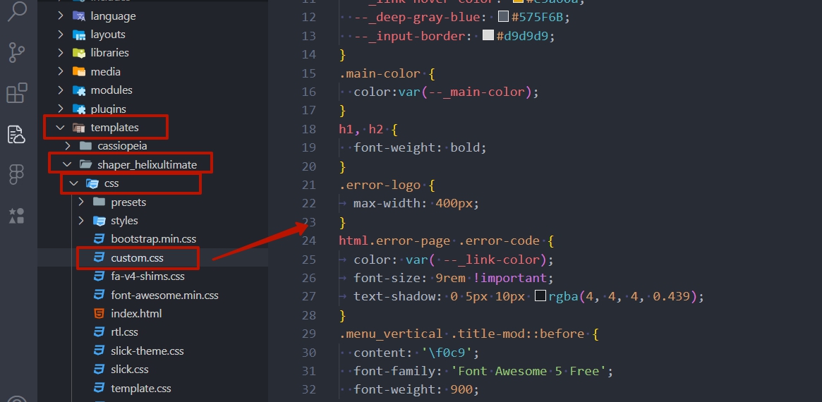
Accepted AnswerAnother tip (if we're talking about Helix).
First of all, nothing is stopping you from opening multiple browser tabs — one with the template CSS field, second with SP Page Builder, third with live view. However, in any case, CSS is not applied on the fly, and you need to reload the page to see the changes (CTRL + F5 not only reloads the page but also clears the cache).
Secondly, the Custom CSS field in the template should only be used if your site has multiple template styles and you want to make some small stylistic differences between them. For everything else, you should use the custom.css file, which you should create in the /templates/shaper_helixultimate/css/ folder.
For efficient work, you can connect your desktop editor, such as VS Code or similar, to this file via FTP (CTRL + F5 also need to update live view).
Here’s my workflow: