

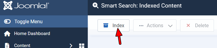
Search Not Working
SG
Steven Gourlay
Hi i have enabled search through the template, when i search for anything in the filed i just get
No Results Found No search results could be found for query:
Template Investa
Website
http://www.ullapoolseasavers.com
15 Answers
Order by
Oldest

Paul Frankowski
Accepted AnswerCSS code seems to be OK. On my emulator looked also OK 2 day ago, all was inside browser window.
Anyway, maybe add Search as "Search" Icon - last menu item.
My video tip >> https://www.youtube.com/watch?v=iJL3rSqVb1U&t=1s
Paul Frankowski
Accepted AnswerHi Steven,
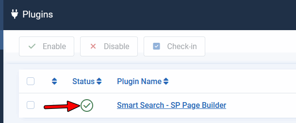
But have you indexed your Joomla Content? Please watch on youtube tutorial(s) on how SmartSearch in Joomla works.
But BEFORE make sure that SmartSearch plugin for SP Page Builder is enabled (published).
Paul Frankowski
Accepted AnswerBTW
To improve site SEO and Web Accessibility add to your site also SiteMap (not only as sitemap.xml file).
SG
Steven Gourlay
Accepted AnswerHi Paul thank you very much that sorted it.
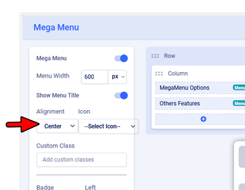
Now have a bit of a odd css issue only with safari, ive checked across browsers but now the mega menu is off the screen in safari :-(
Paul Frankowski
Accepted AnswerYes, becuase is too wide.
Try to change menu alignment - from Left (default) to Center or Right (check which one fit better).
Paul Frankowski
Accepted AnswerAs EXTRA step, use also that Custom CSS (In Helix Documenation read where to use it)
.sp-dropdown-main.sp-dropdown-mega .sp-dropdown-inner .row > div ul.sp-mega-group {
  padding: 20px 10px;}

    @media screen (min-width: 1360px) {
  .sp-menu-full.container {width: 990px;}
}
    @media screen (min-width: 1280px) {
  .sp-menu-full.container {width: 840px;}
    input.js-finder-search-query.form-control {max-width: 210px;}
}
Both steps (settings and CSS) It will help fit everything in all screens (Laptops, Desktop), yes submenu width will be smaller, but no problems to see all boxes.
Paul Frankowski
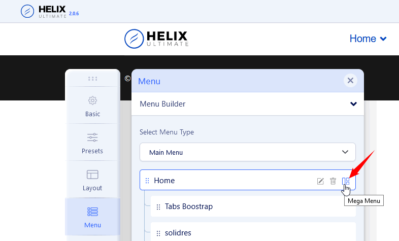
Accepted AnswerIn Template Options > Menu > on selected Menu items click > boxes icon (MegaMenu)
https://www.joomshaper.com/images/2021/11/09/mega-menu-hu20.png
yes, I talk about menu alignment
SG
Steven Gourlay
Accepted AnswerThanks i really appriciate your help but for safari im still getting the same problem. i have cleared cached and using safari in a private window On macbook
Paul Frankowski
Accepted Answer- Your Macbook what screen resolution it has?
- Have you used my Custom CSS, is MUST HAVE (!)
Make screenshot and share link to it, it will be easier...
Paul Frankowski
Accepted AnswerOk, add also that line inside custom.css file OR Template Options > Custom Code > Custom CSS
@media screen (min-width: 1400px) and (max-width: 1800px) {
 #sp-menu .sp-menu-full.container {width: 990px !important; max-width: 990px;}
}