

Hero Image Doesn't Scale Properly On Iphone 8
H
The webpage: www.deijsmannetjes.nl
On the top of the page I am using a standard hero image.
When I view the page with Chrome inspector on a simulated iphone, it shows like this: https://prnt.sc/CZWtw4JoHzwb. Exactly as I want.
But when I visit the website on my real iphone 8, , it looks like this: https://prnt.sc/cZyw4v_BhKLD. The image doesn't scale properly.
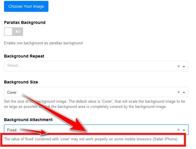
The settings of the hero image: https://prnt.sc/rTiWVSUFn4o6. I have not changed them for other screen sizes.
What is going wrong?

Paul Frankowski
Accepted AnswerSPBB CSS fix for all Mobile Devices:
@media screen and (max-width: 820px) {
#sp-page-builder .page-content .sppb-section,
#sp-page-builder .sppb-section,
.mod-sppagebuilder .sppb-section {background-attachment: scroll !important;}
}
SPPB documenation tip: https://www.joomshaper.com/documentation/sp-page-builder/troubleshooting#background-image-in-section-is-resized-on-safari-mobile-browser
Yes, you can modify that for iPhones browsers only.
/* --- iPhone 6+, 7+ and 8+  --- */
@media only screen
  and (min-device-width: 375px)
  and (max-device-width: 736px)
  and (-webkit-min-device-pixel-ratio: 3) {
    #sp-page-builder .page-content .sppb-section,
#sp-page-builder .sppb-section,
.mod-sppagebuilder .sppb-section {background-attachment: scroll !important;}
}Paul Frankowski
Accepted AnswerHoi H,
What is going wrong?
It's a very old Safari BUG !, sorry they call it a feature ;]
Safari Mobile browser don't like when those CSS background settings are together.

Yes, we informed about that since SPPB 3.x
SPPB 5.x info box
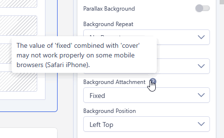
Ironic to have tip that nobody read.
H
Accepted AnswerHello Frank,
Thnx for the quick reply. It seems to solve the issue.
I seem to remember this also from when I build the previous version of the website a few years ago.
I am afraid tips do not solve these questions. As I used the standard settings of the addon, there was no reason for me to investigate teh tips!