

Slideshow Full Swipe/drag Area
Shana
Hi Code Wizards!
I am using the Slideshow Full Addon and I notice that the user can swipe/drag to navigate through the slides instead of using the navigation buttons if they want. However, this only works if the user clicks and drags in the bottom third of the slideshow. The swipe/drag does not work if the user clicks the slide at the menu level or above. Is there a way I can increase the dimension of the swipe/drag area to include the entire Slide? I would like the user to be able to click anywhere on the slide to swipe/drag it. Same on mobile version– the swipe/drag only works if the user clicks in the very bottom of the slide.
Does my question make sense?
Website: https://hermanalunajewelry.com
Looking forward to your code creativity and expertise!
Thanks, Shana

Pavel
Accepted AnswerAlthough an idea came to mind. The swipe feature will work except in the areas of the logo and the menu.
.has-slideshow section#sp-logo, #sp-header {
    pointer-events: none;
}
.logo a, #sp-menu .sp-column {
    pointer-events: all;
}
Mehtaz Afsana Borsha
Accepted AnswerHi
Thanks for contacting us and thanks for your opininos. As per my knowledge, there is no default option to do that, you have to customize it yourself as we do not provide customization support.
-Regards.
Shana
Accepted AnswerHi Mehtaz, thanks for your answer but that's strange because I have been working with Joomshaper for years and your coders are always able to give custom code. All templates require customization. If you are not willing, please pass on my request to another.
Pavel
Accepted AnswerHi Shana.
There is no solution for this, except if you come up with a different design and create a different layout.
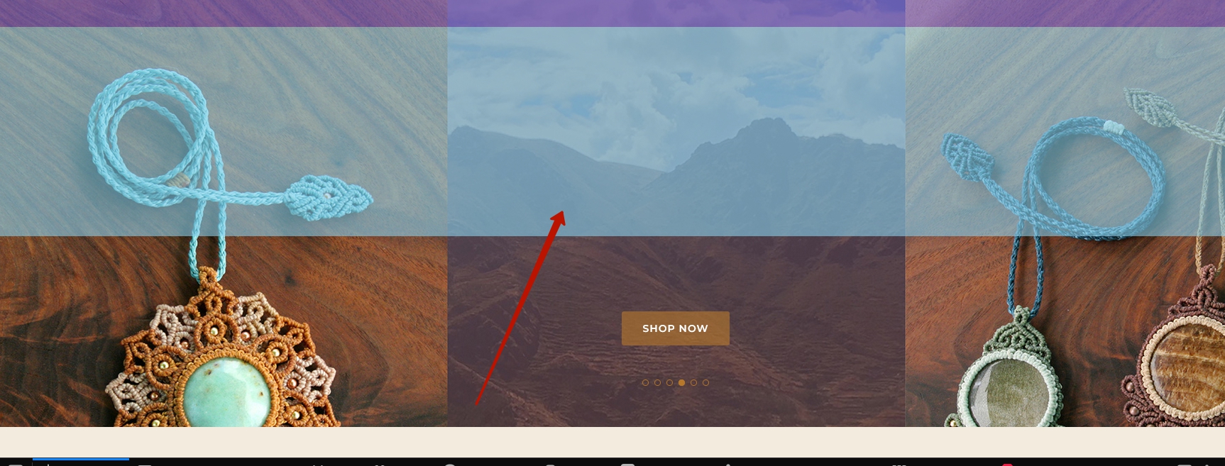
To help you understand, the two sections overlap the slideshow, so the swipe feature does not work at the top.
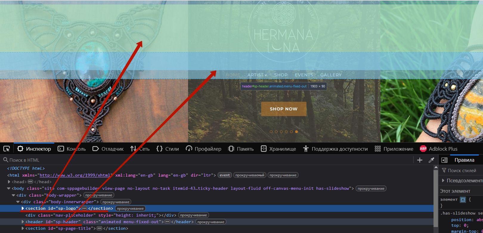
If you move the slideshow (actually, not the slideshow, as that is not possible, but the entire main-body section) to the foreground, then these two sections will not be visible. But the swipe feature will start working completely.
For example only (!)
#sp-main-body {
    z-index: 9999999999;
    position: relative;
}
Shana
Accepted AnswerHi Pavel, You are a genius! Your explanation made total sense, and then your solution also worked perfectly!
Is it possible to also make this work on mobile? I tried adding the same code to my Media Queries but it didn't work.
THANK YOU!!!
Pavel
Accepted AnswerHi Shana.
This code works for all screen sizes and does not need to be added to media queries.
You just need to adjust the sizes of the elements .logo a and #sp-menu .sp-column so that they do not occupy the full width of the screen on mobile devices.
For #sp-menu .sp-column, I can recommend some code for media queries.
#sp-menu .sp-column {
    width: max-content !important;
}
But for .logo a, I can't do that because I would need access to your CSS to remove/rework everything you've done for the logo image. You need to redesign it so that the logo size is controlled specifically through .logo a and not through section#sp-logo .logo .sp-default-logo.
Overall, your CSS is quite messy.
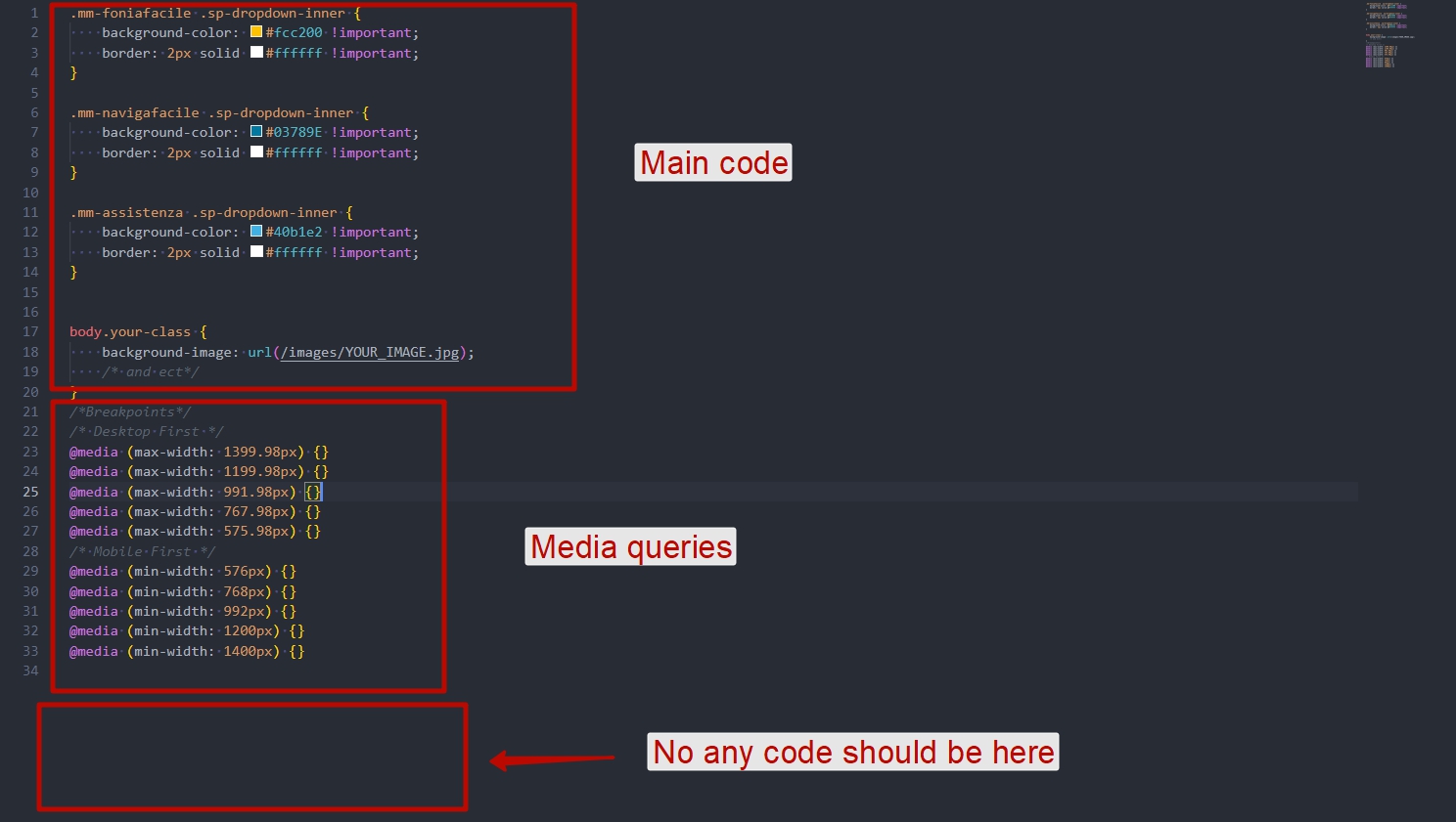
Here are a few tips:
The template CSS field should be used exclusively for a small fragment of code and only if you are using multiple template styles and want to differentiate between them. For example, if in one style you want the header to be red and in another green, then you can use the template CSS field.
All code added to the template CSS field is placed directly inside the <head></head>. Right now, you have a lot of code there, which negatively affects performance.
Additionally, all CSS from SP Page Builder also goes into the head. To remove this, switch SP Page Builder to production mode in its settings.
For all general CSS code, create a custom.css file following Helix documentation and move everything there.
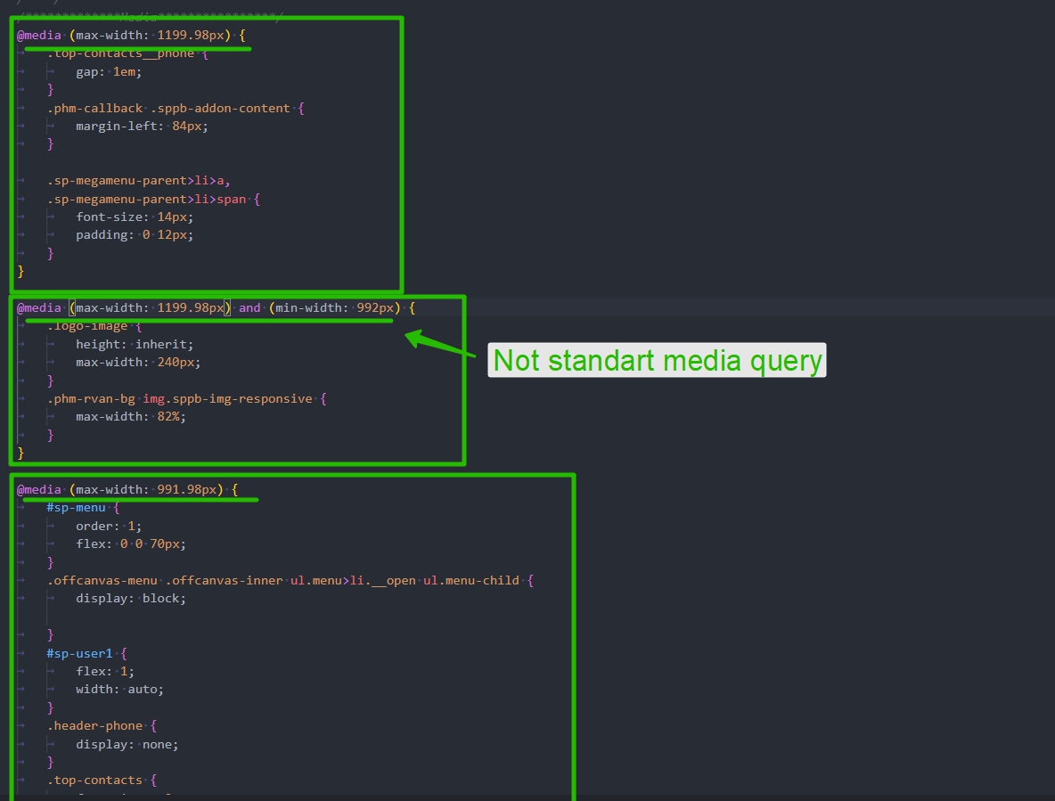
Organize your code. For example, all media queries should be at the very bottom and should have a specific order and standard values. These values are universal.
Here are the standard media queries.
/*Breakpoints*/
/* Desktop First */
@media (max-width: 1399.98px) {}
@media (max-width: 1199.98px) {}
@media (max-width: 991.98px) {}
@media (max-width: 767.98px) {}
@media (max-width: 575.98px) {}
/* Mobile First */
@media (min-width: 576px) {}
@media (min-width: 768px) {}
@media (min-width: 992px) {}
@media (min-width: 1200px) {}
@media (min-width: 1400px) {}
If you need custom media queries, integrate them in order. For example, if you need @media (max-width: 600px) {}, add it between @media (max-width: 767.98px) {} and @media (max-width: 575.98px) {}.
However, in 99% of cases, standard media queries are all you need. Stick to them, and only add custom ones if they do not cover your requirements.
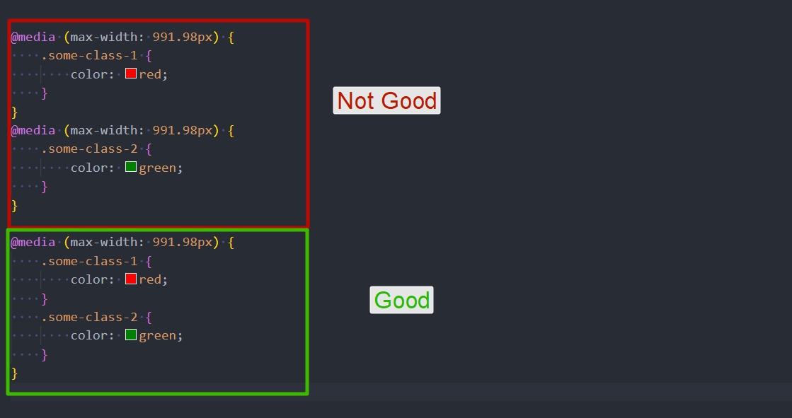
If you have multiple rules for a single media query, write them all in one block.
Live example from my project
Shana
Accepted AnswerHi Pavel,
Thank you for the extensive CSS guidance!
I am going to abandon the idea of enlarging the swipe/drag area and instead focus on cleaning up my custom css code like you advised, and fixing responsive issues. I have some questions.
Following your guidance I removed all the custom css that I had inserted in the template using the Joomla template custom css section. I am using two versions of the Lightbox template– one for my homepage and one for my other pages. I organized all the css into a file custom.css. The only code that I applied directly to each template were the elements that had different values in each version of the template, like you advised.
So now I have three places where I adding custom css code: the custom.css file, and then when needed in each version of the template's backend Custom CSS field (Joomal>System>Site Template Syles>Lightbox>CustomCode.)
My question: Is the correct way to do this? Because now that I have these three areas of custom code, I am running into responsive design issues. For example, below are three screenshots of pages of my site using an iphone 13 browser (looks as it should):


A screen shot of what the site looks like when opened on the same iphone 13 in the internal instagram browser (a mess):


In the instagram internal browser, it seems none of my custom.css code is being read. I can tell that bc simple code in my custom.css file such as .offcanvas-menu { background-color: #B7782A; } is not being read. When this code was directly in my template's custom css field (Joomal>System>Site Template Syles>Lightbox>CustomCode) it was being read in the instagram browser.
What am I missing here? (Sorry I do not know how to insert nice and neat small photos into this response like you did, haha.)
In regards to responsive design code– you will see I have added in very few media queries myself in those three areas where I am adding custom css. The Lightbox template is responsible for the majority of the media queries, including those non-standard media queries. I'm not sure what to do about that.
Anyways, I've spent SO MANY hours trying to figure out why the media queries and custom.css are not showing up across all mobile devices. I also tried changing Pagebuilder to production mode but I didn't notice a change. (Is this something I should do regardless to get all code out of the head?) Can you please tell me what I'm doing wrong? Super frustrated.
Pavel
Accepted AnswerIn the instagram internal browser, it seems none of my custom.css code is being read.
Hi. Clear the Joomla cache and this browser's cache. And always clear the cache of any browser if CSS changes are not being applied. Also, when working with CSS, any caching and compression in Joomla should be turned off.
When you used the code in the template's CSS field, it was directly in the HTML body of the page, so caching did not affect it. By moving the code to custom.css, caching now applies to it. This is better for performance. However, when working with CSS, you should always clear the cache.
I also tried changing Pagebuilder to production mode but I didn't notice a change.
By doing this, you moved a large portion of the code from the head to a separate CSS file. This, again, is better for performance but will also require clearing the cache from time to time.
You can keep production mode disabled while working on the site, but once you finish, make sure to enable it.
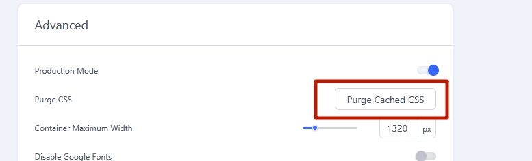
When activating production mode, always click this button.
Shana
Accepted AnswerHi, 1.) Browser and Joomla caches cleared 2.) Pagebuilder in Production mode and I Purged Cached CSS in the advanced option. 3.) Instagram browser cached cleared
... and the custom.css is still not being read when the website is opened with an iPhone instagram internal browswer. Today I was able to confirm that other cell phone instagram browsers look fine. The iPhone instagram internal browser is reading the custom css that I inserted into the template, but not the custom.css file. When I open in external browser on same iphone, the page calls custom.css and it looks as it should. What am I missing?
Pavel
Accepted AnswerHi.
I have no other ideas besides clearing the cache. Clear the cache of the entire Instagram app. Check on another device.
Since the site works fine in all browsers except Instagram, the problem lies with Instagram, not the site. There may be acceleration settings in the Instagram browser. Check and disable them.
Placing CSS code in the head just because of Instagram browser is a bad idea.
By the way, I noticed that the internal browsers of apps, not just Instagram but also Telegram and others, break websites. As a user, I always switch the internal app browser to my main browser.