

From Computer Design To Cell Phone, Ipad Etc

Katarina Karlström
Hi everyone,
I need to ask, I made a page in Page builder, looking good but in the cell phone it look like trash.
How do I work to make the page responsive able to flow over to cell phones, iPads etc?
I'm new to Joomshaper, use to Wordpress but decided to go back to Joomla after some years.

Ziaul Kabir
Accepted AnswerHello Katarina,
Thanks for reaching out to us. When editing your pages using the SP Page Builder Frontend Editor, you can use the responsive breakpoints feature to ensure your site adapts well to all devices.
Check this blog: https://www.joomshaper.com/blog/make-your-columns-responsive-in-sp-page-builder-4
Please let me know if you need any further assistance.
Best regards,

Paul Frankowski
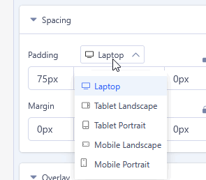
Accepted AnswerIn the back-end editor you have similar options (switcher) that allows you to change appearance in Mobile view. If you used Wordpress, most Page Builders (Elementor, WPBakery) have the same or similar settings.
For example:
- In each Addon settings: Advanced (tab) > Responsive - it allows you to hide addon on Mobile/Tablet or change his width in Tablet/Mobile view
- In each Addon and Section settings you have Responsive (tab) and you use also that switcher
It all depends on what you want to change. But generally it is possible without using additional CSS.
Paul Frankowski
Accepted AnswerAbout iPads (and tablets) there is "small" problem, becuase they may have different resolutions (screen size), as you know even Apple have a few major screen sizes (8,3", 9,7", 10", 11", 12.9", 13"). Thank you Apple, Samsung, Lenovo etc. :/ . And all Page Builders, also ours have one responsive switcher, that may not include all the variants.
Here, too, you need to answer what screen size you (or clients) use most often. For looking at the statistics, tablets are still only a few percent of the share, compare to laptop and phones.
Katarina Karlström
Accepted AnswerHello and thanks for fast responding. Mostly laptop/computers and cell phones I need to design for. I will follow the steps and tips on here.
Again, thank you. :-)
Katarina Karlström
Accepted AnswerThat would be great! Thank you so much, I learn better by videos than texts.
Katarina Karlström
Accepted AnswerThank you everyone, the page is working both in cell phones and in computers. :-)
Ziaul Kabir
Accepted AnswerYou are welcome. We greatly value your opinion and would love to hear your feedback about SP Page Builder. If you could spare a moment, it would mean a lot to us!
You can share your review here: