Hi,
i use Image Layouts. On Laptop it looks good but not on Mobiles.
Can you please check this an give me a hint what i have to do.
Thanks,
Raphael
Hi,
i use Image Layouts. On Laptop it looks good but not on Mobiles.
Can you please check this an give me a hint what i have to do.
Thanks,
Raphael
Please use that extra Custom CSS
@media screen and (max-width: 990px) {
.image-layout-preset-style-card .sppb-img-responsive,
.image-layout-preset-style-overlap .sppb-addon-image-layout-image  {height: auto;}
}
and should be much better :)
Hi Raphael,
What is exactly "bad" ?
I checked your site using iPhone emulator and the only "bad" thing I saw was small space between title and image. And that can fix that:
@media screen and (max-width: 680px) {
.sppb-addon-image-layout-content .sppb-image-layout-title {margin-top: 20px !important;}
}
Becuase too small or too big padding/margin between addons or columns in mobile view you can set manually in Settings, so that's not a bug but missing setting (webmaster duty).
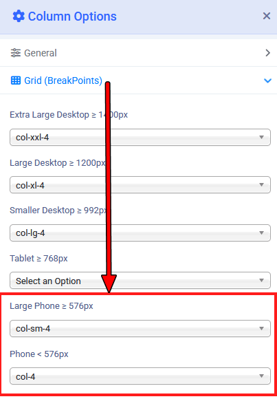
About header, if you used Custom Header, you forgot to set column width for Mobile view.
If you planned 3 columns, maybe you can set col-4 for each column. Look my example settings (Template Options > Layout > Header - logo & menu column)
BTW
To share screenshot on forum use:
... and then it will be easier to talk (and help).
Hi Paul,
thank you very much. Now it looks fine :-)
On Tabelt view the images are scaled.
Thank you very much, Paul :-)
And as conclusion humor
"Bad Mobile" in Google
That's why still humans response here, not AI.