Hi,
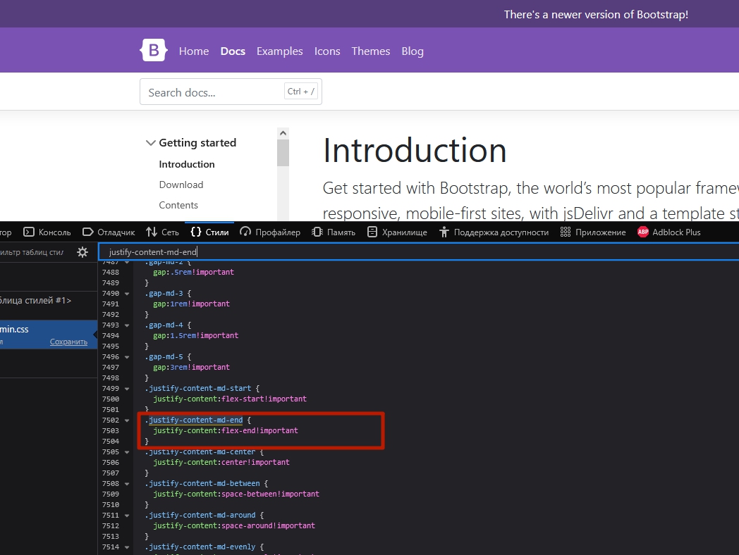
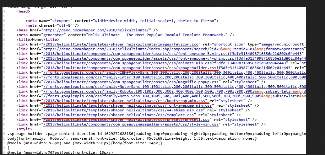
I’m experiencing a CSS conflict between your component and my website’s Bootstrap-based template.
The template uses the following media query:
@media (min-width: 768px) {
.justify-content-md-end {
justify-content: flex-end !important;
}
}
Your component applies this class:
.justify-content-center {
-ms-flex-pack: center !important;
justify-content: center !important;
}
When both classes are applied to the same element (e.g., <div class="justify-content-center justify-content-md-end">), they conflict on screens larger than 768px, due to conflicting justify-content rules with !important.
Could you please consider updating the component to avoid hardcoding .justify-content-center, or apply it conditionally based on screen size? This would improve compatibility with Bootstrap-based layouts.
Thanks!
Davide