

SP Page Builder 5.5.5 – Trouble Understanding Responsive Layout Workflow
Bruce Paine
SP Page Builder Pro: 5.5.5 Joomla Version: 4.4.13 Template: shaper_helixultimate - Default Website: www.comfoot.co.nz
Hello, and thank you in advance for any guidance.
I’m managing a website that serves as a straightforward showcase for different brands of specialty footwear. I've kept the design clean and simple, avoiding complex effects, with the goal of making the site easy to navigate on all devices.
When I decided to purchase and install SP Page Builder Pro, I assumed the software would automatically handle responsive formatting—so that pages would display correctly across various browsers, screen sizes, and orientations.
However, while recently adjusting the homepage layout, I noticed that elements don’t always behave as expected on different devices. It seems that I may need to define layouts separately for mobile, tablet, and desktop views, which I hadn't anticipated.
Considering how time-consuming it has been to get the layout right just for a laptop screen, I’m concerned about the effort involved in repeating this process for every device type and orientation.
So far, I’ve relied on trial and error, with occasional use of the online help guides. But now I’m wondering:
- Is there a more efficient method to manage responsive layouts in SP Page Builder?
- Could switching to a different template (perhaps a more modern or minimal one) improve how layouts adapt across devices?
- Has anyone else faced this issue and found a workflow that simplifies the process?
Any insights or practical suggestions would be greatly appreciated.

Ofi Khan
Accepted AnswerI have found the modal popup addon bug that you have reported. I will talk about it with the developer team. Hopefully, it will be fixed soon. For now, you can use custom CSS. Please use this CSS to
Template Options -> Custom Code -> Custom CSS
.sppb-modal-selector i{
  padding: 0px 5px;
}Ofi Khan
Accepted AnswerHello Bruce Paine,
Thanks for reaching out and providing detailed context—it's great that you're keeping the site clean and user-friendly!
You're absolutely right that SP Page Builder Pro does offer responsive tools, but it's not always automatic in terms of fine-tuning layouts for different screen sizes. Here are a few suggestions and insights that might help streamline your workflow:
-
Responsive Controls Are Built In—But Need Some Manual Input: SP Page Builder provides responsive settings for each row, column, and addon. You can use the Device Switcher (icons at the top right of the frontend editor) to toggle between desktop, tablet, and mobile views. Adjust margins, paddings, font sizes, alignment, and visibility per device within each addon’s settings. This allows more control without needing to duplicate full layouts.
-
Tips to Simplify the Responsive Workflow: Start with mobile-first layout or at least make the base layout as flexible as possible (e.g., using % or auto width where possible). Use Flexbox settings within row/column structures to align content better across devices. Avoid absolute positioning unless really necessary, as it’s harder to manage responsively. After setting a good base on desktop, you’ll usually only need to tweak a few things for smaller screens—this gets quicker with experience.
-
Template Considerations: The Helix Ultimate template is generally responsive and well-maintained, but: if it feels restrictive, you could explore a lighter or more modern Helix-based template, which may come with better spacing defaults and cleaner breakpoints. Templates with fewer predefined styles can sometimes offer easier customization for responsive needs.
Final Thought: You don’t need to completely rework layouts for every device—just refine where needed. With some familiarity, it becomes quicker to build once and fine-tune across breakpoints.
If you’d like, share a screenshot or link to a page that’s giving you trouble on mobile—I’d be happy to take a closer look!
Best regards
Bruce Paine
Accepted AnswerHello again - this is an update to say I've made further progress with the headers. I've managed to adjust the template settings without needing to write code. I'm using the top1 and top2 positions. For some reason top3 doesn't show up but I will experiment a bit more.
By the way, I have discovered 'modal popups' which has helped tidy up text clutter.
Bruce Paine
Accepted AnswerAnother update - I have solved a lot of problems by choosing an alternative default header style 'Multi Rows'. Seeing a more condensed layout, I have stopped using top1 and top2 positions and simply used title position instead.
It would be nice if I could access the space between the Header and the Main Menu items. This is not possible with the chosen header style. Also I cannot display anything in the blank space left of the centered logo. For example, I would like to show a tagline that sums up the business.
One other very minor issue I noticed is when adding an icon to a Modal Pop-up button, there is no space betweent the icon and the button text. In the case of a standard button, the icon allows space before the text.
Sorry to add so many comments but maybe they are helpful.
Bruce Paine
Accepted AnswerThis is following on from my question about responsive layouts.
I have been trying a few things with some success, but also more observations.
I work a lot with SP Page Builder site modules.
One significant problem is that the 'Device Switcher' you mentioned is not appearing in the Backend Editor nor the Frontend editor. However, the 'Device Switcher' does appear when I open the shaper_helixultimate template options.
The only way I can test different views is by either adjusting the window size in my desktop Browser, or use a separate phone or tablet.
I have noticed another problem which I will raise in a separate post.
Ofi Khan
Accepted AnswerIt would be nice if I could access the space between the Header and the Main Menu items. This is not possible with the chosen header style.
You can use Custom Header. On predefined header style, customization is not possible.
One other very minor issue I noticed is when adding an icon to a Modal Pop-up button, there is no space betweent the icon and the button text.
Please use text margin to create space between icon and text. prnt.sc/1GTW_cE_Er7U
I am working with your responsive layout. For some reasons, your frontend editor does not load. Without frontend editor, you cannot make it responsive. So, I have to fix frontend editor first.
Bruce Paine
Accepted AnswerThanks for providing these responses.
I've deliberately avoided creating a Custom Header. This is simply to avoid complication as well as the time and effort involved. It would be great if Joomshaper could further predefined header styles that allow access to the areas such as I mentioned. For now, the current header style is acceptable.
OK regarding the text margin. I will try again with the setting you recommended.
It will be a real achievement if you can fix the frontend editor and be able to see what it does. I did not realise it was needed for responsive layouts. The backend editor has some settings for this. What is the reason for having both editors? It seems pointless if one does more than the other. Why not have just one editor?
Bruce Paine
Accepted AnswerApologies but I have not been able to find the options you refer to in the Modal Popul addon settings. There is only the option to change the icon's left or right position.
Please use text margin to create space between icon and text. prnt.sc/1GTW_cE_Er7U
Here are two screen grabs of the visible options.
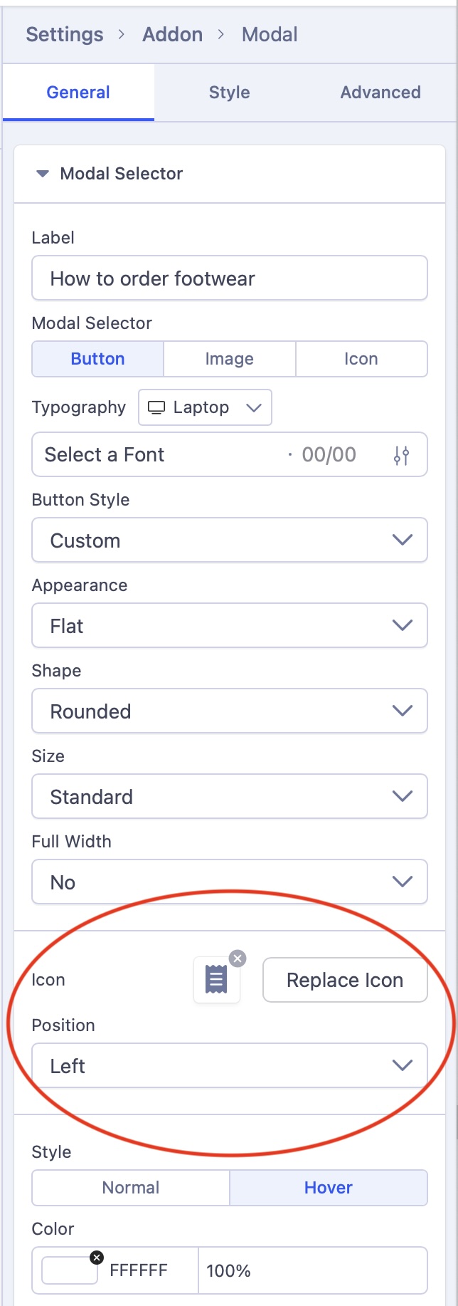
Am I looking in the right place? Is this a difference between the backend and frontend editors?
Ofi Khan
Accepted AnswerIt would be great if Joomshaper could further predefined header styles that allow access to the areas such as I mentioned. For now, the current header style is acceptable.
Sorry, it is not possible. Pre-defined header styles are for those who does not want to customize. On the custom header, you can customize the layout as per your need. It will be complicated if we give the pre-defined header customization option. It is not developed this way.
What is the reason for having both editors? It seems pointless if one does more than the other. Why not have just one editor?
Some users prefer backend editor. In SP Page Builder 4, we had intruced one frontend editor. But since then our users shared mixed reaction and demanded to bring back the backend editor. So, in SP Page Builder 5, we have kepts both editors. Frontend editor is very useful when working with responsive layouts because you can edit and see how it might look. Frontend editor as known as visual editor does this job perfectly. I have already fixed your frontend editor and will check the module today.
Bruce Paine
Accepted AnswerOk thanks. I'm prepared to be converted to Frontend editor - if it works. You can understand my reluctance to switch because I have been using the Backend editor for some years. But if it is as you describe, easier to preview responsive layouts, then that is a good thing.
Thank you for fixing the frontend editor. I will look forward to trying it later on.
Bruce Paine
Accepted AnswerI changed my mind and decided to try the Frontend editor just now, from one of the site modules. It is still taking me to the home page as before. I cannot see any editing menus - just the home page. It is strange because it also shows the user 'Sign in' at the top right of the window. I have disabled Joomla user login. This shouldn't be visible at all.
The same happens when I open the Frontend editor from an article.
Bruce Paine
Accepted AnswerThanks for confirming the addon bug. It is good to know that it is not just my imagination. OK I will update Custom CSS.
It worked perfectly, thank you again. :-)
Bruce Paine
Accepted AnswerThanks for confirming the addon bug. It is good to know that it is not just my imagination. OK I will update Custom CSS.
It worked perfectly, thank you again. :-)
Also, please note the Login option was disabled but then enabled when I adjusted header options. I didn't realise it until just now.