

Helix Ultimate 2.1.2. Problems When Reducing The Width Of The Window
Ottele
In Joomla 5.3.1 using the Helix Ultimate 2.1.2. template, I have the problem in desktop-mode that if I am reduce the width of the window that the main menu is overlapping with the following modules.
In Mobile-and Tablet-mode the „Sign-in“ in the Title zone disappears. But I need it…
What am I doing wrong?
My test site can be seen at ottele.lu
Many thanks in advance for any help!
Kind regards, jm

Paul Frankowski
Accepted AnswerHi,
It's a simple math, if there is no space for menu items, it goes down.
For Desktop/Laptop view please read Helix tips how to solve it (Custom CSS method) >> https://www.joomshaper.com/documentation/helix-framework/customization-tips#how-to-reduce-space-between-menu-items
Paul Frankowski
Accepted AnswerIn Mobile-and Tablet-mode the „Sign-in“ in the Title zone disappears.
Yes, by default is hidden on smaller screen, below 1024px.
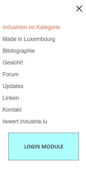
I have easy suggestion, please create a new Login module, and publish it on all pages and select "offcanvas" position then it will be visible under Mobile Menu - here
Paul Frankowski
Accepted AnswerAnd if you want to keep current Sign Up link in Tablet/Smartfone view - use this Custom CSS
@media screen and (max-width: 999px) {
 #sp-header .header-modules.align-items-center { display: flex !important;}
}
Of course you can use both methods: login module and above Custom CSS.
And before you will ask me where/how to use Custom CSS, please also take a look at Helix documenation >> https://www.joomshaper.com/documentation/helix-framework/custom-code-css-js-meta#documentation-heading-3
Ottele
Accepted AnswerMany thanks. I have now created a new custom.css - file with your code - in the css folder of shaper_helixultimate, but there is no changement: no Sign Up in Tablet/Smartfone view.
What is the difference between putting this code in a (new) custom.css - file or directly in the Custom CSS - window of Custon Code of Helix Ultimate?
In in the Custom CSS - window of Custon Code of Helix Ultimate I have:
sp-main-body {
padding: 6px 0;}
.sp-module.boxed-module { border: 2px solid lightgrey !important; box-shadow: 1px 1px 1px 1px lightgrey !important; padding: 20px !important; background-color: #fff !important; border-radius: 12px !important; }