

Mobile View
Art
Hello! I'm having trouble adapting my website for mobile devices. When viewing the site on mobile devices, sections overlap each other (I've attached a screenshot from my phone), although I tested the layout on my own phone and everything looked fine. In an attempt to fix this, I experimented with the height values for mobile and tablet devices, but to no avail.
I was wondering if there's a solution in your documentation that might help me?

Ofi Khan
Accepted AnswerHello Art,
Thank you for reaching out to our technical support forum. I’m sorry to hear about the trouble you’re experiencing. Rest assured, I will look into this issue for you and work to resolve it as quickly as possible.
Unfortunately, I cannot view the imgbb screenshots from my region. Please share it on another platform so that I can check it. For example: use Lightshot or Imgur.
Best regards

Paul Frankowski
Accepted AnswerHi,
I don't see "Carta Informativa" block. But I saw screenshot.
In each Row/Section and Column or Addon you can set margin also only for Mobile view, it can help to solve problems when objects are too close each other. Use that setting!
Art
Accepted AnswerThe problem is a bit different. Initially, I set the block height and tested the final result in Firefox on a desktop, which allows you to see how the site will look on mobile devices. However, when I visited the site on my phone, I saw a completely different result, similar to what's shown in the screenshot. I also tested the site's display in Chrome on my phone, but with the desktop version setting selected, and I saw something I didn't like.
I've attached two screenshots: the first is Chrome on a phone (https://postimg.cc/hzBRHNWq), and the second is Chrome's desktop adaptation on a phone(https://postimg.cc/3y0qr1jq).
I think I'm doing something wrong, but I can't figure out how to best optimize it.
Paul Frankowski
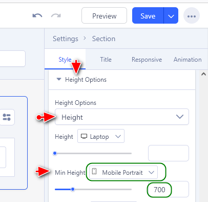
Accepted AnswerSet "min-height" for that blue Section for mobile view 700px , yes from settings.
OR use
@media screen and (max-width: 680px) {
.sp-page-builder .page-content #section-id-863b3ff8-5035-4719-a15b-1236fc268e96 {
    min-height: 700px;}
        }