Header Height Changes For Mobile But Logo Doesn't
C
CCT
Hi, My header is set at 100px high and logo at 85px and looks fine for laptop ot large tablet.
When on smaller screen/mobile the header seems to go to 50px high but logo remains at 85px. I can use CSS to keep the header at 100px I think but the logo remains in a postition that is above the header, this then hides a top part of the logo.
How can I make this suit show the full logo on mobile device nicely?
See attached screenshot and login details if needed. https://prnt.sc/oOseIkzS3f9C
Thanks CT
2 Answers
Order by
Oldest

Paul Frankowski
Accepted AnswerHi CT,
Username and password do not match or you do not have an account yet.
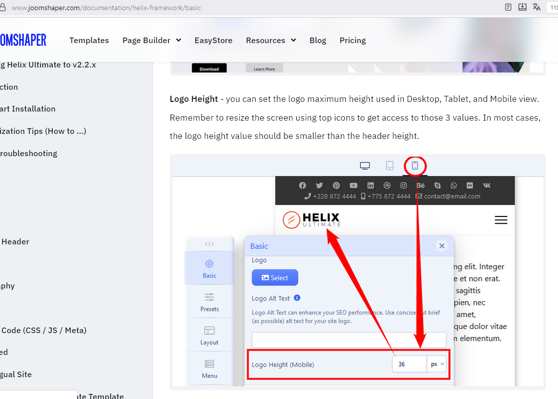
Have you tried to change Logo height from Template Options settings, first you have to click "Mobile" icon at the top, then change height value, and Save & Close.