

Row Containing 2 Buttons Not Displaying Well On Small Screens & Mobiles
marley man
I'm designing a new website: http://72.52.156.215/~themosquitoman/ I needed a large image on this homepage with text and 2 buttons on top of it, so I added an image to a section background, and then added a heading and a row with the 2 buttons on top of the section with the background image.
Unfortunately, when I shrink down the browser to a smaller size, those buttons get squeezed together instead of displaying them like button 1, then button 2 below button 1.
Can you explain how to correct this issue on smaller screen sized please? Thank you

Paul Frankowski
Accepted AnswerPlease use it inside Page Settings > Page CSS > Custom CSS
and only a new version of code.
Paul Frankowski
Accepted AnswerHi,
Two Quick Tips:
- If you used two different Button addons, you can set also Margin (top/right/bottom/left) then it will help to have space between them, also on mobile view. No CSS hacks, just basic settings.
- Instead of using columns and two separate addons, you could use Button Group addon (LESS IS MORE)
marley man
Accepted AnswerThanks Paul, but if I use a button group add-on, I wouldn't be able to display these two buttons side by side like I'm trying to mimic this homepage with their button side by side on top of their image: https://moshield.com/
Paul Frankowski
Accepted Answerin that case use tip No 1
If you need a video guide ping me tomorrow (+10h), I am going sleep now, sorry late hour.
BTW
As I saw on moshield they used extra CSS
@media (max-width: 767px) {
  .mos-btn-alt {
    width: 100%;
    max-width: 350px;
  }
}
to improve view on iphone. But also margin value for buttons.
marley man
Accepted AnswerHi Paul, I am already using 2 different button addons in a row. Just to confirm, that is the setup (#1) that you're suggesting right? inside a row? Thanks Janel
Paul Frankowski
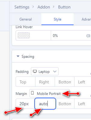
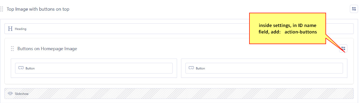
Accepted Answer2nd step. To make it "nice", inside internal Row add ID name (in Row settings), for example, action-buttons
Paul Frankowski
Accepted Answer3rd step, if you done 1 & 2nd as I asked.
Now we will grab an idea from moshield site.
@media screen and (max-width: 680px) {
#action-buttons  .sppb-btn {width: 100%;max-width: 320px;  display: block;}
}
as you see, this is still CSS basics. To be honest, using 3rd step (with extra margin value) you could replace first step. But it's worth to know how, and for is (1).
marley man
Accepted AnswerPaul, I've done all your steps so far...can you please clear your cache and let me know how these 2 buttons look on your smaller screen & Mobile? Thanks Janel http://72.52.156.215/~themosquitoman/
Paul Frankowski
Accepted AnswerYou still need to do 2 & 3 step exactly as told you.
But even now on mobile view I see 10px space between buttons.
Paul Frankowski
Accepted AnswerYou added ID name in wrong Section, it was screenshot with red arrow !!!
and there is missing "and" here
@media screen and (max-width: 680px) {
No morning Coffee ?? ;) please look again, and correct mistakes.
marley man
Accepted AnswerAnd I did the 3rd step by adding the CSS you suggested below that int he Custom CSS field. Does it look good now to you?...thanks again Paul
Paul Frankowski
Accepted Answerabout 3rd step, I see that extra CSS line is needed, becuase of your grid settings (I didn't see it before), so here is NEW step 3:
@media screen and (max-width: 680px) {
#action-buttons  .sppb-btn  {width: 100%;max-width: 320px; display: block; margin: 5px auto;}
 .sp-page-builder .page-content #action-buttons {width: 100%;}
 }
and you own me Orange juice, becuase I don't drink coffee.
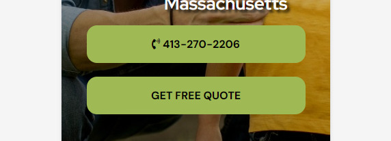
AFTER on IPHONE
Paul Frankowski
Accepted AnswerAfter wine, I cannot write stright , hahaha