

Error At The Bottom Of My Testsite (maybe Helix Or Pagebuilder)

BassLast
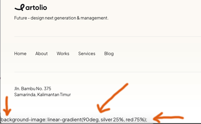
Hi! Where is the mistake based and why is it?
"background-image: linear-gradient(90deg, silver 25%, red 75%); "

Atick Eashrak Shuvo
Accepted AnswerHello BassLast,
Thank you for reporting this issue. I apologize for the inconvenience you're experiencing with the error on your test site.
To investigate this further and hopefully resolve it quickly, would you be willing to grant me temporary administrative access? Before you do, I highly recommend creating a full backup of your site to ensure data security.
Looking forward to your response.
Best regards

Paul Frankowski
Accepted AnswerIn CSS, the property background-image: linear-gradient(90deg, silver 25%, red 75%); defines a smooth color transition across an element.
Here is the breakdown of how the browser interprets this:
- The Direction:
90deg
The angle 90 degrees tells the gradient to move horizontally from left to right.
- would go from bottom to top.
- would go from top to bottom.
- The Color Stops
The percentages (25% and 75%) act as "anchors" for the colors. They control how much of each color is solid versus how much is blending.
- Silver at 25%: The color is solid silver from the very beginning (0%) until it reaches the 25% mark of the element's width.
- The Transition: Between 25% and 75%, the browser calculates the math to blend silver into red. This is where the actual "gradient" effect happens.
- Red at 75%: Once the gradient reaches 75% of the width, it becomes solid red and stays that way until the end (100%).
Why use percentages?
Without percentages (linear-gradient(90deg, silver, red)), the transition would start at 0% and end at 100%, making the entire element look "blurry." By using 25% and 75%, you create a more defined look with solid color blocks on the sides and a controlled blend in the middle.
So I am not sure what does it mean "error" in your case ??
BassLast
Accepted AnswerOkay, sorry for the incorrect expression! In any case, that shouldn't be displayed below. I tried to comment it out, but it doesn't work. Which script is affecting it?
Paul Frankowski
Accepted Answer- You have to check what .css file added that or maybe it's inline css code.
- You cannot edit template style files, so you have to override it using Custom CSS. As we teach in Helix documenation.
You forgot to mention full template name (!), becuase here we support only our templates, not from other providers/sellers.