

Text Wrap - Divs?

PhoenixGB
HI
I want to wrap text around and object, prob a dynamic contant text box and or image. I have been using PB for years and for some reason just cant get it,
Anyone help me? TIA
Robert
Accepted AnswerBlock makes an element start on a new line and take up the full available width by default.
inline-block keeps the element inline (no new line) but still allows you to set width and height.
Flex makes the element behave like a block-level container and enables flexbox layout for its children, allowing advanced alignment and spacing control.
Inline-flex works like flex (flexbox for the children) but the element itself behaves inline instead of starting on a new line.
You can change the layouts better for responsive purpose. For example when you have a 4 column row it often looks bad on tablet. Using divs I change the colums to vertical sooner so it all shows good. dozens of ways to use the divs. Often also divs in divs to get the behavior I want.
Just play with it to see what it does, its quite powerfull. Also for backgrounds behind an element.

Ziaul Kabir
Accepted AnswerHi PhoenixGB,
Thanks for reaching out to us.
Robert’s explanation about block, inline-block, and flex is technically correct — those control layout behavior and responsiveness.
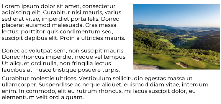
However, they won’t create true text wrapping. If your goal is to have text flow around an image or dynamic content box (magazine-style), you’ll need to use float: left; or float: right;, and make sure both elements are inside the same column.
Please, share your url with me. Let me check your rendered blocks.
Thanks
PhoenixGB
Accepted AnswerHi Ziaul
I have a test page set up, if i send the SA details in Hidden could u set it up for me so its as the the original image i used? Once iknow how its done I can carry on.
Thanks
PhoenixGB
Accepted AnswerGuys I have a deadline to complete this site, some help ASAP would be verty much appreciated.
Ziaul Kabir
Accepted AnswerHello,
Thanks for your reply.
First, please note that this type of support is not officially provided. However, I’ve added two solutions for you:
- Using Text Block + Image Addons
- Using a Raw HTML Addon
Both approaches require some CSS adjustments to work correctly.
You can check the implementation in this screenshot: https://prnt.sc/FyIAyXihajCo
Thanks.