

Menu Wrap - Menus Looks Weird
J
Jeanette
Hi, I experience that the menus look strange when i make the desktop screen smaller / or the client has a less size on the screen. The wrapping is weird:
- the space between the wrapping becomes very big t
- some menu items are only half visible at the top
- some menu items are wrapped down

Can you help?
25 Answers
Order by
Oldest

Paul Frankowski
Accepted AnswerI did something else. Anyway, now Logo column is col-3 and menu is col-9, it means that you have more space for menu items.
Paul Frankowski
Accepted AnswerHi Jeanette.
If you have our template (!) - please read & implement CSS corrections >> https://www.joomshaper.com/documentation/helix-framework/customization-tips#how-to-reduce-space-between-menu-items
I can help after, not before.
Paul Frankowski
Accepted AnswerIn most cases:
1st step: Use that Custom CSS :
#sp-menu {padding: 0;}
2nd step, reduce menu font-size. For example, if you have 19px use 17px (less 2px!)
3rd step: Reduce space between menu items (1px or 2px less), using Custom CSS.
and there will be more space to hold all Menu items in one row. Easy.
J
Jeanette
Accepted AnswerThank you Paul,
I am sorry to say i cant make it work :( I have tried to remove everything i had in the custom.css file, and put stuff in again, but seems i am not able to see why its not working. Do you mind have a look?
Paul Frankowski
Accepted AnswerYes, probably it was server cache or your browser cache - all is OK. Just check site in Incognito Mode.
- Ctrl +Shift + p (Firefox)
- Ctrl + Shift + n (Chrome)
Please mark topic as solved.
J
Jeanette
Accepted AnswerHi again Paul,
I dont look right even in inkognito mode: (https://www.portsystemas.no/images/ney1.jpg)
As you can see the menuline are wrapped into two, the top you can only see half the letters and there is a very big gap before the rest of the menu.
Paul Frankowski
Accepted AnswerIt depends on the screen, on my 23" was/is fully OK.
If you have laptop, indeed extra CSS line may be needed. What resolution and screen size do you have ???
Paul Frankowski
Accepted Answeron resolution 1680px and 1440px and 1366px should be OK now, check in Icognito mode. I added extra CSS rules.
J
Jeanette
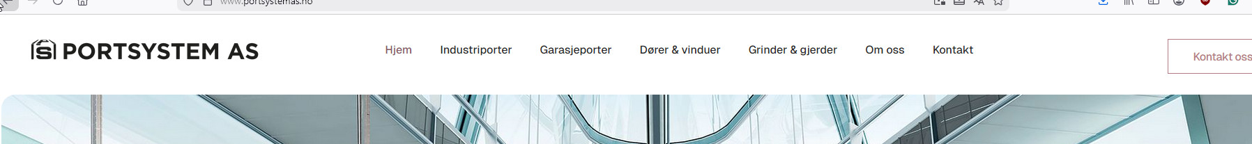
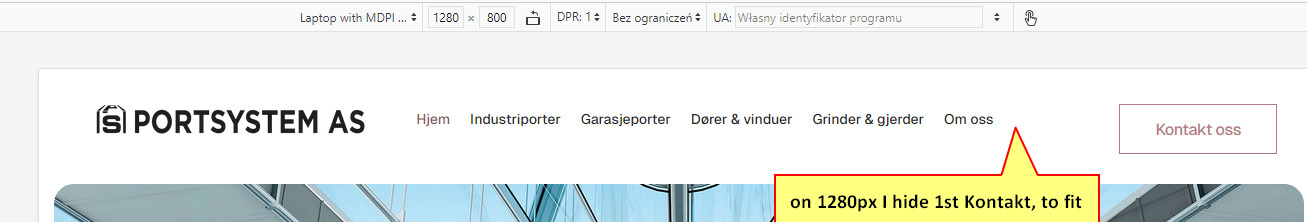
Accepted AnswerI have 1920 x 1080 and it looks good on my screen. But it dont look good on my clients pc', and it dont look good when you make the browser window smaller.
The menus on the webpage are supposed to look good no matter the resolution.
It dont help that it looks good at your screen when its not responsive/wrap better on other users screens.
And for the Kontakt button, even if i remove this it dont help. It still wraps and looks bad.
J
Jeanette
Accepted AnswerThere must be something off on this whole menu. When you resize a webpage, the menutop are to be responsive.
In this template when you resize down the browser, the menu dont become correct responsive. The way you describe this to me, it seems you have to address every possible browzer size to make to menu look correct.
1055 dont lok ok - 
1280 dont look ok - its missing the last menu item called Kontakt which probably are wrapped under the image.

Here are two other examples on me just changing the browser size randomly where the menu looks bad:


Paul Frankowski
Accepted AnswerI repeat again, this is NOT a template issue, it's a simple grid math. If there is no space for menu items, items collapse. I done even more than I should, it was customization.
If you want to make it OK, also for 1024px (and/or less than 1280px) - you have two options:
- Enable Mobile Menu faster (described in documenation: https://www.joomshaper.com/documentation/helix-framework/customization-tips#span-class-h3-how-to-show-offcanvas-menu-sooner-span )
- OR sdd extra @media rule and reduce menu item font-size even more.
J
Jeanette
Accepted AnswerAs i see it, it is a template issue when the wrapping gives an enormous gap between the wrapped rows, and makes the top part of the menu letters beeing cut so that only half of the letters are displayed.
I understand that there are less space when wrapping the browser, but i dont expect the menuitems to end up like this.
Paul Frankowski
Accepted AnswerI use WordPress themes and there is the same. Two rows if menu is too long.
Paul Frankowski
Accepted AnswerIf you dediced to remove button from header in that case you have to increase Menu column size. Boostrap grid!
@media screen and (min-width: 999px) {
#sp-menu {width: 75%;}
}
and that line is not needed anymore
#sp-menu { padding: 0; }
J
Jeanette
Accepted AnswerHi Paul, I appreciate you have tried to help me, but unfortunately it has not given me the results i needed to fix the menu. I have tried everything you told me but the letters in the menu are still cut in half when the menu wraps.
I had a "talk" with chatgpt and it helped. If you like to see how it now looks, you can check it here: [https://www.portsystemas.no/]
Maybe its just language issues making us not understand / speaking pass each other.
Anyways, its good now.
Paul Frankowski
Accepted AnswerAfter all I would create a custom header with two columns (logo+menu) and life would be easier.
But if current solution with "line-height:1.3" also work, maybe tip for next time
J
Jeanette
Accepted AnswerI did try that, using a 4+8 (logo + menu modules) but it gave me a croppet logo and a squeezed together menuline, and i could not figure out how to fix it. Looked like the 8 column was not 100% in size, but it was set to fluid width.
Paul Frankowski
Accepted Answerif logo was squeezed/resized - in most cases it means that logo height value is/was wrong.
Your logo is wide, so it need col-lg-3 for Desktop/Laptop
then simple math: 12-3=9 and set col-lg-9 for Menu
all is based on Bootstrap Grid 12
J
Jeanette
Accepted AnswerI have tried that too. [https://www.vatnamo.no/porter/images/logomenu.jpg]
Paul Frankowski
Accepted Answerprobably you made basic popular mistake like not adding "header" name for that row, hmm?
J
Jeanette
Accepted AnswerYes i did, cause that was written in your documentation. But i also tried without the header reference, and it was the same result unfortunately.