

Wimble-Template - Pos1/Pos2 - How To Configure?
Michael
Hello,
I have created a new area with top1 and top2 in the template settings (layout-Builder).
In the basic settings is set that the social icons are on Pos1 and the contact information is on Pos2.
So far so good.
They are also displayed above the menu (predefined header). BUT:
-
they are not clickable (seem to be behind the menu) - how can I change that ?
-
the background of the modules is gray, where can i change it to transparent so that my background of the page builder is exactly like it is in the menu behind it?
-
where can I set which social icons are displayed?
-
the format is very bad (where can I adjust it? which css formats?)
Thanks and Regards

Ariba
Accepted AnswerYou are most welcome.
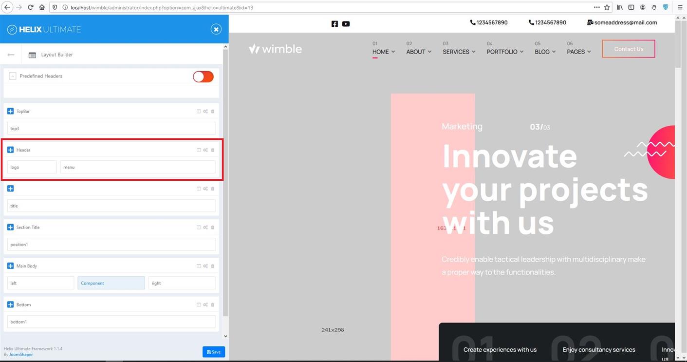
If you want to place top1 & top2 before header, you need to turn off predefined header and create a custom one like in the screenshot below:
Also use the following css rules in custom CSS section:
#sp-header {
    position: absolute;
    top: 50px !important;
}
#sp-header.header-sticky {
    top: 0px !important;
}
Hope that helps you :)
Please do let me know if you have any confusion
Ariba
Accepted AnswerCould you please provide me the site URL? Also kindly share your administrative access please. Use the hidden mode to send the log in credentials.
Michael
Accepted AnswerHello, no more reaction? Are you still working on it? No solution or idea?
Ariba
Accepted AnswerHello
Sorry for the unwanted delay.
Q1. They are not clickable (seem to be behind the menu):
Because you are using the default header, which has been set as the top most element of the page and you have enabled top1 & top2, which again by default they are placed in top most position. Both section are placed in the top that is why they are on top of each other and one i clickable. You need to set margin-top css rule for the section that contains top1 & top2. The value of the margin-top will be the height you have set of the header. So that the top1 & top2 is placed after the header.
Q2. The background of the modules is gray, where can i change it to transparent so that my background of the page builder is exactly like it is in the menu behind it?:
Could you specify which modules you want to make transparent?
Q3 where can I set which social icons are displayed?:
From "Template Options" go to "Basic" settings. In "Social Icons" section remove the string "#" from the address input box of the social sites you don't want to display.
Q4 the format is very bad (where can I adjust it? which css formats?):
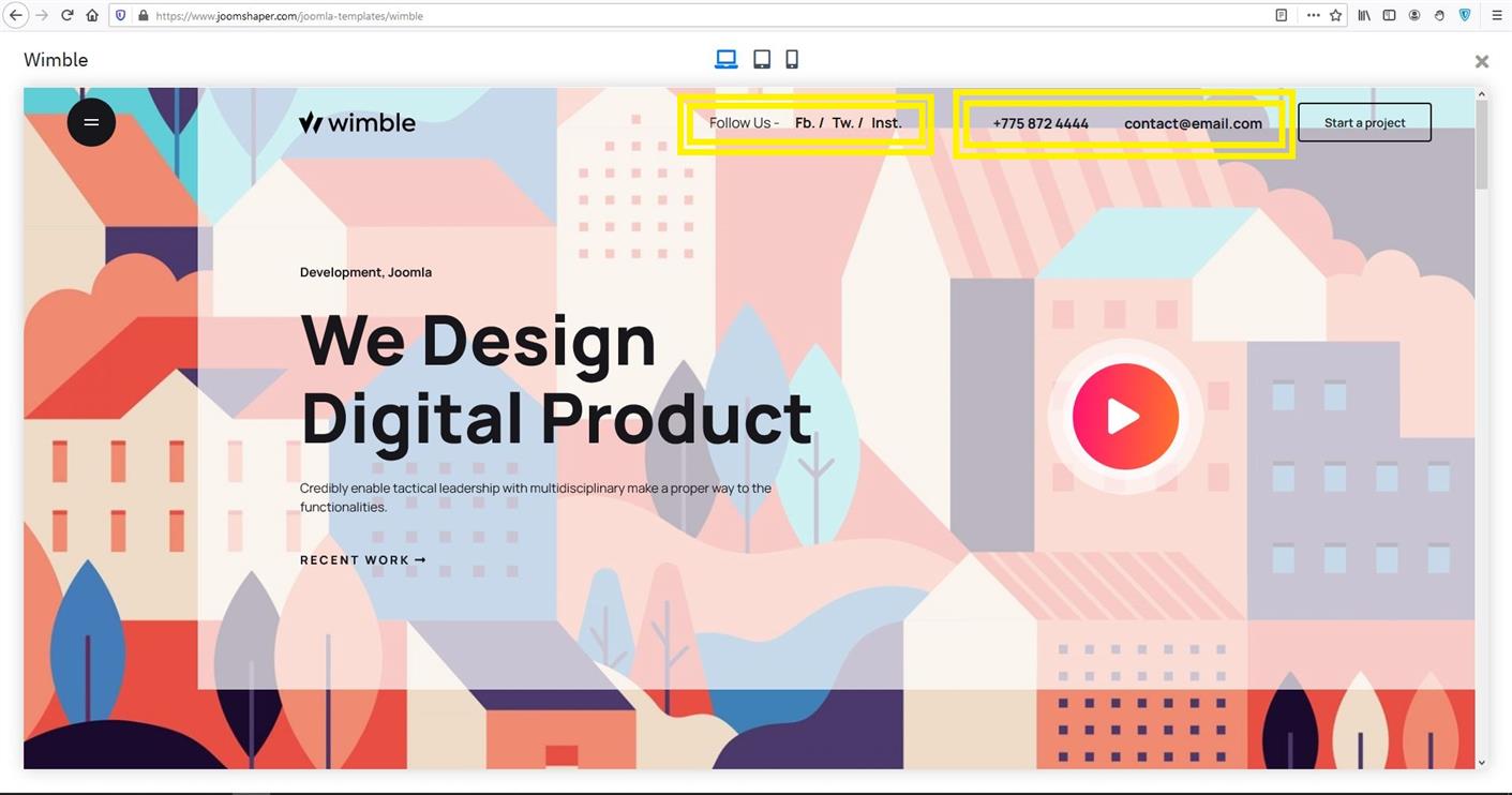
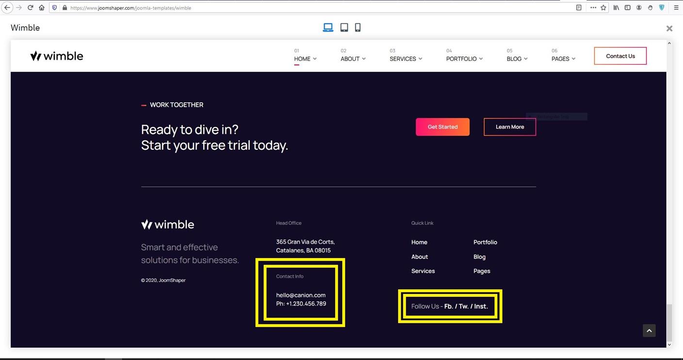
Kindly check the following two screenshots below - they are taken from the "Wimble" template preview page. I have highlighted some sections with yellow rectangular box. These are the contents of "top1" & "top2". And this is how they are designed to use in this particular template. That's why they are rendered this way in your site.
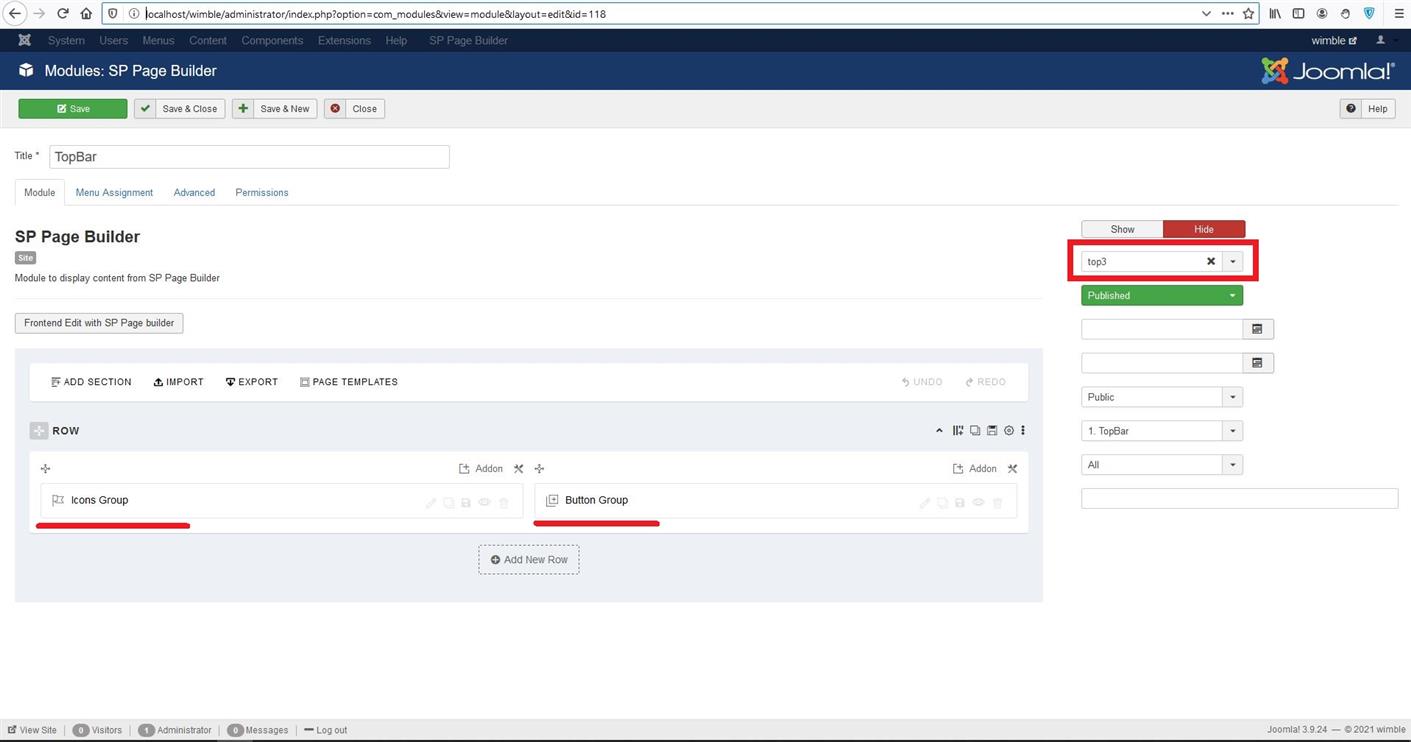
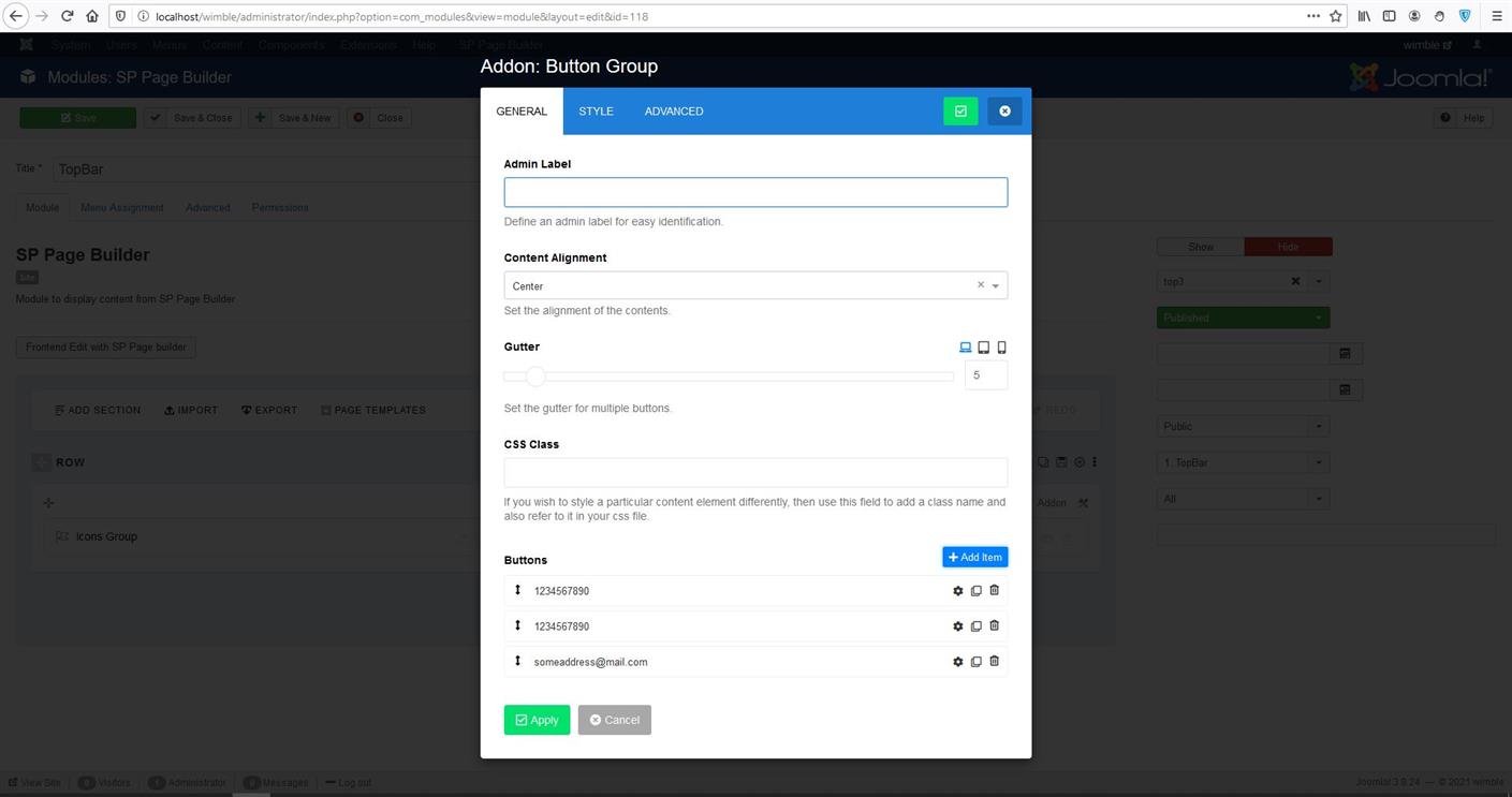
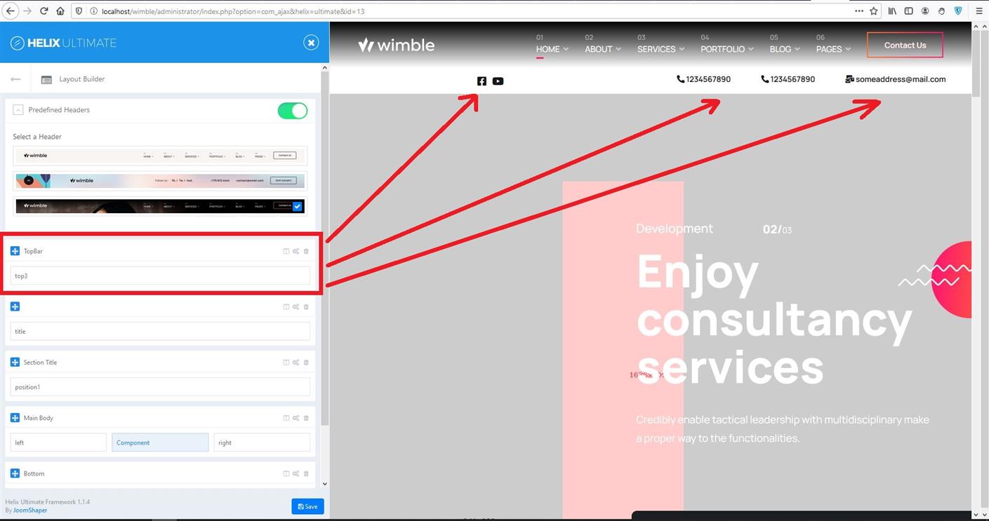
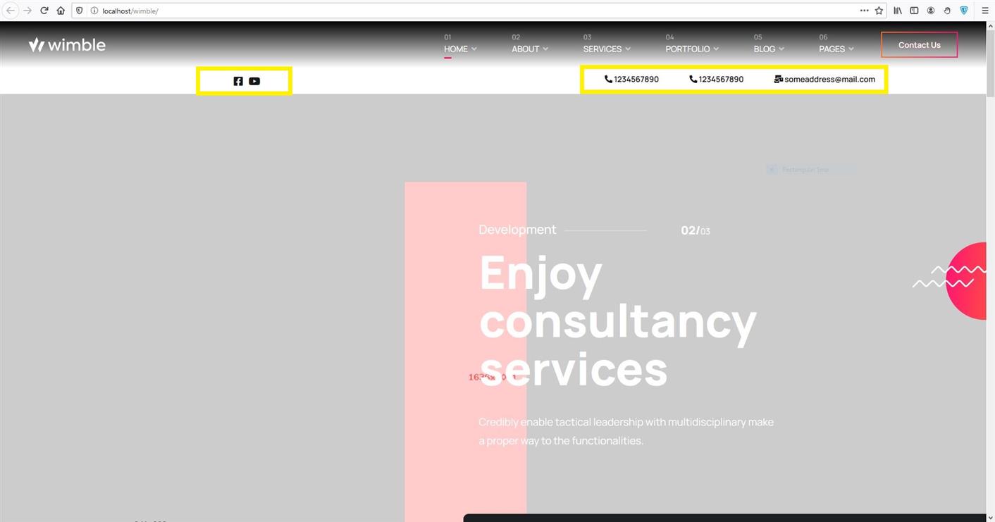
What you can do to improve is build a custom SP Page Builder type Module that will contain social icon group & button group addons. Kindly check the screenshots below. I have tested this in my localhost. See how it rendered in the final image. And I have set it to be positioned after the header menu - so they don't render in the same position.
Michael
Accepted AnswerThank you very much for the very detailed answer! I'll take a look at it again.
Two quick questions: Regarding question 1: That means that I can only place the Top section (with Top1 + Top2) with the margin top under the header (menu)?
Regarding question 4: The same thing. I only get the "Top1 + Top2 information" under the header section?
My dream would actually be the solution from the Templete Floox. Unfortunately this is still in Helix3.
Nevertheless, first of all, thank you very much for your efforts. I'll try your suggestions again.
PS: Q2: I found it: body.default-home #sp-header.transparent-header { background-image: linear-gradient(180deg, #000 0%, rgba(0, 0, 0, 0) 100%); }
Michael
Accepted AnswerOk, i almost thought so, afraid :) this would be the solution. I think that's a possible option. Thanks for the css specification.