

Offcanvas Menu is Not Working Properly
Nicole Otto
On our site fenstrainsurance.com our offcanvas menu is not working properly. When we click on the menu when it is on mobile, it just gives me a # at the end of the URL. The site is now live and it needs to be resolved as soon as possible.

Ariba
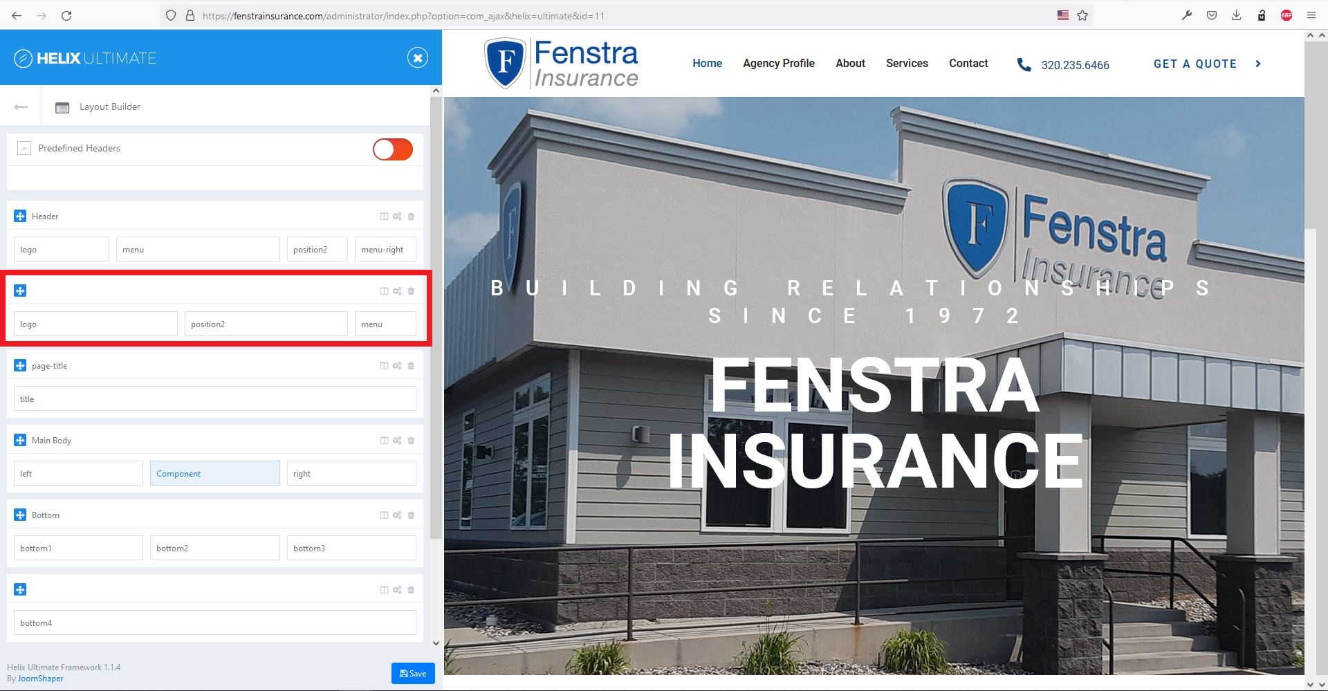
Accepted AnswerPlease see the attached screenshot below. You don't need the red marked area. Please remove it. You can edit the column visibility from column options. Example: if you want to hide "Menu-Right" in tablet & mobile devices, you can go to column options -> responsive area and toggle the phone, tablet buttons.
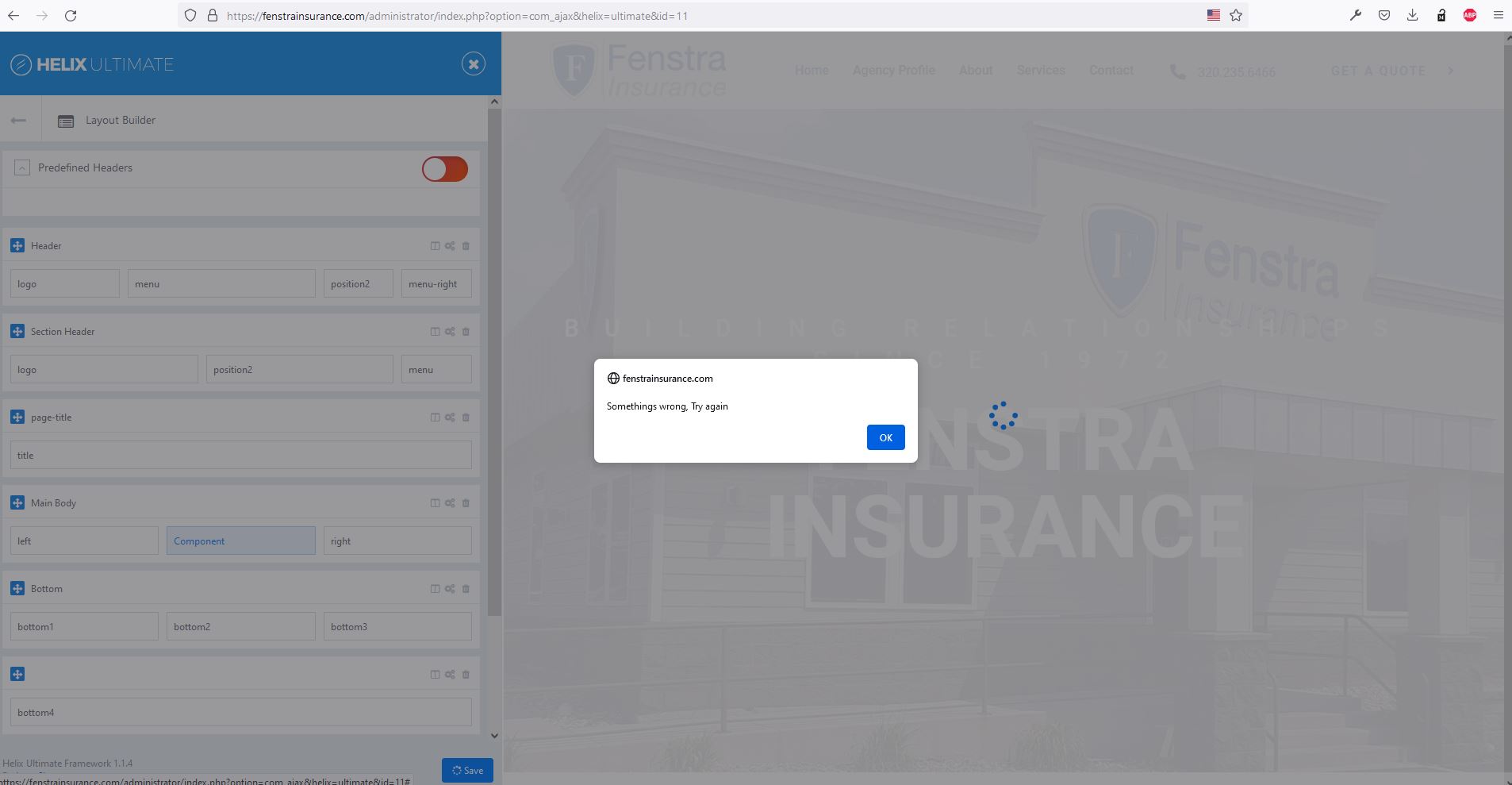
I tried to edit the layout but it does not save and gives a error - see in the screenshot below.
The menu inside the header will work fine once you remove the red marked area from layout. Now the header row is hidden on mobile & tablet.
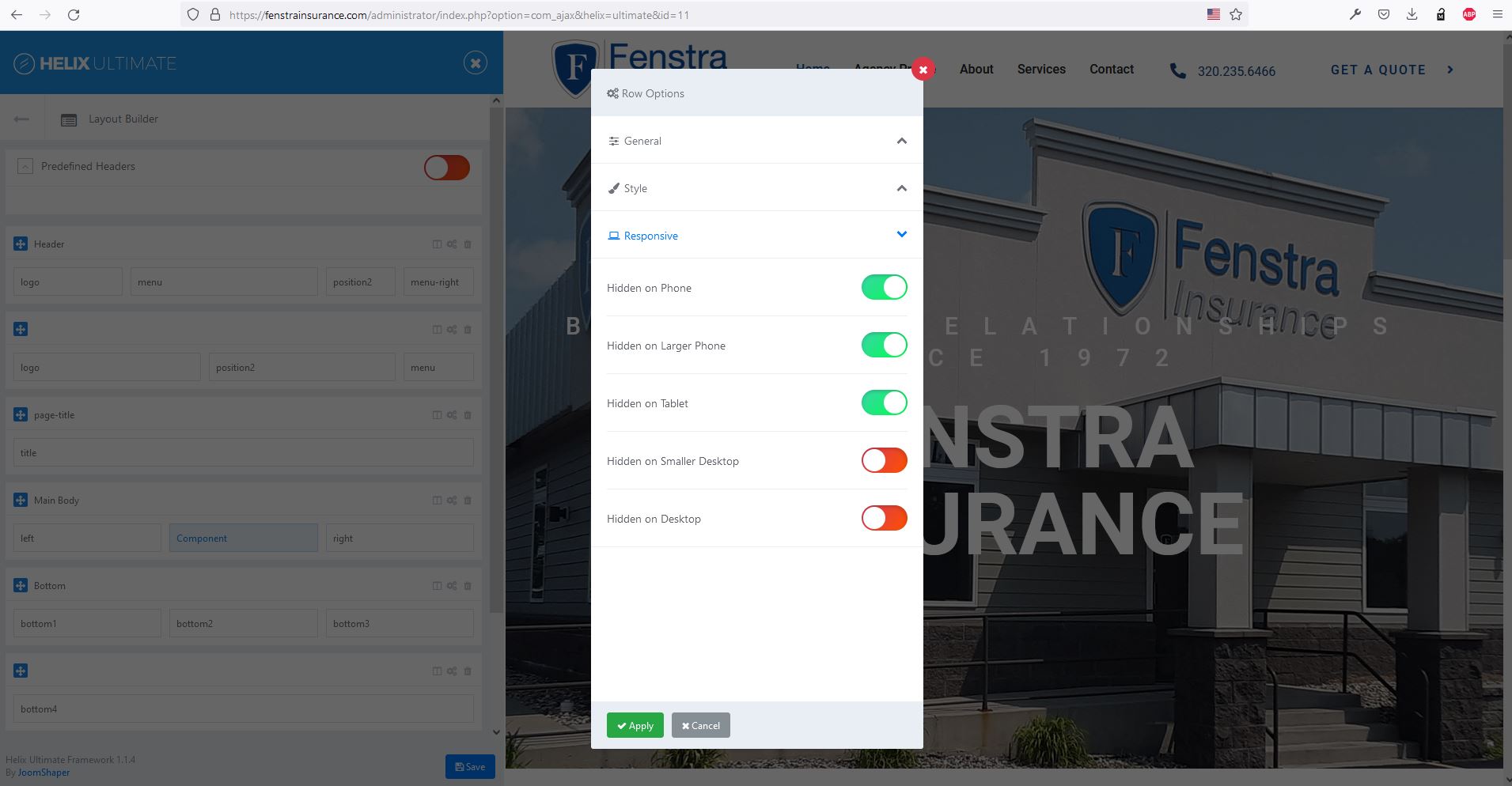
You need to disable these three toggole buttons:
 Please do let me know if that works.