Off-canvas Menu Position Changes On Resize
clausjepsen
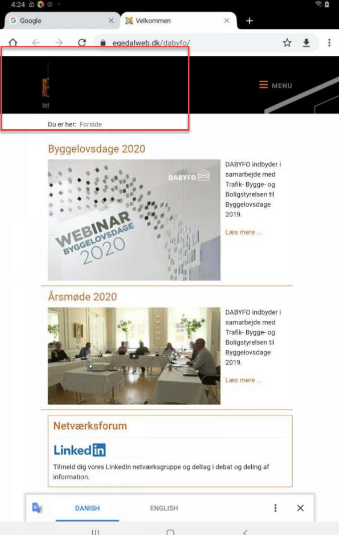
On this site: https://www.egedalweb.dk/dabyfo/
My menu is the off-canvas menu. If I resize the browser window (smaller) or view on smartphone, the offcanvas menu moves into the body instead of staying in the header.
How can I force it to stay on resize?

Mehtaz Afsana Borsha
Accepted AnswerHi, It looks like this on my end https://prnt.sc/wsxqlw
clausjepsen
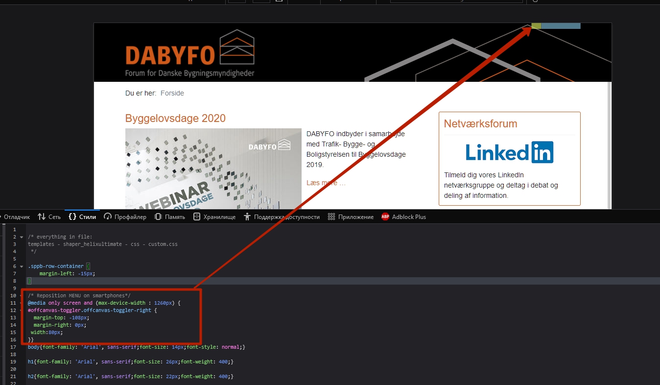
Accepted AnswerHi, I did some googling and came up with the @media custom css to correct it as shown by Pavel.
Pavel: Please verify if it looks correct now.

Pavel
Accepted AnswerHi. It still looks wrong. You should completely remove your code.
/* Adjust Menu position on Smartphones*/
#offcanvas-toggler.offcanvas-toggler-right {
  margin-top: -108px;
  margin-right: 0px;
 width:80px;
}
And instead, adjust the column widths in the Helix Ultimate layout builder. Read the Helix documentation https://www.joomshaper.com/documentation/helix-framework/helixultimate/layout-builder, it is very helpful.
Your mobile columns now look like this.
 You should set it up like this
clausjepsen
Accepted AnswerHi again,
I think I managed it now - at least part of it.
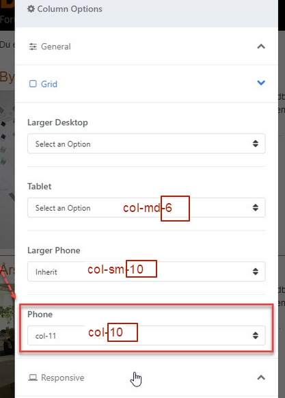
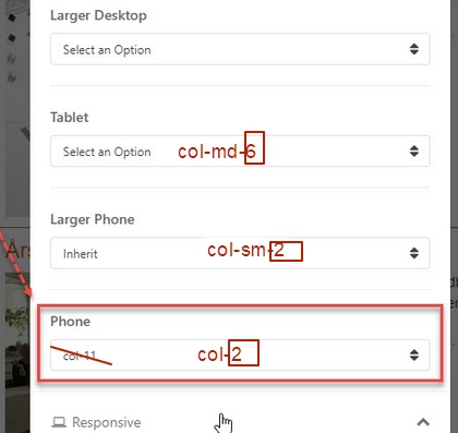
Using Column Options, I could set which bootstrap column to use on Smaller Phones. Had to set both "Logo" to col-1 and "Menu" to col-11 for "phones" in order to work (see image 1).
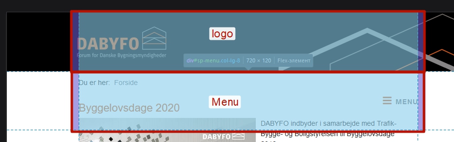
On tablets, I can do the same, but when fixing the logo at col-1 it squeezes to be within the col-1. How to overcome that? (image 2). I solved it on phone, by decreasing logo size for small screens. Is that the way to do it?
/* Decrease logo-size on Smartphones*/
.logo-image {
  display: block;
  max-width:200px;
  max-height:78px;
  width: auto;
  height: auto;
}
Image 1: Column options to set bootstrap column
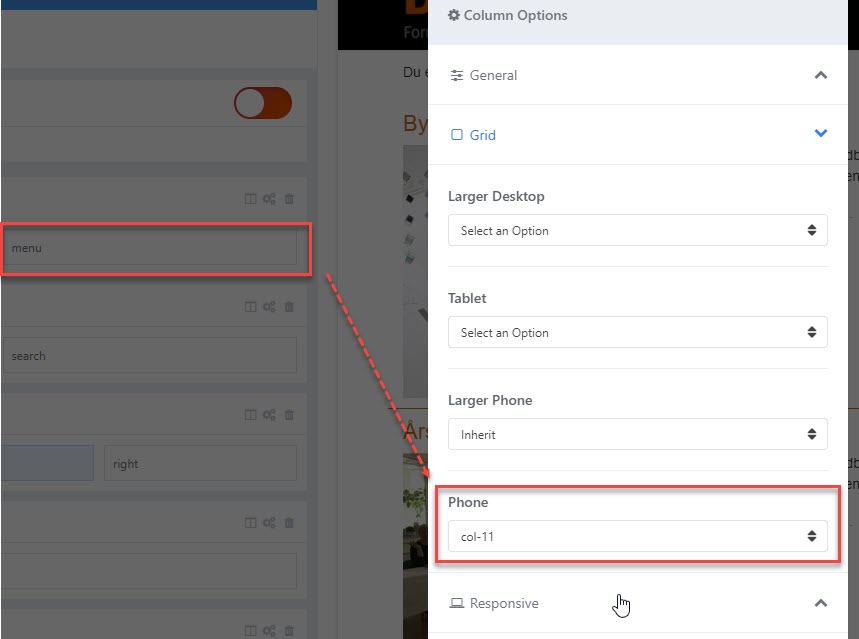
Image 2: On larger screens the logo squeezes
Pavel
Accepted AnswerHi.
You don't need css code. Just set up the columns.
For exemple:
tablet - logo 6 menu 6
phone (and larger phone) - logo 10 menu 2
clausjepsen
Accepted Answer@Pavel Not sure I fully understand you. On my "Logo" I can set column by device, but what do you mean by: "logo 6" and "logo 10" ?
Pavel
Accepted AnswerHi. Yes, set column by device. I meant it.
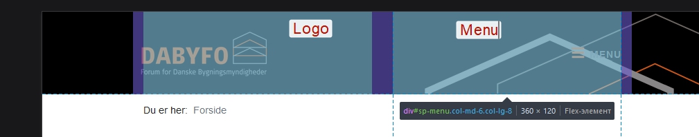
Screen for Menu column
Screen for Logo column