

Header Customazation
Martin Seidl
Hi Team, I was using the aresmurphy template and the header had no background.the menu is on the background image. see it here: https://dosch2.arkiadesign.de/angebote-dosch/klangbehandlung.html I switched to helix framework for it is Joomla 4 compatible, but how to make the header section without background in the main navigation like in aresmurphy? see here: https://dosch2.arkiadesign.de/termine.html

Ofi Khan
Accepted AnswerHello Martin Seidl
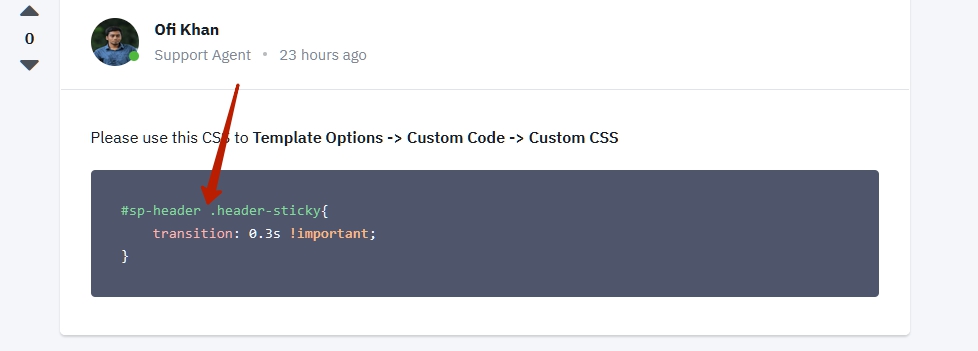
Please use this CSS to Template Options -> Custom Code -> Custom CSS
#sp-header {
    background: transparent;
    position: absolute;
    box-shadow: none;
}
Best regards
Martin Seidl
Accepted Answerthnx Ofi, but how can I have the sticky logo with padding-top:0px; and the normal log with padding-top:50px;?
There is also a strange behaviour in the header when I scroll down, it seems like there is a horizontal line coming.
I want the header like here: https://dosch2.arkiadesign.de/ not like here: https://dosch2.arkiadesign.de/angebote-dosch/klangbehandlung.html (the logo should not have padding top)
thnx
Ofi Khan
Accepted AnswerPlease use this CSS to Template Options -> Custom Code -> Custom CSS
.header-sticky .logo{
    padding-top: 0px !important;
}Martin Seidl
Accepted Answergreat, thnx, one step more, now the last step:-)
see, the change/switch (by scrolling down) from normal header to sticky header is much more smooth in the old template https://dosch2.arkiadesign.de then here: https://dosch2.arkiadesign.de/angebote-dosch/klangbehandlung.html what to do?
Ofi Khan
Accepted AnswerPlease use this CSS to Template Options -> Custom Code -> Custom CSS
#sp-header .header-sticky{
    transition: 0.3s !important;
}Martin Seidl
Accepted Answersorry I cant see any change :-( I tried also
sp-header .header-sticky{
-webkit-transition: 0.3s!important; transition: 0.3s!important; }
but no change or improvement. the header jumps still very quickly to the top, even if i change the value
Ofi Khan
Accepted AnswerPlease use this CSS to Template Options -> Custom Code -> Custom CSS
#sp-header .header-sticky{
    -webkit-transition: 0.3s !important;
    transition: 0.3s !important;
}
Then clear your Joomla cache and Browser's cache and then check. If possible, then check with a different browser.
Martin Seidl
Accepted AnswerI did as you said. I cleared also browser cache and I have a browser without caching, but no result. it is still junping too fast.
Ofi Khan
Accepted AnswerBoth the sites have the same CSS used. Please check if there is other thing causing this issue. I have no clue since I see it fine.

Pavel
Accepted AnswerHere is a mistake. There should not be a space.
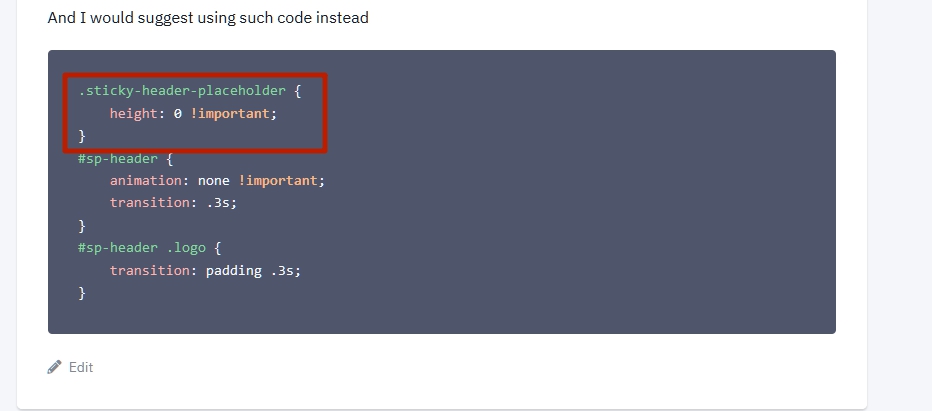
 And I would suggest using such code instead
.sticky-header-placeholder {
    height: 0 !important;
}
#sp-header {
    animation: none !important;
    transition: .3s;
}
#sp-header .logo {
    transition: padding .3s;
}Martin Seidl
Accepted AnswerPavel, fantastic!!! it works, just on mobile view it looks horrible....if u like help me....later i can look myself....
Pavel
Accepted AnswerHere are fixes for mobile on the basis of your code
@media (max-width: 991px) {
    #sp-header .logo {
        height: 60px !important;
    }
}
But in general, the code that you used for Desktop is not a very successful solution. Therefore, this hotfix longer looks like a crutch.
Martin Seidl
Accepted Answergreat, thnx, need ot see how I will work out mobile view. right now there is conflict with slideshow
Pavel
Accepted AnswerI do not see a slideshow.
By the way, pay attention, I updated the code while you saw the old version. Additional important point in using this part.
Martin Seidl
Accepted Answersee mobile vie including slideshow and your new code. the logo is too small and above slideshow. thnx, dear for all!
Martin Seidl
Accepted Answer
Pavel
Accepted AnswerRemove that
@media (max-width: 991px) {
    #sp-header .logo {
        height: 60px !important;
    }
}
Use it with your values instead.
@media (max-width: 991px) {
   #sp-header {
       height: auto !important;
   }
   #sp-header .logo {
       height: inherit !important;
       padding-top: 30px;
   }
   .logo-image {
       height: 80px;
   }
}