

Menu CTA Button Formatting Issue

Melissa
I'm using Joomla 4. Template Barber.
The menu call to action button is changing format, depending on the screen resolution. As far as I can tell, it's not a simple desktop vs tablet vs mobile responsive issue as the format only changes with certain desktop dimensions.
Between 1441px and 1761px the button becomes smaller, the menu shifts, and a social icon jumps to the next row. [See screenshot "A"]
1762px+ & 1440px - 1200px the CTA button formats correctly, but the menu is also shifted to the left [See screenshot "B"]
Please advise. Thank you.


Website
https://hairlogicbeautybar.com/
7 Answers
Order by
Oldest

Ariba
Accepted AnswerHello
Thank you for your patience.
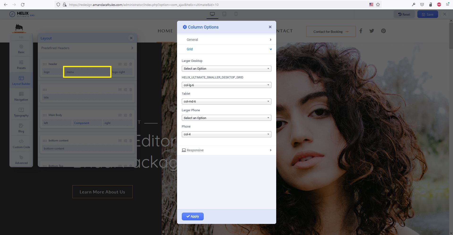
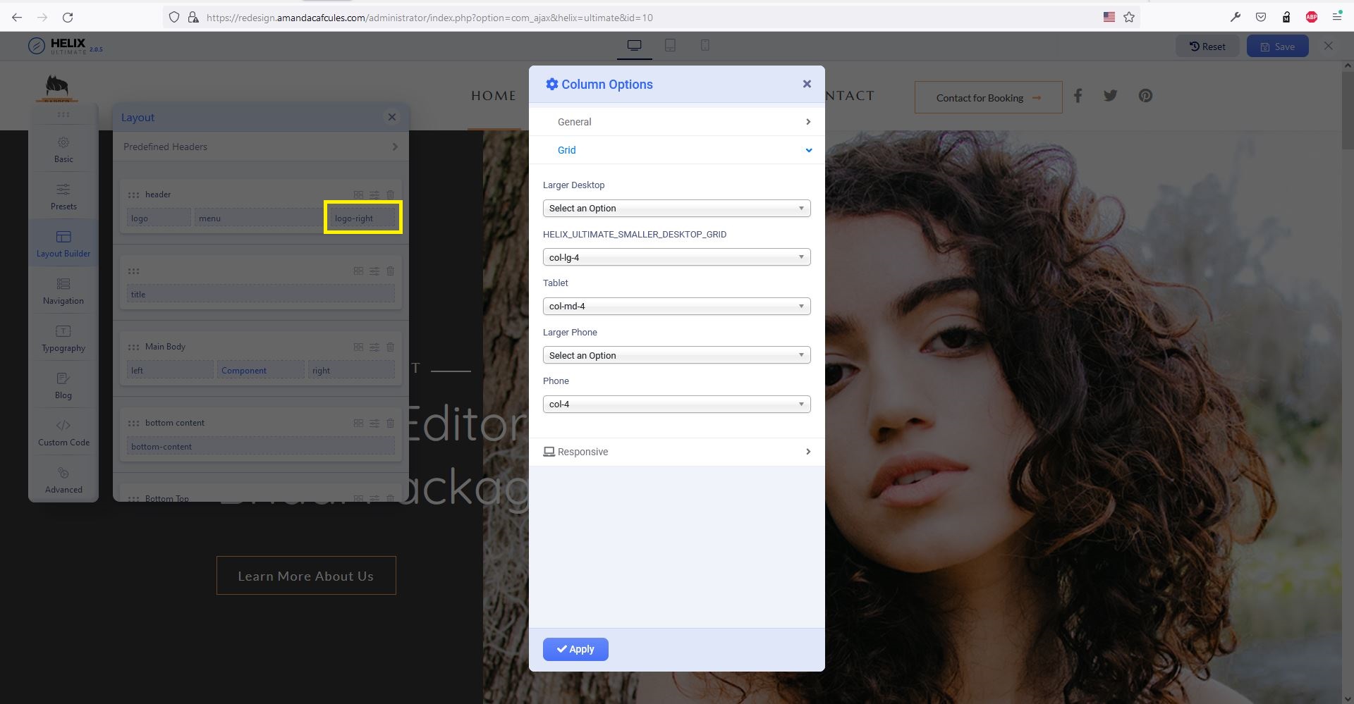
Please check now, it should be alright. I have added the following css rules in custom code section and changed some column settings as shown in the screenshots:
#sp-header #sp-logo-right {
    margin-left: inherit;
}
@media (max-width:991px) {
    #sp-header #sp-logo-right {
            margin-left: auto;
        }
}
Ariba
Accepted AnswerHello
Thank you for your query. Could you please share your administrative access? Use the hidden mode to share the log in credentials.
Melissa
Accepted AnswerJust FYI, I have another comment posted regarding issues with Helix working with Joomla 4 on this domain.
I assume you will need access to custom code section within the template and right now since that isn't available due to the other issue I will repond with the requested information once that issue is resolved.
Thanks,
Melissa
Accepted AnswerMy issue with Helix working with Joomla 4 was solved, so I've shared the login credentials in hidden content for this issue with the menu button on this post.
Thanks and let me know if you need anything else.
Melissa
Accepted AnswerBump. Just following up on this. It's been a few days since I've posted the requested information.
Please advise.
Melissa
Accepted AnswerYes, it works! Thank you for the fix and posting the solution publicly. I appreciate all your help.