

Set A Button Over An Image
francesco1980
I have a page that need to show different images on a computer, a tablet and a smartphone. In order to do that I used 3 image add-on and set each of them to show only on the proper device. I also used a button add-on to show only on a smartphone and used the custom position to move this button over the image.
I please you to check if this approach is the best possible or if there are other solutions that are more effective.
I would also ask you to explain why on a smartphone a strange symbol (a large arrow down) appears between the first and second row of the page.
Thank you for your support

Paul Frankowski
Accepted AnswerOk, check your website. Some done by addon settings and rest by custom CSS. I finished my job for today.
Paul Frankowski
Accepted AnswerCiao.
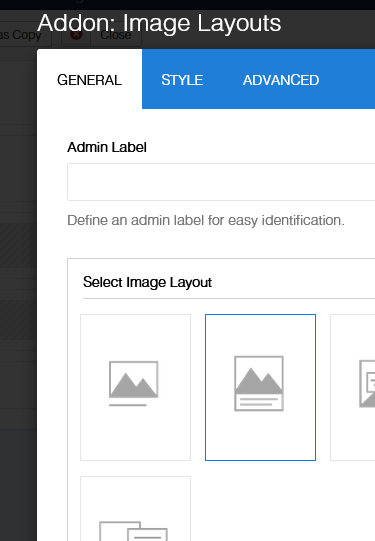
We have Addon: Image Layouts - which is much more flexible than using 2 different addons. Check its "Content Order Options".
francesco1980
Accepted AnswerI followed your suggestion using an Image layout but I need help to set i properly. This is what I got https://pasteboard.co/7HeZG41miSYz.jpg but I need to understand how to eliminate the background around the botton and to position the button elsewere in over the image.
In addition to that I would like to remove the "down" arrow
Could you please help?
Paul Frankowski
Accepted AnswerBut "Arrow" was added by your designer -- it's part of image :: https://www.compagniadelmantello.it/test/images/2021/09/25/header_landing_page_responsive.jpg
Paul Frankowski
Accepted AnswerAbout white backgroud in that Page - Options - Custom CSS add this line:
.sppb-addon-image-layout-content {background: transparent; }
francesco1980
Accepted AnswerHi Paul, I'm sorry I didn't noticed that the arrow was part of the image. About the Custom CSS I tried to add it into Style tab of the Image layout add-on but now the button is under the image. https://pasteboard.co/8yonXcuqTsxM.jpg And I don't understand how to move the button over the image (to cover the boy's hands. You suggest to add the CSS to the Page - Options - Custom CSS but I cannot find how to navigate to it. Could you please help?
Paul Frankowski
Accepted AnswerI set button under the image using Addon settings mostly.
Yes, now just replace image with different one without "arrow".
francesco1980
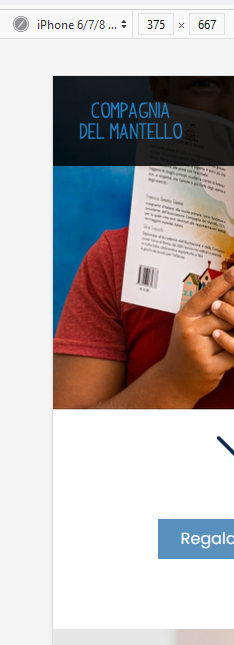
Accepted AnswerThank you for your patience Paul. I removed the CSS code inside the add-on. But the button is over the boy's face while I would like to move it over the boy's hands. https://pasteboard.co/fUuw3VIsZIl4.jpg Could you please suggest how to set the button position over the image?
francesco1980
Accepted AnswerI'm sorry Paul I also used a different browser and the button is over the boy's face https://pasteboard.co/EMLHAG3v3huu.png
Paul Frankowski
Accepted AnswerIt was OK, you changed my changes.. we cannot play this game. I set this last time.
francesco1980
Accepted AnswerHi Paul, I'm really sorry to bother you and it is clear to me that I was not able to explain what I need. This problably depend on my poor english and I beg your pardon for this. "Playing this game" is a very good opportunity for me to learn from you.
Let me start again from the beginning one last time. I have been able to put the button over the image using two add-on and asked your opinion to find a better solution. You suggested me to use a single add-on but I was not able to obtain the same result.
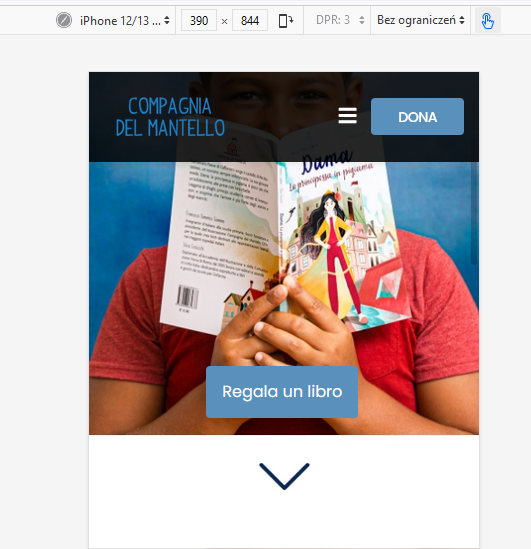
What I need to do is to put the button over the boy's hands not under the image. Something similar to this https://pasteboard.co/VhhuMVeBRrOV.jpg but using a single add-on (if it is possible)
Thank you again for you patience.
Paul Frankowski
Accepted AnswerOh, now I understand. I will check - please do not touch anything on www in next minutes.