Can anyone point me out what options there are to have a minimum with of a text block in these feature boxes, so that the text in the feature box is not floating to the next line. In the example in the screenshots my feature boxes on the tablet view should be as in the mobile view, one underneath the other.
Screenshot tablet view : https://test.happaerts.net/images/capture/contact-tablet.png
Screenshot mobile view : https://test.happaerts.net/images/capture/contact-mobile.png
Staff replied
SP Page Builder
Responsive design
3 replies



Paul Frankowski Senior Staff
Hi,
if those are 3 different addons in 3 columns layout - just change "Tablet Layout" settings in every column.
Here set col-12 (it means full width, boostrap)
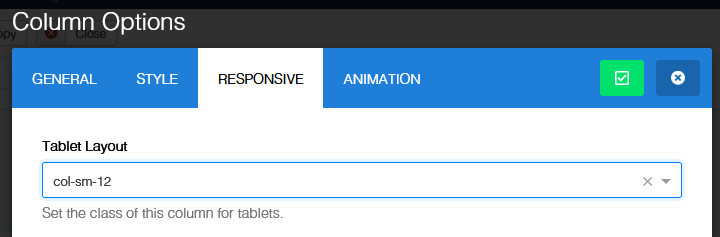
Happaerts Asked this
That was exactly what I needed. The missing link in my 'responsive' understanding, at the level of the Helix Ultimate framework. But still in reach from within the Joomshaper editor. Thanks.
Paul Frankowski Senior Staff
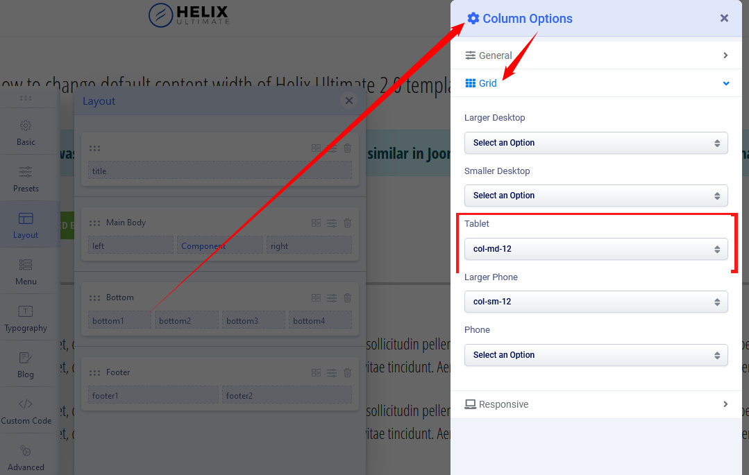
Helix Ultimate 2.0x uses Bootsrap 5 - it means that you can use all classes from it inside modules, addons as well as inside Helix Column Options.
Besides if we talk about HU 2.0 features, each column also has extra settings, so you can just choose.
Log in to reply.