

How To Make The Menu Responsive And How To Change The Page Width
MH
Matt Hunt
How do you make the menu a bit more responsive? I've got the menu on a wide screen, looking great and when the screen gets down to 1024px it coverts to the off-canvas menu, perfect.
But on those middle screen widths, the menu is pushed below the header and is wrapped on two lines. How can I get the menu to convert to the off-canvas menu sooner?
I've tried this code with no luck:
@media only screen and (max-width: 1024px) and (min-width: 1024px) {
    .sp-megamenu-parent {
        display: none !important;
    }
    #offcanvas-toggler {
        display: block !important;
    }
}9 Answers
Order by
Oldest

Mehtaz Afsana Borsha
Accepted AnswerHi,
Could you please give me your site URL so that I can check?
-Regards
MH
Matt Hunt
Accepted AnswerThanks! It is https://a2zpreview4.com/
Mehtaz Afsana Borsha
Accepted AnswerLet me clear first do you want it like this position?
Mehtaz Afsana Borsha
Accepted AnswerHi,
Use this custom css
@media (min-width: 1024px){
div#sp-menu{
bottom:160px;
}
}
Note: Path towards custom CSS: Extensions>Templates>Styles> Click on your current default template name then choose Template Options. Then find custom CSS within the custom code.

Pavel
Accepted AnswerHi. Mehtaz it's wrong solution. You still can not find the reasons and struggle with a consequence with the help of terrible crutches.
Correct solution
- Hide logo column for desktop
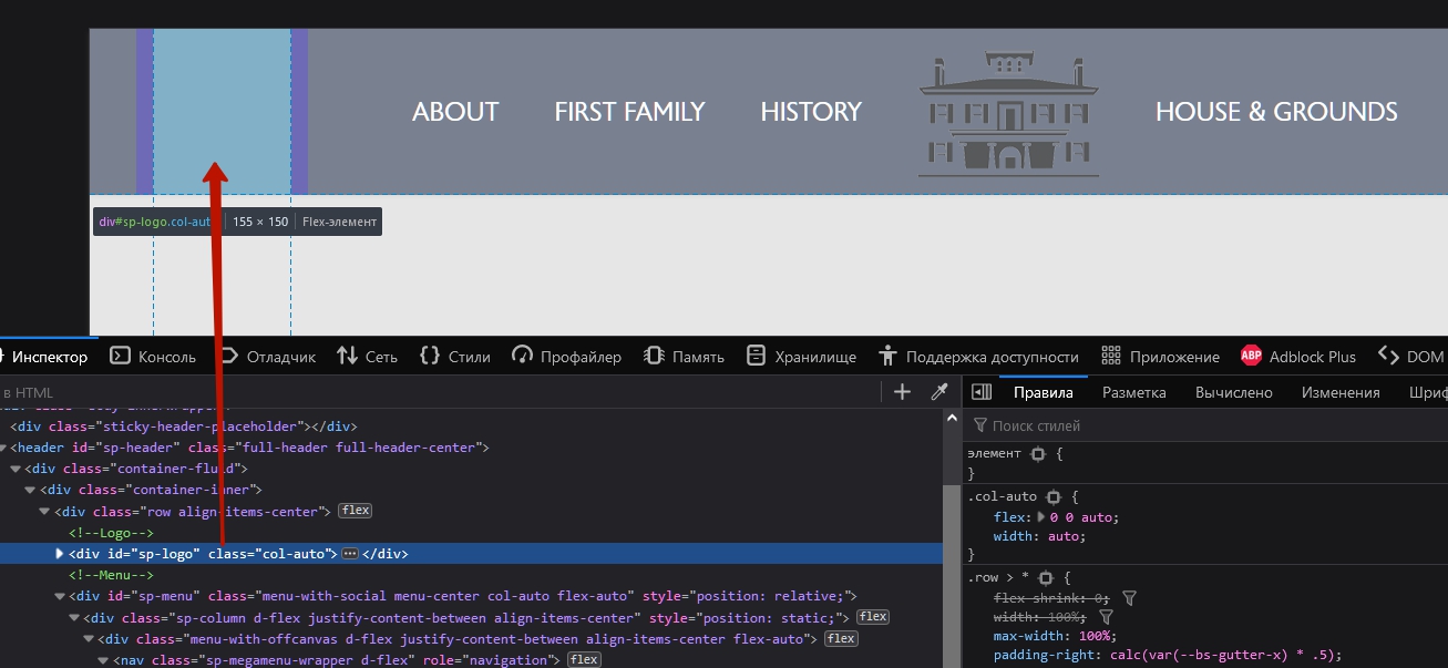
@media (min-width: 992px) {
    #sp-logo {
        display: none;
    }
}- Reduce font size
@media (max-width: 1399px) {
    .sp-megamenu-parent>li>a,
    .sp-megamenu-parent>li>span {
        font-size: 19px;
    }
}
@media (max-width: 1199px) {
    .sp-megamenu-parent>li>a,
    .sp-megamenu-parent>li>span {
        font-size: 16px;
    }
}
If you want to turn on the offcanvas sooner
@media (max-width: 1024px)  {
    .sp-megamenu-parent {
        display: none !important;
    }
    #offcanvas-toggler {
        display: flex !important;
    }
}Mehtaz Afsana Borsha
Accepted AnswerWow thanks Pavel for this solution.I do not think like that. Thanks anyway
NV
N.E. Vermaas
Accepted AnswerI have the same problem. Could you help me with this too. I would like to have have the menu removed and the off-screen menu turned on when zooming into 200%. Here is the website https://getinmotion.nl Many thanksin advance for your answer.