

Helix Ultimate 2.0 In Joomla 4 Megamenu Dropdown Width Deviates In Ipad-screen
HW
Han Wagter
I am using the template Helix Ultimate 2.0 in Joomla 4 . For the menu is used the Mega Menu. The dropdown width is 240px. The menu width used is for 2 different menu- items ( mega menu) is 800 px and 500 px. On the desktopscreen the 2 width's are correct presented. However on the ipad (screen 1080x810) the 2 width's appears not to be adapted to the smaller screen but are partially overlapping the ipad screen. What can i do to the settings?
With 'Inspector' in Firefox i see following css info for the 500 px menu-item:
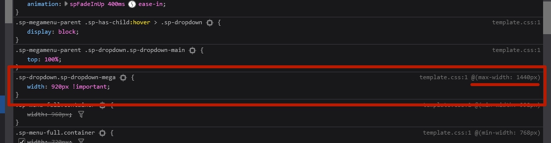
element { width: 500px; } body.ltr .sp-megamenu-parent .sp-dropdown.sp-dropdown-main.sp-menu-left { right: 0; } .sp-megamenu-parent .sp-dropdown.sp-dropdown-main { top: 100%; } .sp-dropdown.sp-dropdown-mega { width: 920px !important; } .sp-megamenu-parent .sp-dropdown { margin: 0; position: absolute; z-index: 10; display: none;
    Is it triggered by:  .sp-dropdown.sp-dropdown-mega {
width: 920px !important; Resulting from a standard setting?

Thanks for your answer16 Answers
Order by
Oldest

Mehtaz Afsana Borsha
Accepted AnswerYou are most welcome. You can now accept my answer and close this post if you do not have any questions

Pavel
Accepted AnswerHi. If you look more carefully, you will see that this code is in the media query.
 And you can override it through your own CSS, placing it in a custom.css file.
@media (max-width: 1440px) {
    .sp-dropdown.sp-dropdown-mega {
        width: 800px !important;
    }
}
HW
Han Wagter
Accepted AnswerThanks for your prompt reaction. Custom.css accordingly adjusted, but did not solve the issue that the dropdownmenu does not adjust to the ipad screen. It remains too wide. Curious what the solution could be. Thanks in advance Han
Mehtaz Afsana Borsha
Accepted AnswerHi,
Could you please give me your site URL so that I can check?
Thank you
HW
Han Wagter
Accepted Answerurl = www.klokkenbouwen.nl/test2 In the menu click f.e. on "cursus" The dropdown takes the whole ipad-screen. After login for members i have the same issue but then the dropdown goes outside the screen, due to the position of the menu-item in the top menu. But the situation is the same: no adaption of the dropdown to the smaller ipadscreen ( 1080x810). Looking forward to your reaction
HW
Han Wagter
Accepted AnswerSorry sorry. The issue is ont the url : www.klokkenbouwen.nl/test2 This is the development for my joomla 4.0 site Has the the url in the first answer already adjusted
Mehtaz Afsana Borsha
Accepted AnswerOk got it. Please give me your super admin access on the hidden content please I need to check
Mehtaz Afsana Borsha
Accepted Answer Mehtaz Afsana Borsha
Accepted AnswerCant access please check
Mehtaz Afsana Borsha
Accepted AnswerI am able to access on this portion but after that when https://prnt.sc/1zoggmi it comes then I am not able to access your site