

Media Queries does Not Work
I
igorsv
HI friends i used to apply media queries to mobile wiew. Something has changed with bootstrap 5.
what ever i do i canot apply margin to logo on mobile view. Beffore i used this and it worked great:
@media screen and (max-width: 480px)
.header-sticky .logo-image {
    height: 50px;
    margin-top: 0px;
}
Can you help please
20 Answers
Order by
Oldest

Pavel
Accepted AnswerThis code shoud work, it works in chrome dev tools.
This code cannot work, as it has a syntactic error - the lack of figure brackets at the media query.
Ugur provided the correct code. I would add a more rigorous selector to it, as it is in template.css that successfully override it.
@media (max-width: 480px) {
  #sp-header.header-sticky .logo-image {
    height: 50px !important;
    margin-top: 0px;
  }
}
Or if your Header not sticky
@media (max-width: 480px) {
  #sp-header .logo-image {
    height: 50px !important;
    margin-top: 0px;
  }
}
Paul Frankowski
Accepted AnswerHi, without link to URL hard to guess and help. But your CSS is not fully corect.

Ugur Uygur
Accepted AnswerIt should be:
@media screen and (max-width: 480px) {
  .header-sticky .logo-image {
    height: 50px;
    margin-top: 0px;
  }
}
I
igorsv
Accepted AnswerFor some reason it does not work i post it in custom code and no result. site is https://vervo.eu/ee/ i try to change logo possition on mobile
I
igorsv
Accepted AnswerThis code shoud work, it works in chrome dev tools. but it none of them works in custom css
@media (max-width: 575px)
#sp-header .logo {
    height: 60px;
    margin-top: 10px;
}
I
igorsv
Accepted AnswerHi Pavel in stiky it works all the time. bBut even your code does not change logo possiton. I try to add margin-top:10px but no result
I
igorsv
Accepted AnswerThanks Pavel this worked. Thanks
@media (max-width: 480px) {
  #sp-header .logo-image {
    height: 50px;
    margin-top: 10px;
  }
}Pavel
Accepted AnswerIt works but this is not the right code to solve your task. margin-top: 10px; is a crutch.
Since you have increased the Header height you should also increase the height of all items that take the height of the Header.
The correct code will be such
@media (max-width: 480px) {
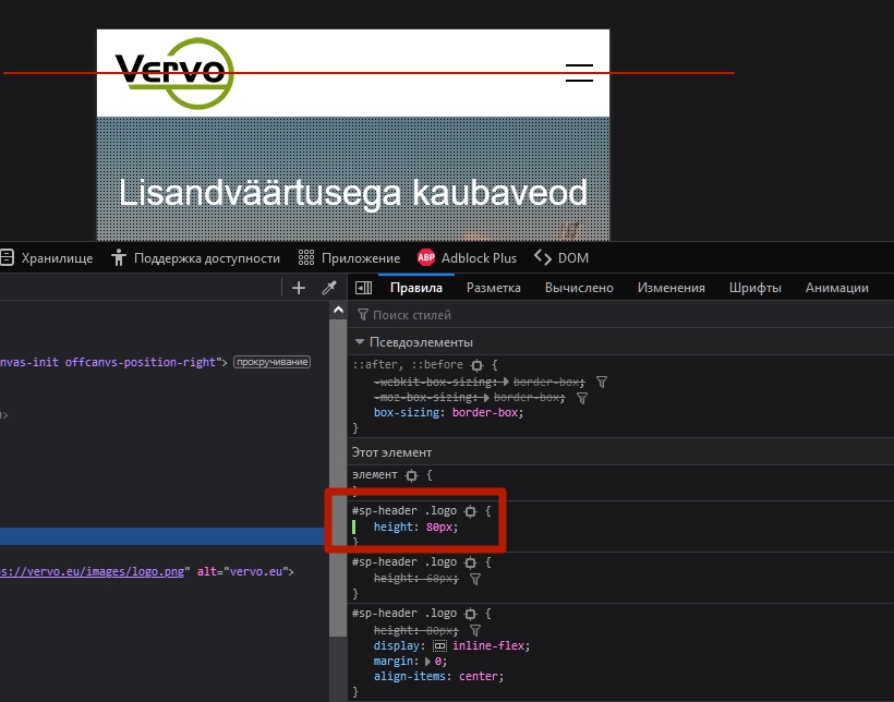
#sp-header .logo {
height: 80px;
}
#sp-header .logo-image {
height: 50px;
}
}It lines all the elements in the center of the Header vertically.
I
igorsv
Accepted AnswerPavel I am so thankful for your help. I wish i would be such pro. Realy thanks.
Pavel
Accepted AnswerI wish i would be such pro.
Hi @igorsv. Not so difficult. Just need to study the behavior of the tool which use. When you change the height of the Header in the template settings, all other elements are aligned according to this height. But when you change the Header height through CSS, all other elements are crooked.
And here it is enough to ask yourself a question "Why is it going on?". Then open the browser code inspector and you will be able determine that the height value of the Header changed in the template settings is used as well in the line-height property for the menu item links, in the height property for the .logo (logo container) and in the height property for the #offcanvas-toggler.
After that you will know that fo changing the Header height via CSS you need also change the remaining items. Thus, the full code for changing the height of the Header will look like
#sp-header {
    height: 100px;
}
#sp-header .logo {
    height: 100px;
}
.sp-megamenu-parent > li > a,
.sp-megamenu-parent > li > span {
    line-height: 100px;
}
#offcanvas-toggler {
    height: 100px;
}
And more compact record
#sp-header,
#sp-header .logo,
#offcanvas-toggler {
    height: 100px;
}
.sp-megamenu-parent > li > a,
.sp-megamenu-parent > li > span {
    line-height: 100px;
}
MS
Martin Seidl
Accepted AnswerHey Pavel I put this into template options custom code, but it does not work:
@media (max-width: 480px) { .logo-image { height: 90px; }
sp-header .logo {
height: 100px;} }
MS
Martin Seidl
Accepted Answer...now I embeded the @media code on top of the custom.css and now it works, but ussually this code should be at the end of the css file ....strange
Paul Frankowski
Accepted AnswerMartin,
my suggestion is .... validate whole custom CSS code that you have inside custom.css using offcial tool: https://jigsaw.w3.org/css-validator/
I can only guess there you have some small human mistakes, like missing "{" or " }" etc..
And sorry, but we are not here for CSS support for obvious reasons.
MS
Martin Seidl
Accepted Answerthnx, u r right and goog idea! my bigger problem seems to be a bug issue from Joomshaper > Helix: https://www.joomshaper.com/forum/question/21508 :-)
MS
Martin Seidl
Accepted AnswerHelix didnt solve it I had to create a deviation to solve it, I just sais "it seems..."