How can I change the logo in the off-canvas menu? - Forum | JoomShaper
Solved General

How can I change the logo in the off-canvas menu?

Asked by Josef 4 years ago Last activity 4 years ago

I use Joomla 4 and Shaper_helixultimate 2.0.10

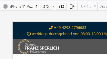
In the main menu, the background is white and the logo font is dark. The off-canvas menu has a dark background, so I need the logo with white lettering there. This logo is identical to the mobile logo.

How can I set it up so that the mobile logo is displayed in the desktop view and off-canvas?

Accepted answer

Marked as the solution
Paul Frankowski Senior Staff

It works if you make screen smaller, on resolution 860px and smaller. Look again inside my CSS code. Do you see number "860px" ? Just change value from 860px to ??? 1280px or 1444px or 1960px. Those are popular screen resolutions used in laptops.


Anyway why do you need mobile menu displayed on also on desktop view?
Disable it in Template Options > Menu > Offcanvas

14 more replies

Paul Frankowski Senior Staff

Hi Josef,

In general logo used in offcanas is taken from Mobile logo.
Yes, it can be overriden by Custom CSS.

In your case you can also use Dark header for Mobile view then white logo can fit both.

Paul Frankowski Senior Staff
4 years ago · edited

If you decided to use dark logo for Mobile and Offcanvas menu, maybe consider using this custom CSS

@media (max-width: 680px) {
#sp-header, #sp-header.header-sticky {
  background-color: #555;
  top: 58px !important;}
    .burger-icon > span { background-color: #eee;}
    }

and in Template Options - Basic - Logo - Mobile view - set logo height: 60px

After
foto_8510_2022.jpg

Josef Asked this
4 years ago · edited

Hello Paul,

I misunderstood something, because it's not running yet.

Josef Asked this
4 years ago · edited

Hello Paul,

I misunderstood something, because it's not running yet.

Paul Frankowski Senior Staff
4 years ago · edited

small correction

background-color: #555 !important;

Update only that part.


and if you want to use it also for tablet instead of 680px value - use 860px - here:

@media (max-width: 860px) {

Josef Asked this
4 years ago · edited

it's a problem with my untrained English.

I don't want to change the colour but use a different logo.

For the logo in the desktop version I want
Logo1.jpg.

In Off-Canvas and mobile I would like to use Logo2.jpg.

Paul Frankowski Senior Staff

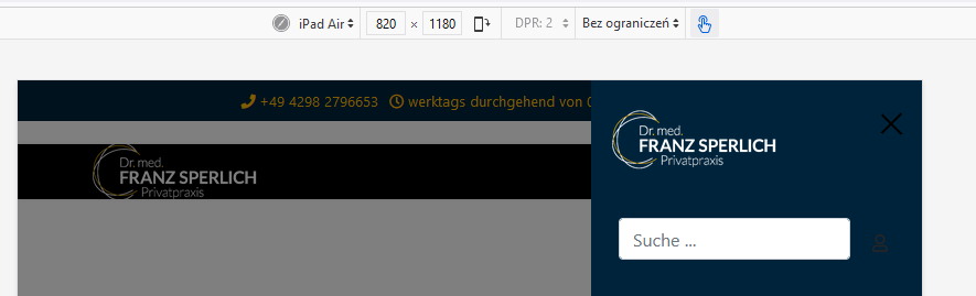
Now you have this way (iPad preview) on Mobile & Tablet

ipad.jpg

Josef Asked this

Hello Paul,

that's nice, but when I see it in the desktop version, it's a dark logo on a dark background and therefore meaningless.

That's why it's described in more detail again.
In the main menu on the white background the logo with the black font (example-logo1.jpg).

When I click on the off-canvas (hamburger) menu, the logo with the white font should be displayed ((example-logo2.jpg).

Paul Frankowski Senior Staff

Ok, in that case:
DELETE all above today CSS code from your site and use only a NEW one:

@media (max-width: 860px) {
#sp-header, #sp-header.header-sticky {
  background-color: #fff;}
    #sp-logo .logo-image-phone {
  display: none !important;}
  #sp-logo .logo-image {
  display: block !important;}
    .offcanvas-active .burger-icon > span  {
  background-color: #ccc;}
}
Josef Asked this

there is not running :-(

I delete all entries and paste your code in custom.css

Log in to reply.