Hello
I'm testing sp page builder pro's article plugin.
In pc format, it shows two articles, one next to the other as I have it configured.
But I want it to do the same in mobile format and it always shows a single article.
I can't get it to display two articles next to each other.
In the options of the addons in mobile I have put col-xs-6.
I only get it to show the smallest items, but always one below the other. And now they have room to hang out side by side.
I am doing something wrong?
What should I do?
The url is not public.
Greetings
Solved
SP Page Builder
SP Page Builder pro items add-on
Accepted answer
Marked as the solution
Paul Frankowski Senior Staff
5 years ago
· edited
Hi,
1st step: Check Column options.
You have problem with Column width. You should have 12 (col-xs-12 and col-ms-12) for mobile view not 6 as you have now.
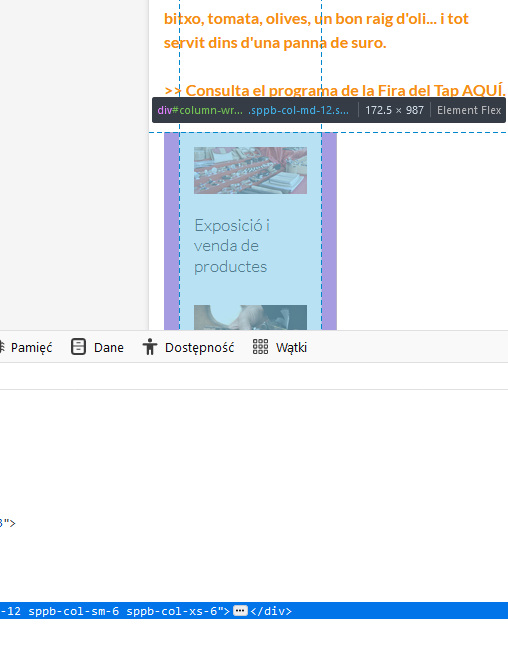
2nd step:
Use following custom CSS:
@media (max-width: 580px) {
.sppb-addon-articles > .sppb-col-sm-6  {
    -ms-flex: 0 0 50%;
    flex: 0 0 50%;
    max-width: 50%;}
}3 more replies

Ariba Staff
Hello
Thank you for your query. Kindly allow me some time, i will get back to you soon.
AJCS Asked this
If I put 12 (col-xs-12 and col-ms-12) I get a single image, and I wanted to see two.
I will provide this code in the component, although at the moment it does not work for me.
But I will test it further.
I will keep you informed.
Thanks
AJCS Asked this
perfect, now yes. I think that in the code there is plenty of the '<'
Thanks for the help
Log in to reply.