Hope Template Footer Inline Issue? - Forum | JoomShaper
Solved Templates

Hope Template Footer Inline Issue?

Asked by Nader A. 11 months ago Last activity 11 months ago

I have an issue where only on mobile, the footer menu items mix into each other or appear on the same line even though they are their own menu items under footer headings. I'm using an iPhone 16 Pro Max to test. If you go to https://jondavidsalon.net/newjds you will see what I mean. How do I resolve this issue where the menu items in the footer appear on their own line on mobile portrait mode?

Thanks,
Nader

Accepted answer

Marked as the solution
Paul Frankowski Senior Staff
11 months ago · edited

Oh, in that case, extra Custom CSS is needed.

Solution #1

@media screen and (max-width:990px) {
#sp-bottom .sp-module ul.nav {display: block;}
}

Solution #2:
or you can keep inline, but add margin for menu items, also very simple:

#sp-bottom .sp-module ul.nav.menu li {margin-right: 10px;}

info_3409_2025.jpg


Next time add screenshot with red arrows in first post.

Nader A. Asked this

Thanks, Paul. That worked.

Nader

6 more replies

Paul Frankowski Senior Staff
11 months ago · edited

Hi Nader .

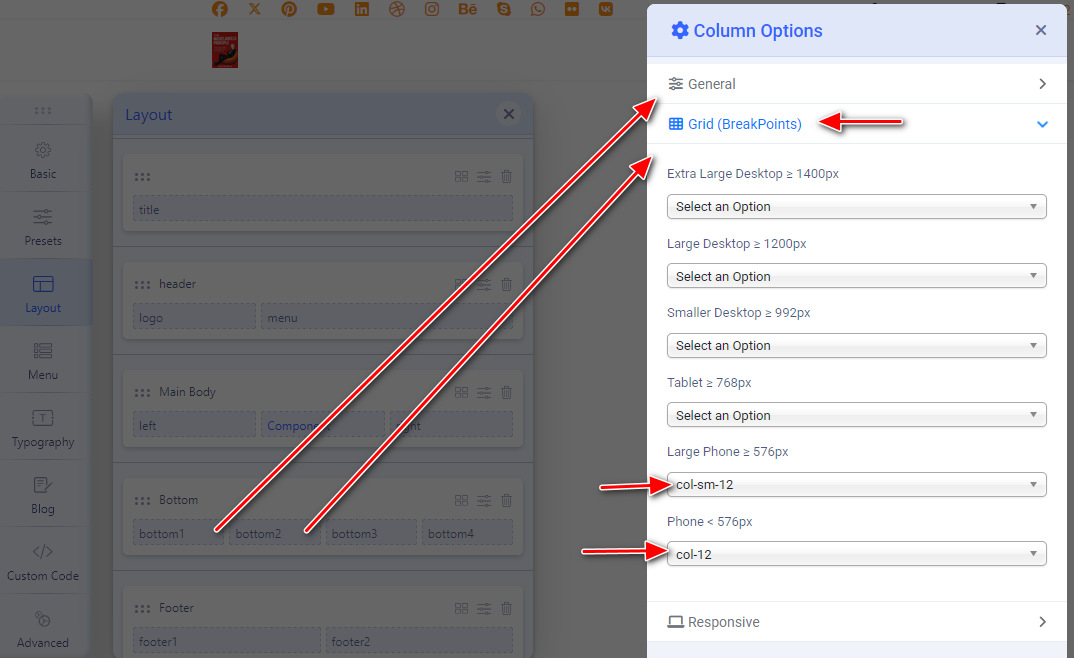
Please go to Template Options > Layout and change grid for bottom1 and bottom2 > Column Options> , if no value just use col-12 for Mobile view (both).

quick tip

info_3386_2025.jpg

Nader A. Asked this

Hi Paul,

This is what I see. Am I looking at the right place? Your display looks different than mine.

Paul Frankowski Senior Staff

in that case in Mobile Layout - choose/set col-12 in theory it should fit for IPhone 16.

Do the same for Bottom1 and Bottom2

Nader A. Asked this

Hi Paul, I tried that but it still didn't work. The issue are the menu items under the headings, not the headings, themselves. Any other ideas?

Nader A. Asked this

Need a solution to this. Please respond as soon as you can.

Thanks,
Nader

Paul Frankowski Senior Staff

In general, Boostrap style made that "mess" ;]

Log in to reply.