Hello.
I'm having problems with the shaper_hope template.
- The mobile menu icon ☰ is in the wrong place. (mobile-menu.jpg)

- When reducing the browser window size, both the TOP1 and TOP2 pages misalign. (top1-top2.jpg)

Please help me with this.
Regards
Hello.
I'm having problems with the shaper_hope template.
Regards
Hello,
Hope you are doing well.
There is an Accept button below each reply. You can accept an answer there to officially close the post.
Thanks!
Hi there!
Thanks for reaching out.
Kindly update your Template and Joomla version. You are using extreme old versions there.
https://cleanshot.com/share/VNxQb8HX
The alignment issue should have been fixed with update.
Note: Please keep a full site backup before trying anything.
Best regards,
Indeed, as you can read also inside your Joomla 3 admin area "Support has ended for your version of Joomla 3.10" (3 years ago).
All extensions must be updated, also from security reasons.
Once you have Joomla 4 or 5 and updated extensions, we can revisit this thread if you encounter any design problems. The Joomla 3 migration remains your responsibility.
Hi.

Regards
1 - logo fixed. If your logo image is HQ you don't need to put Retina logo. In themes based on Helix3, it doesn't always works good.
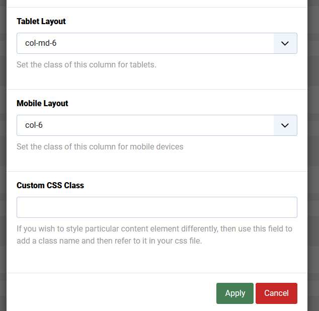
2 - fixed by setting. You forgot about Tablet/Mobile Layout grid settings
Extra bonus tip!
Becuase you are using Polish language, in Typography for Google Fonts in "Font Subset" alsways set "Latin-ext" becuase we have : ą, ż, ś, ę, ź, ł. Normal "latin" you can set for English.
Using that you will have those extra letters in the same font like the rest.
Please mark topic as solved.
Hello.
The Facebook icon and phone at the top don't look very good. They're not aligned properly.

Regards.
Hi,
Please check now. I have added the indicated lines in your custom.css file.
If you need same adjustment for other resolution than this, you may change the font size for that resolution as per your need.
Best regards,
Hello,
Did you check?
Hi.
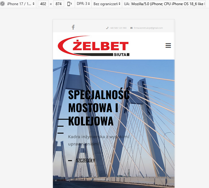
Yes, the fonts in the header are fine, but the headings in the sliders are in the wrong places.

Best regards
I see like this now. What do you need to correct, screenshot with add red arrows maybe
Hello.
I don't quite understand what I need to fix? The slider headers are still in the wrong place on my smartphone.
Regards
I am asking you, what is wrong exactly, explain us with details.
Hello.
The entire section with headings and descriptions in the slider has lost its margins in mobile view.
Best regards
should be better now
Hi,
Kindly check and let us know the update.
Thanks!
Thanks for accepting the answer:)
Have a nice day!

